Make every portal visit count
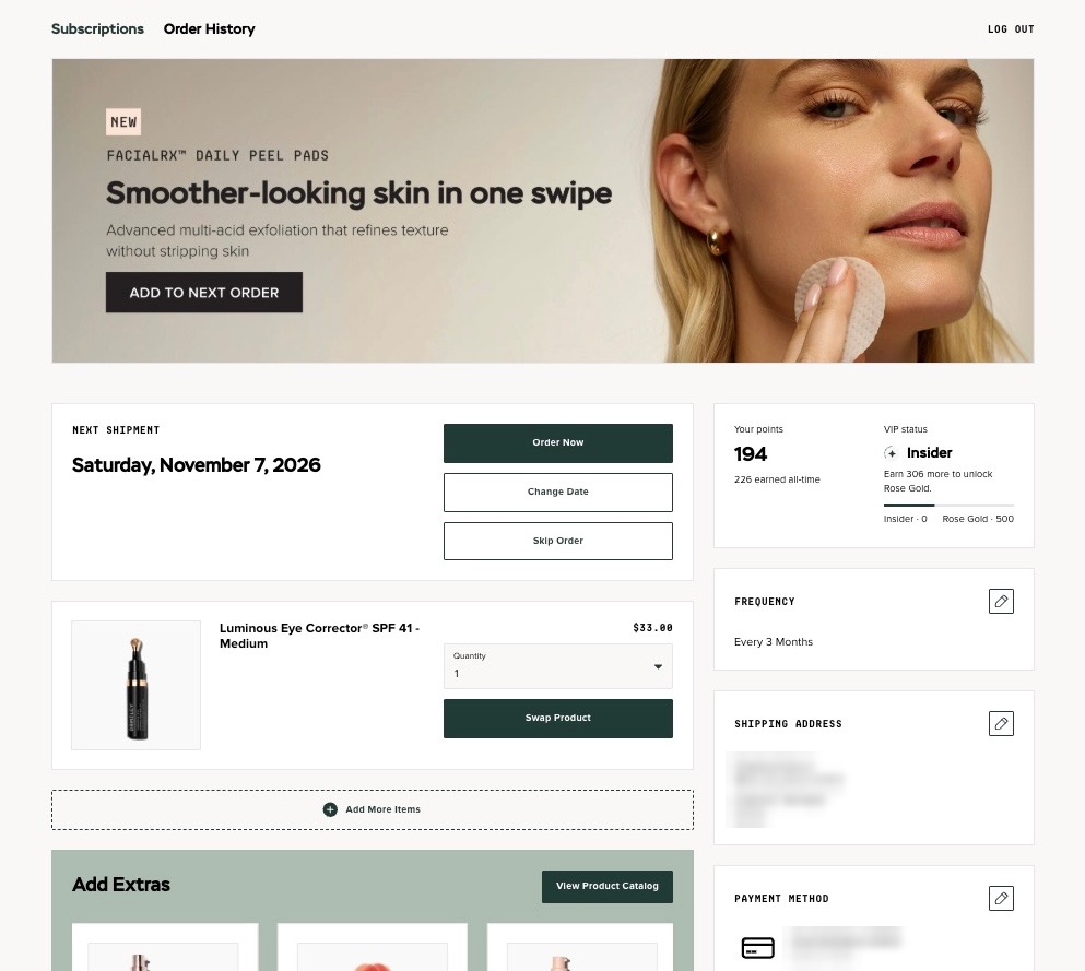
The subscription portal is where DRMTLGY’s subscribers check their next shipment, swap a product or change a date. That makes every visit a chance to show them something useful.
With dynamic banners and segmentation on Stay, the CRM and retention team decides who sees what, and can change it whenever the program needs it.
Customer quote
The biggest wins for us are that we seamlessly migrated six figures of subs with no issues.
Save rate has improved ~25% → 29%. We’re able to AB test easily. Exports are minutes to download vs. DAYS. And we’re continuously unlocking data improvements thanks to Staylien and now especially with the Stay x Claude MCP.

Louise Bak
CRM and Retention Strategist
DRMTLGY
At a glance
Three placements, five banners
Top
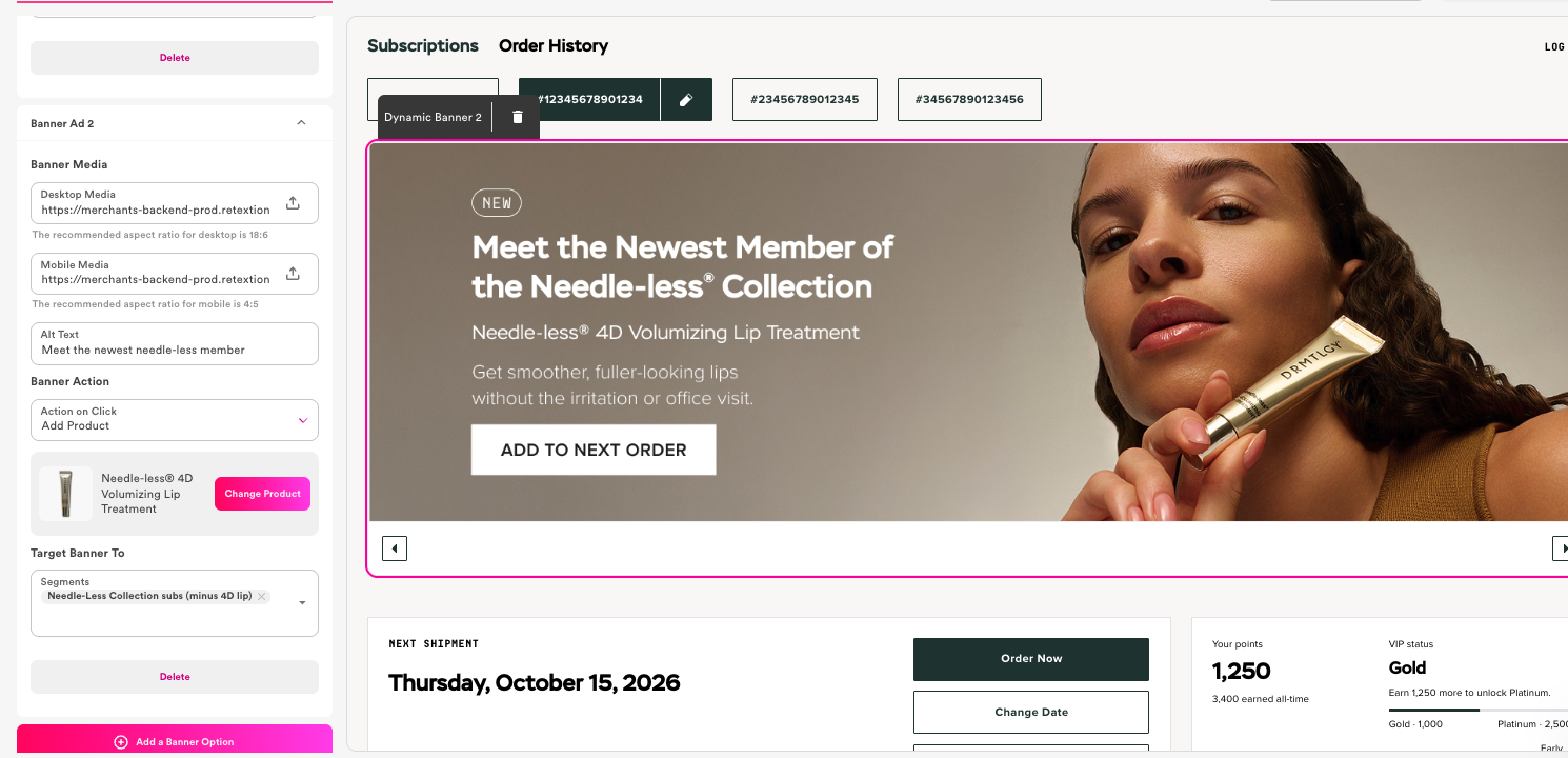
Carousel of 2 banners. Peel pads for all, lip treatment for a segment.
Side
2 banners. Each subscriber sees the product they don’t have yet.
Final
1 banner for everyone: the 140k+ member community.
Placement 1 · Top · Carousel
Peel pads for everyone, the lip treatment for the right customers
The FacialRX daily peel pad banner shows to every subscriber. The second promotes the new Needle-less 4D Volumizing Lip Treatment, and only shows to customers in the Needle-less collection who don’t already have it on their subscription. If you fit that segment, you see the peel pads first, then the carousel moves to the lip treatment.

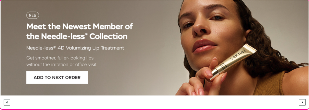
Who sees it: segment “Needle-Less Collection subs (minus 4D lip)”. Both banners have an Add to Next Order button.
Placement 2 · Side · Segmented
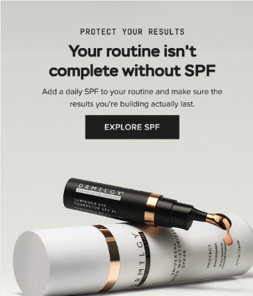
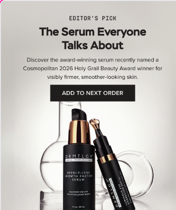
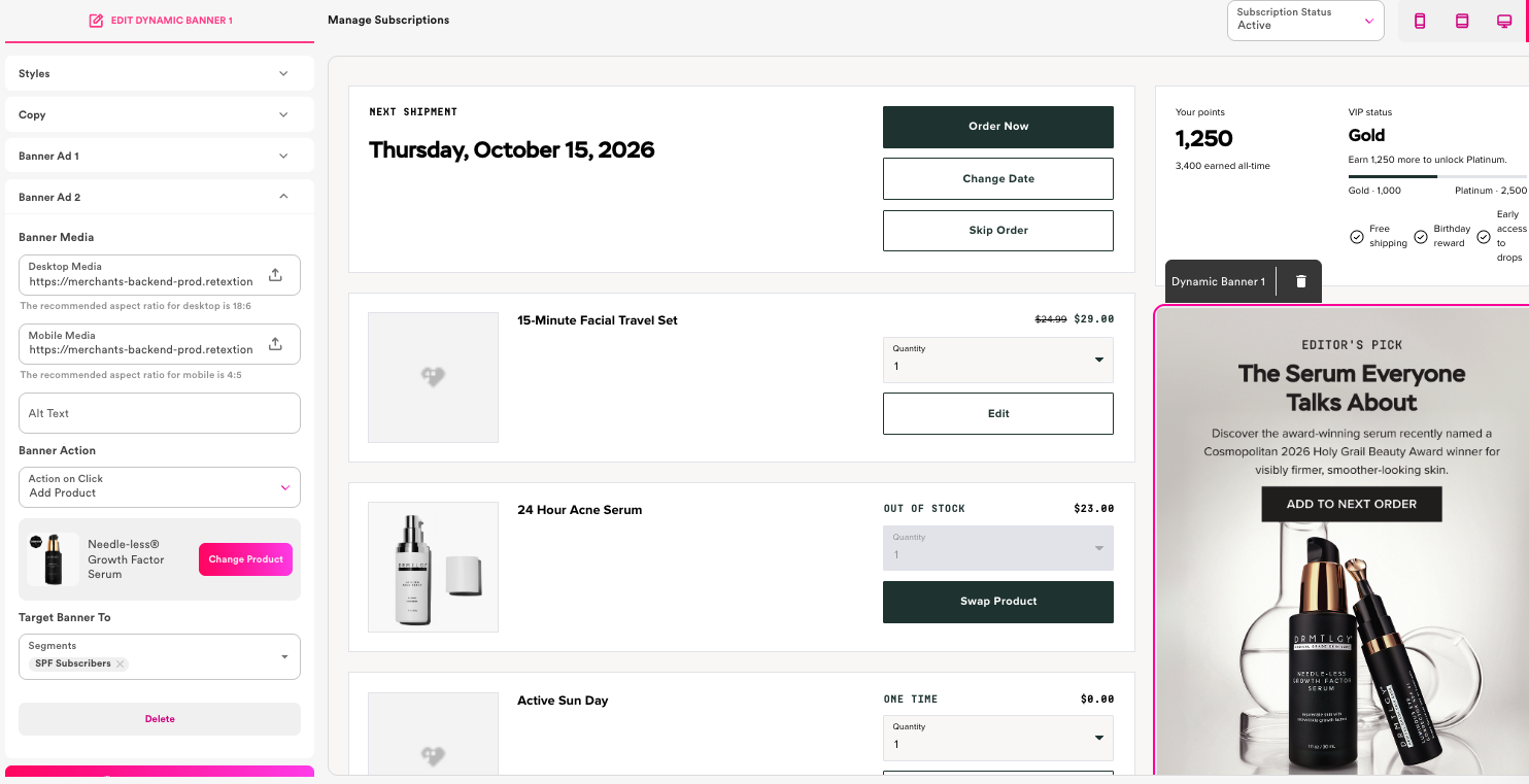
Serum subscribers see SPF. SPF subscribers see the serum.
Each customer sees the banner that fits. Serum subscribers get a banner to add SPF to their next order. SPF subscribers get a banner to add the Needle-less Growth Factor Serum. Each customer is nudged toward the product that completes their routine.
Placement 3 · Final · Everyone
Community: no sales pitch at all

The last banner skips the sell and invites customers into DRMTLGY’s 140k-member Facebook community. It keeps customers engaged once they already own most of what you’d push, and it pushes the cancel button further down the page.
Built in the portal editor, no code
All of this is set up in Stay’s portal editor. Upload creative for desktop and mobile, choose what happens on click, pick the product, and choose the segments that should see it. The editor shows a live preview as you work.
Add-ons in the same flow
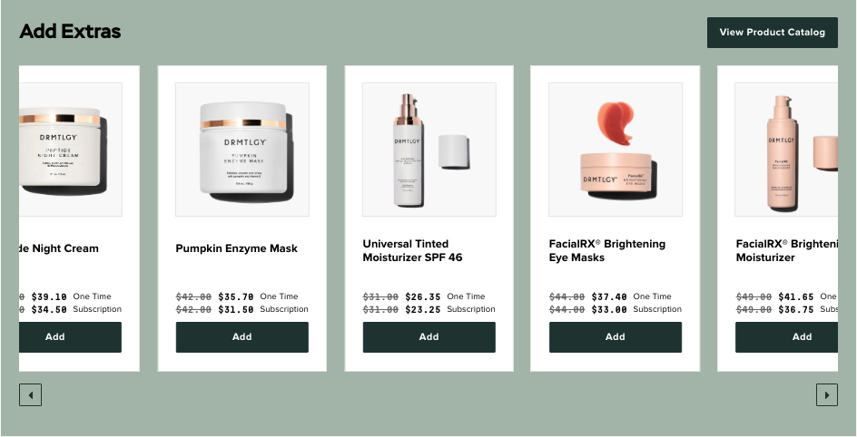
Banners point subscribers to products. The Add Extras shelf sits below the order details, so adding one takes a single click, and the subscription price is shown next to the one-time price.
A cancellation survey that asks the second question
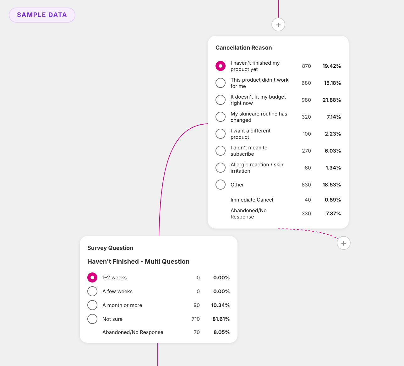
DRMTLGY’s cancellation survey doesn’t stop at “why are you canceling?” Each reason can lead to a follow-up question. If a customer says they haven’t finished their product yet, the survey follows up with a timeframe to choose from: one to two weeks, a few weeks, a month or more, or not sure. The team does this across their cancellation reasons, so each customer is guided toward the next step that fits.
Test the save offer, see the winner at a glance
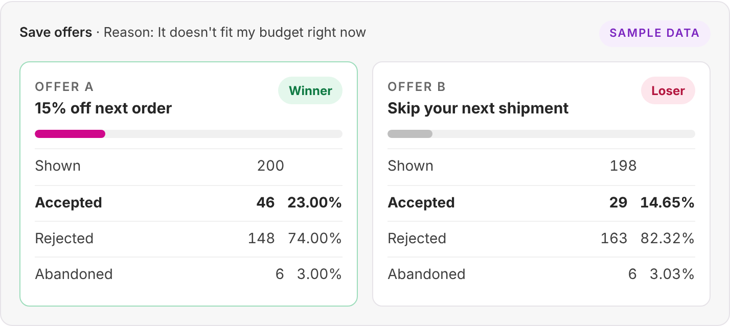
Save offers can be A/B tested right in the survey flow. Stay marks which offer is winning and which is losing as results come in, with the numbers next to each. DRMTLGY ran a round of tests, kept the winners, and has since turned the tests off.
Results
29%
Save rate
Up from 25% with easy A/B tests
+27%
Add-on revenue
Banners and the Add Extras shelf
0
Subscriptions lost
Six-figure base, no issues
The data keeps getting better too. DRMTLGY’s team uses Staylien and the Stay x Claude MCP to keep pulling more out of their subscription data.


