Understanding and mitigating your churn is essential for sustaining growth and long-term success. That’s why we made our new churn reporting dashboard, where you can easily monitor and analyze your subscriber churn all in one place.
This powerful tool puts your most essential data and metrics in a single location, so you can take control of your churn rates and unlock actionable insights. Get a comprehensive, bird’s-eye view of your churn or deep-dive into critical trends over time.
Let’s walk through the features and functionality of our Churn Reporting dashboard so you can hit the ground running.
1. Cohort comparison graph
The first of its kind in the subscription space, this graph enables a high level view of churn based on more than 15 metrics. To dig deeper into specific questions, you can also build comparison views to put two of those 15+ metrics up against each other.
First, a couple of foundational notes about how to use it:
1. Metrics are split out by monthly cohort; i.e., by the month the subscriber created their new subscription. So, as an example, every subscription started by a new subscriber in June 2023 would be a part of the June 2023 cohort.
2. At the top of the graph, “Applied Category” is your first selected metric. You can look at this metric alone, or you can choose another metric to compare it against by clicking “Compare Metric.” The Applied Category (left) metrics are displayed in pink, and the comparison metric on the right is displayed in purple.
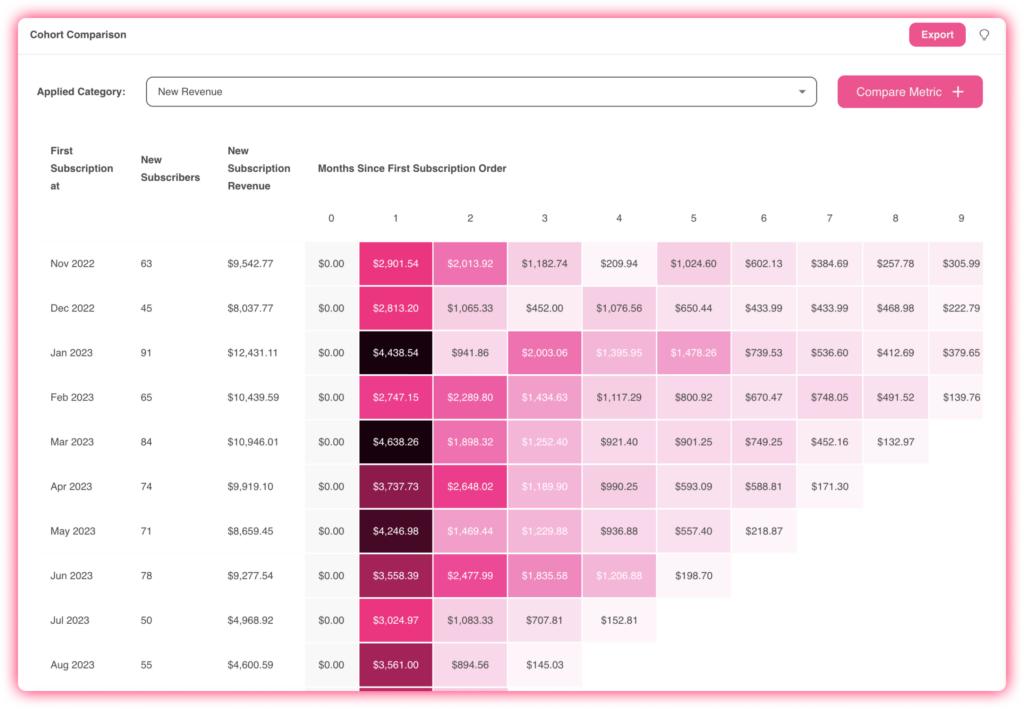
Cohort comparison graph: example use cases
Looking at just one metric in the cohort graph is pretty simple, and you can scroll down to see the list of churn metrics and their definitions at the bottom of this post. The comparison graphs go a little deeper, so you can see one metric right against the other.
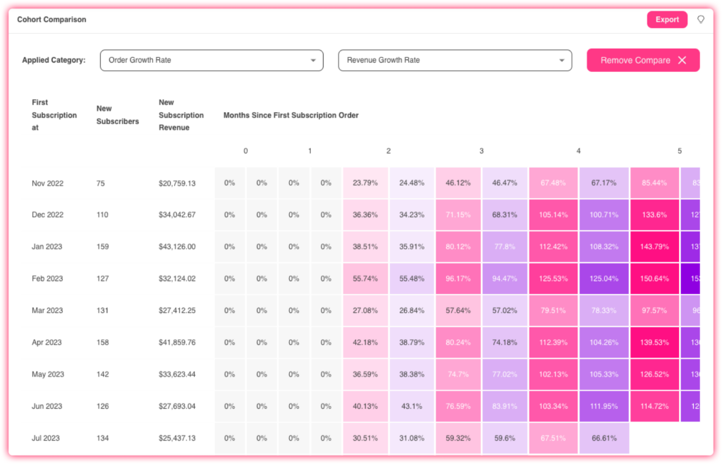
What is the value of your average subscription order, and how is it trending? First, compare Order Growth Rate to Revenue Growth Rate. Is one increasing or decreasing faster than the other? For example, if Order Growth Rate is increasing much faster than Revenue Growth Rate, your subscription purchases are probably lowering in value. Understanding that means that you can now make a data-driven decision about what to do next, like run an upsell promotion via ExperienceEngine to drive up average order value.
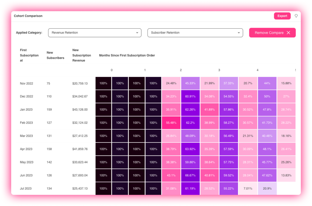
How is retention rate trending, by revenue and by subscriber? Compare Revenue Retention to Subscriber Retention to see how each is headed directionally. If both are steadily decreasing, it might be time to offer a free gift promotion to increase monthly retention. On the other hand, if subscriber retention is increasing but revenue is decreasing, you know that each subscriber is spending less — so you could consider a discounted upsell campaign instead of a free gift, to increase that AOV.
2. Revenue and order retention graph
This graph gives you an overview of revenue and order retention by monthly cohort so you can see how each is performing.
You can toggle between Revenue and Subscription Retention, for if you want to see active subscriptions, and Revenue and Subscriber Retention, which will show you the number of active subscribers instead.
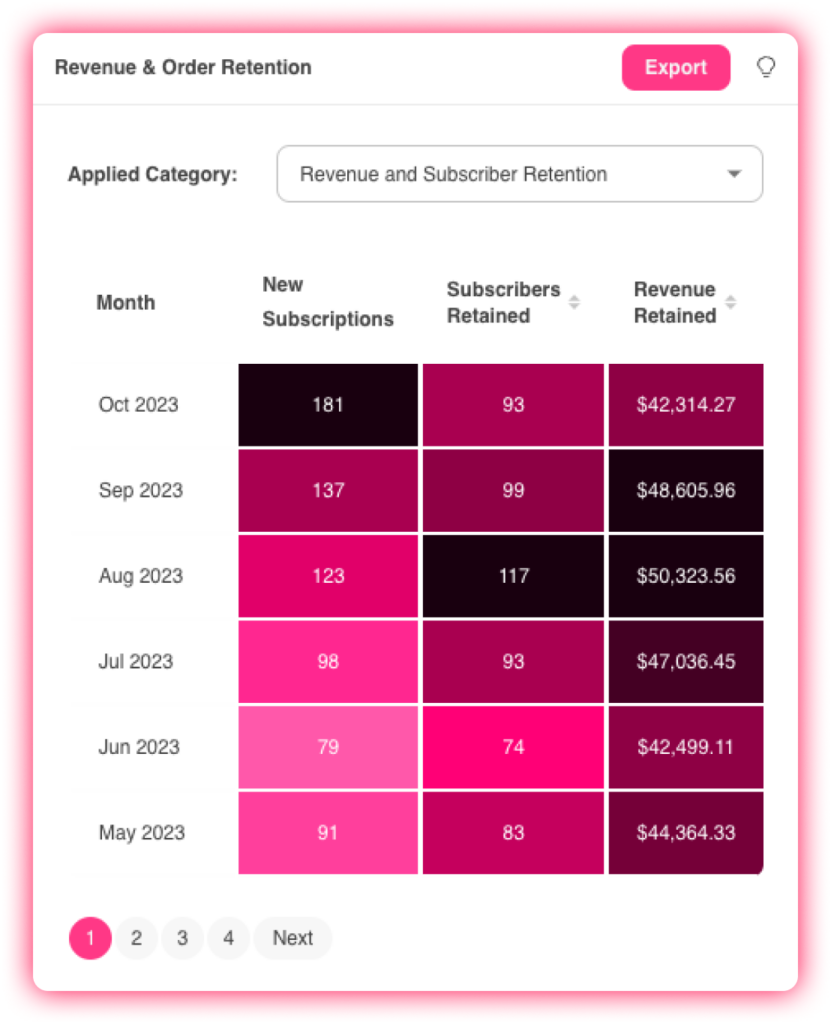
So, if you’re looking this graph, for example, you know that in the September cohort:
– 137 new subscribers were created
– 99 of those subscribers are still active at this time
– those 99 subscribers generated $48,605 of revenue this month
You can also sort within the graph to see which cohorts are performing best, and export data to campaign towards or reward the cohorts accordingly.
If you look at which cohorts are performing best, you can go back to your broader business analytics to see if there are specific things you did that month to draw in higher-value subscribers, like a certain promotion or ramp-up on a specific channel.
3. Churn by order graph
We’ve integrated our machine learning model with our drilled-down analytics to help you pinpoint the time of highest churn risk in your subscription program.
While most of the graphs we’ve looked at so far have been by monthly cohort, this one is broken out by order cycle.
Churn Risk is calculated by order cycle with the help of our ML model, considering factors like inconsistent ordering, order date changes, order skips, and more. Then, you can also see how churn risk fluctuates by cycle — in other words, is churn risk higher or lower on order cycle 4?
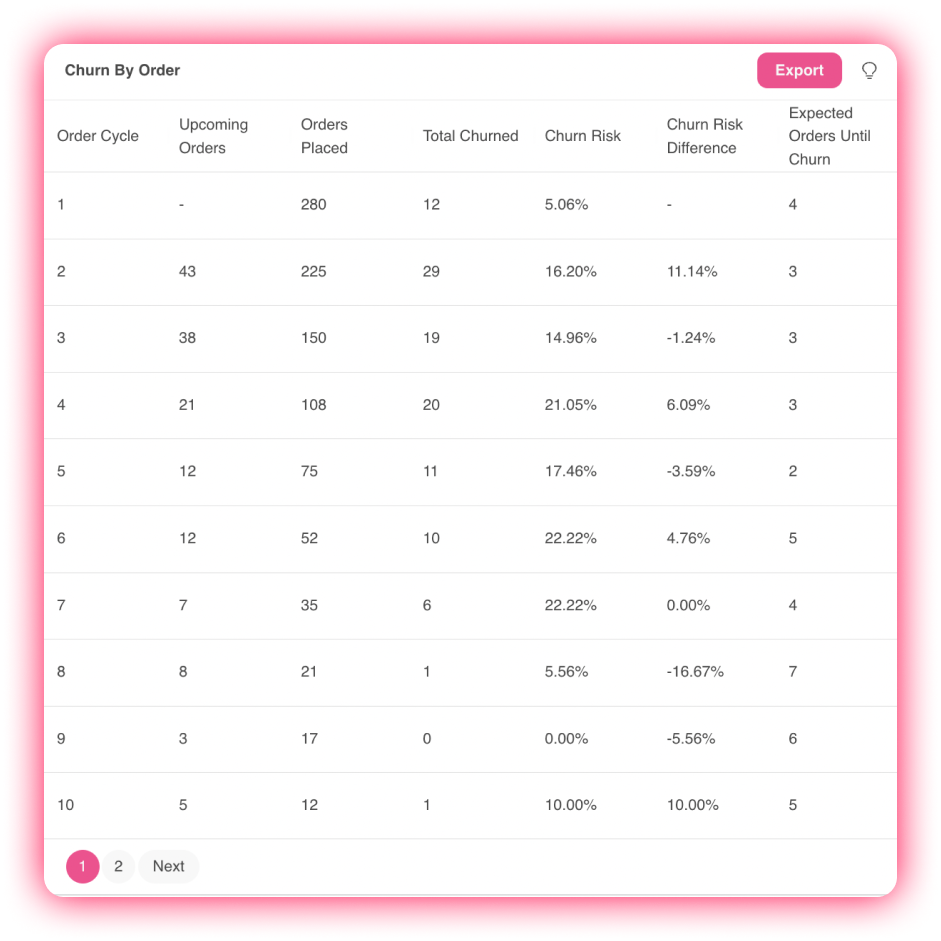
In this example, you can see the churn risk on cycle 4 does jump by over 6%. That could be a strategic spot to start testing freebies or promotions in advance of cycle 4 to decrease that 21% churn risk.
4. Churn reporting data
These analytics report on RetentionEngine metrics, so you can get a ton of at-a-glance information about your current retention position and how it’s trending over time:
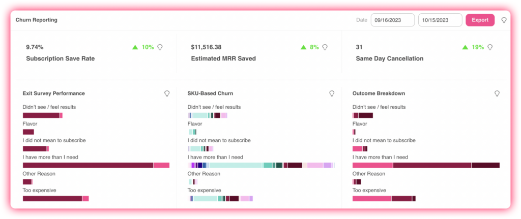
Subscription Save Rate: What percentage of churning customers are saved by your follow-up cancel flows?
Estimated MRR Saved: How much estimated monthly recurring revenue did those saved customers help you retain?
Same Day Cancellation: How many customers subscribe for the discount, just to turn around and cancel the same day?
Exit Survey Performance: Why are subscribers churning, and how many were saved by a follow-up treatment?
SKU-Based Churn: Which products were churning customers subscribed to?
Outcome Breakdown: Which follow-up treatments saved the most subscribers, by cancel reason?
5. New & churned report
This has been a long-requested graph from our customers. This is a simple, by-day look at how many new subscriptions were started, and how many existing subscriptions churned, along with the email addresses associated with each.
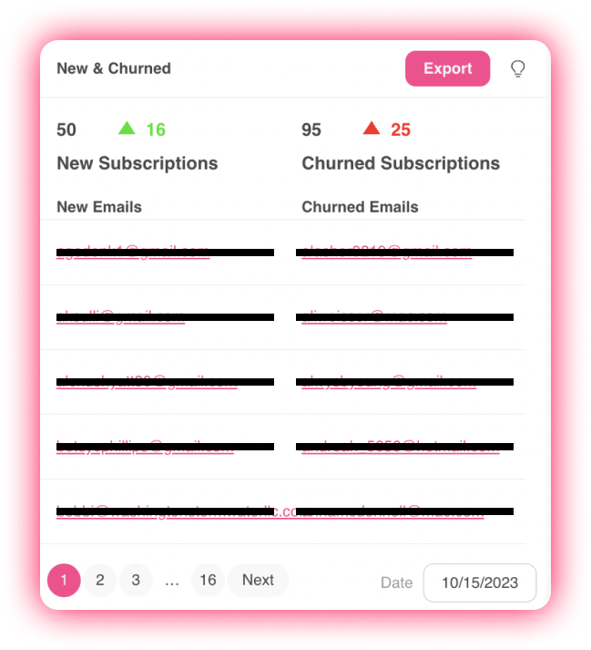
Pro Tip: export and use the email information in this report to target specific customers based on the date of acquisition or churn.
6. Overall cohort performance report
This graph will give you a high-level view of a set of five metrics across monthly cohorts. Whereas the Cohort Comparison graph is made to identify trends and dig into specific metrics, this overall performance graph gives you a bird’s eye view of LTV, Cumulative Revenue, LTO, and Cumulative Orders.
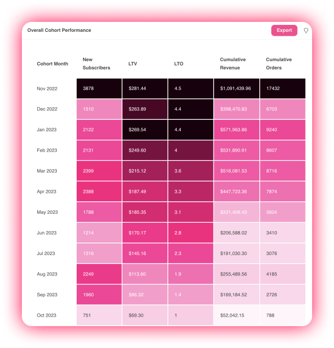
Pro Tip: Use this graph to get a quick glance understanding of the LTV of each month’s acquired subscribers, and then review the promotional messaging or ad creative running that month for optimization.
7. Forecasting by order report
Understanding when your orders will fire is critical for inventory tracking and financial planning. You can also segment this data by first, second, and third recurring order. Navigate month over month to upcoming dates, and export as needed.

Churn metrics: definition “cheat sheet”
- First Subscription: Refers to the month this cohort of customers started their first subscription.
- New Subscribers: Customers who created their first subscription within the allocated time period.
- New Subscription Revenue: Revenue generated from first-time subscriptions.
- Months Since First Subscription Order: 0 indicates the month in which the customer’s first subscription was created. 1 indicates the first month since the customer’s first subscription was created, etc.
- New Revenue: Total revenue generated by that cohort’s subscribers, as recorded monthly since the first subscription order.
- Revenue Retention: New revenue /1st month revenue.
- Revenue Per Subscriber: New revenue/number of subscribers.
- Cumulative Revenue: Total revenue by cohort, recorded monthly since the first subscription order.
- Revenue Growth Rate: Cumulative revenue / 1st month cumulative revenue.
- LTV: Cumulative revenue/number of subscribers, by cohort.
- New Orders: Total order count, recorded monthly since the first subscription order.
- Order Retention: New orders / 1st month new orders.
- Orders Per Subscriber: New orders/number of subscribers.
- Cumulative Orders: Total order count by cohort, recorded by month since the first subscription order.
- Order Growth Rate: Cumulative orders / 1st month number of orders.
- LTO: (Lifetime orders) Cumulative orders / 1st month number of subscribers.
- Subscribers with Orders: Total number of subscribers who placed an order that month.
- Subscriber Retention: Total number of subscribers who placed orders/number of subscribers within the cohort who placed orders in month one.
- Subscriptions Per Subscriber: Subscriptions with orders placed that month/number of subscribers in the cohort.

