The business case for brand consistency across every customer touchpoint.
Imagine you’re working with a dev agency on a new landing page to boost subscriber acquisition. They keep getting the font wrong, and the buttons don’t match the rest of your experience.
As a brand, you’d never approve that landing page. Lack of brand recognition hurts your take rate, right? Likewise, why would you approve a customer portal that doesn’t feel consistent with the rest of your user experience?
Every month, your subscribers log into their customer portal, and they’re not actively thinking about your brand guidelines or your design system. But they are feeling them.
Your customers are consistently asking themselves: Is this the brand I signed up for? Does this feel like the same company that showed up in my inbox last week?
If the answer is “kind of”, then that hesitation is costing you. Here’s what the research actually says about why.
Brand consistency isn’t a nice-to-have. It’s a revenue lever.
Visual design is the single most important factor consumers use to judge whether a company is trustworthy, outranking content quality, company reputation, and everything else studied. (Stanford Web Credibility Project) For a subscription brand asking customers to hand over a recurring payment every month, that’s not a design detail. That’s the whole pitch.
Consistent brand presentation across all platforms can increase revenue by up to 23%. (Marq Brand Consistency Report) Companies that prioritize design grow faster than their competitors. Not a little faster, but a lot faster. And the gap widens every year. (McKinsey) Design isn’t just aesthetics. The brands that take it seriously outgrow the ones that don’t.
One bad experience is enough to undo it. 1 in 3 consumers would walk away from a brand they love after a single bad experience. (PwC) For subscription brands, the portal isn’t a one-time checkout. It’s where the relationship lives, every single month. A clunky, off-brand experience isn’t neutral. It plants doubt.
The throughline: your brand equity doesn’t stop at the checkout page. Every touchpoint either reinforces trust or erodes it.
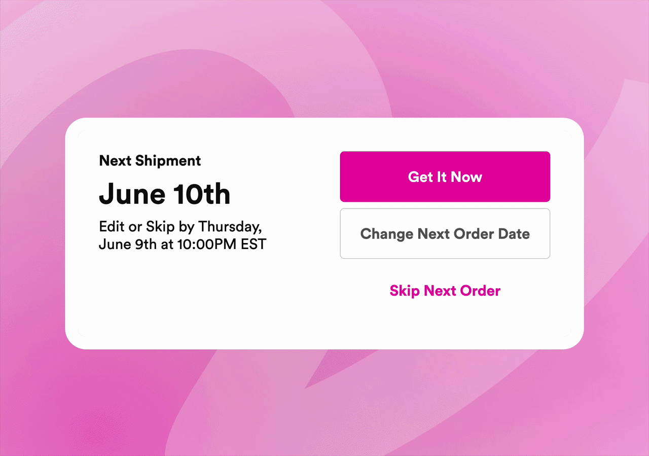
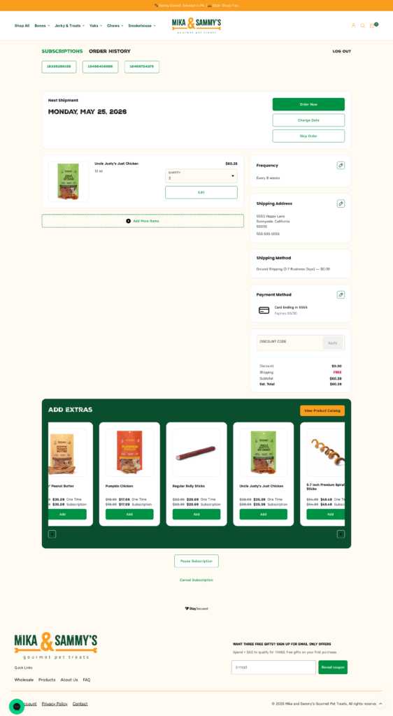
Your customer portal is one of your highest-frequency post-purchase touchpoints. For most subscription brands, it’s the most under-designed one. This is why Stay made the most flexible portal in the ecosystem, putting brand control into your hands.
We tested it. The numbers back it up.
We ran consumer preference studies with hundreds of participants to find out how Stay AI’s Customer Portal actually performs against what’s out in the market. Real consumers, real portals, side by side. We tested against three different competing portals. Here’s what they said.
Is it trustworthy? When compared to one competing portal, 83% of participants chose Stay AI’s as more trustworthy.
Does it look modern? When compared to a second competing portal, 66% said Stay AI’s portal looked more modern.
Does it look like effort went into it? When compared to a third competing portal, 99% of participants said Stay AI’s portal looked like more effort was put into it.
Consumers can’t always articulate why they trust a brand. But they can tell in seconds whether someone cared about their experience.
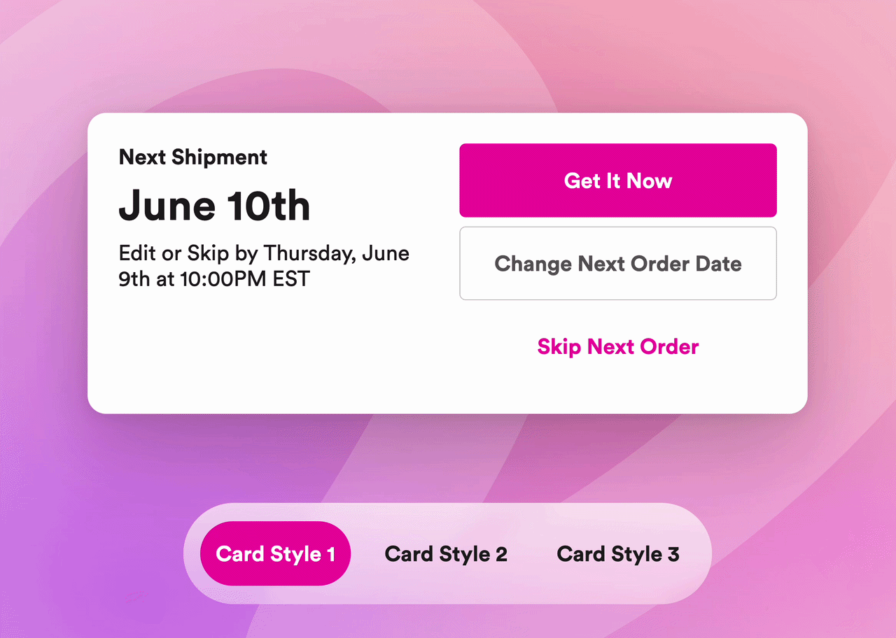
What makes the difference: card styles
A big part of what drove those results is something we built into the new Customer Portal specifically: card styles.
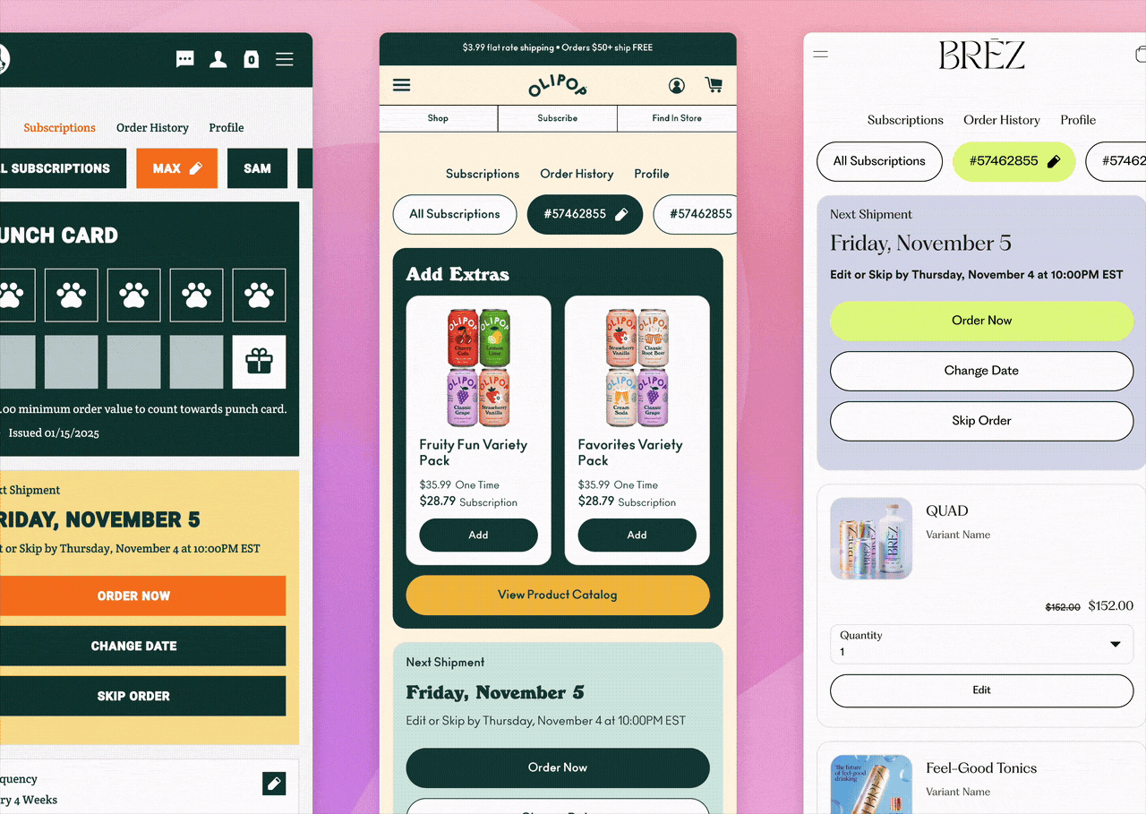
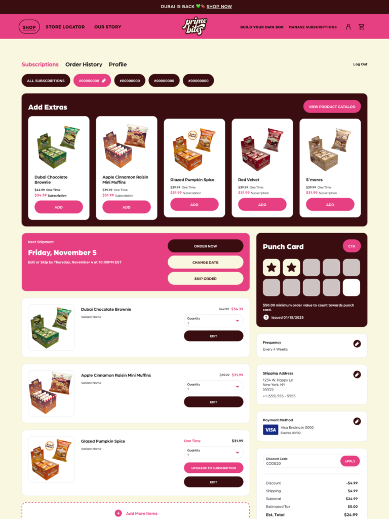
Card styles let merchants control the look and feel of every component in their portal — subscription cards, product displays, action buttons — with the same visual language as the rest of their brand. Custom fonts. Brand color palettes. Corner radius, border weight, background treatment. The kind of details that make a portal feel like it was built for your brand, not just deployed on it.
Most subscription portals default to a generic, platform-branded UI. Subscribers can tell. Even when they can’t name it, they feel the disconnect between the brand experience that acquired them and the management page they’re stuck with. Card styles close that gap. They’re the mechanism by which your brand identity carries through every interaction, every month, for the life of that subscription.
The moment that matters most
Here’s what that means for retention specifically.
Your portal isn’t just another brand touchpoint. It’s where subscribers decide whether to stay. The most consequential session in that decision is the one where they’re already on the fence.
Most portal sessions start with some kind of friction. A charge that prompted a question. An order they want to push back. A moment of “do I still need this?” If what they see when they log in doesn’t look or feel like the brand that earned their first order, generic fonts, platform colors, a UI that signals “this is where subscriptions get managed” rather than “this is still us,” that disconnection doesn’t announce itself. It just quietly chips away at the trust that was keeping them subscribed in the first place.
Every off-brand portal session creates small erosions. Most don’t end in a cancel. But the ones that happen at the cancel moment do.
Stay’s innovative feature, card styles, is what keeps that from happening. Not just for brand consistency, but at the exact moment it matters most.
Card styles are the visual building blocks of your portal. They control the look and feel of every component a subscriber sees, subscription cards, product displays, action buttons, using your brand’s own fonts, colors, and design details. Not the platform’s defaults. Yours.
Why this actually moves the needle
Your portal is your most-visited post-purchase page. It’s where subscribers decide whether to stay, skip, swap, or cancel.
A portal that looks and feels like your brand does retention work on every login, reinforcing the trust that keeps subscribers beyond the first order and making it harder for doubt to find a foothold before it reaches the cancel button.
A generic portal quietly signals: we worked hard to get you. Not to keep you.
Brand consistency in the portal isn’t about aesthetics for aesthetics’ sake. It’s about making sure every subscriber who logs in gets a reason to stay, not a reason to question whether the brand they subscribed to is still the brand showing up for them.
Stay AI’s Customer Portal was built to make that easy. No CSS required. No dev tickets. Just a portal that actually looks like you.
Ready to see it live? Book a demo today →
Already on Stay? Your CSM can walk you through what’s available in our Customer Portal today.