For brands that live and die by customer loyalty, subscriptions hold a key to unlocking a stream of recurring revenue. But the million-dollar question — quite literally! — is: “How can I transform a casual shopper into a subscriber?”
Cue the buy box on your product pages — that’s where you can expose customers to your subscription program’s value at a glance, encouraging them to opt for recurring orders over a one-time purchase. At Stay AI, we’ve got years of experience optimizing ecommerce sites for maximizing conversions, seamlessly funneling shoppers through to checkout.
So, let’s look at some of our team’s best practices for crafting high-converting buy boxes, check out some of the best examples from Stay AI merchant brands, and dig in to the design, functionality, and offer messaging that turns a browser into a loyal brand advocate.
Best Practices for a Stunning, High-Converting Subscription Buy Box
Before we explore specific examples of top-performing subscription buy boxes from ecommerce brands, let’s tackle a quick rundown of proven buy box best practices.
1. Default to the subscribe-and-save option.
The default option a new customer experiences on their first visit to your PDP has a strong influence on the buyer’s decision-making. To state it simply, shoppers tend to prefer the default option because it requires less cognitive effort. Even though you’re the seller that’s making the recommendation, customers love being guided towards the “best deal”, what’s “recommended”, or what’s “most popular”. Defaulting to a subscription purchase, when paired with highlighted subscription benefits, like a discount, makes customers consider why they wouldn’t act on snagging a better deal.
2. Incentivize subscription purchases with side-by-side comparison pricing.
Be sure to highlight the savings a customer will receive with ordering their product as a subscription, rather than a one-time purchase. Typically, we see that the highest-converting buy boxes feature some sort of pricing strike-through to reinforce the discounted pricing of the subscription offering. We also recommend A/B testing information on your PDP and subscription landing page to determine if your customers are more likely to convert when offered a % off discount, a $ off discount, or just comparative pricing. No matter how you slice it, highlighting the savings a customer will recieve with a subscription order is a critical way to emphasize the long-term value and cost effectiveness of a subscription purchase.
3. Highlight the most popular delivery cadence.
Similarly to point #1, customers respond well to recommendations and direction, as it enables them to feel confident in their purchasing decisions. This is especially effective for first time buyers, who may not have an idea of their future product usage yet. Guide customers to the frequency option that you’ve seen result in the highest retention rate from other subscribers, and you’re no only more likely to make the sale – you’re more likely to keep that customer subscribed for the long haul.
4. Showcase your subscription program’s unique benefits.
Beyond your subscribe-and-save discount, make use of the real estate on your buy box to call out the exclusive benefits subscribers receive, such as early access to new products, lifetime free shipping, or surprise free loyalty gifts. This further woos new customers by emphasizing that in addition to a sweet discount, they get other perks too! If you’re looking to freshen up your program’s perks, check out this article with 15 unique ideas for subscription program benefits.
PS: If you’re working on optimizing your subscription website, check out this article highlighting the best practices for creating subscription PDPs, straight from the experts!
9 Top-Notch Buy Box Examples from Leading Subscription Brands
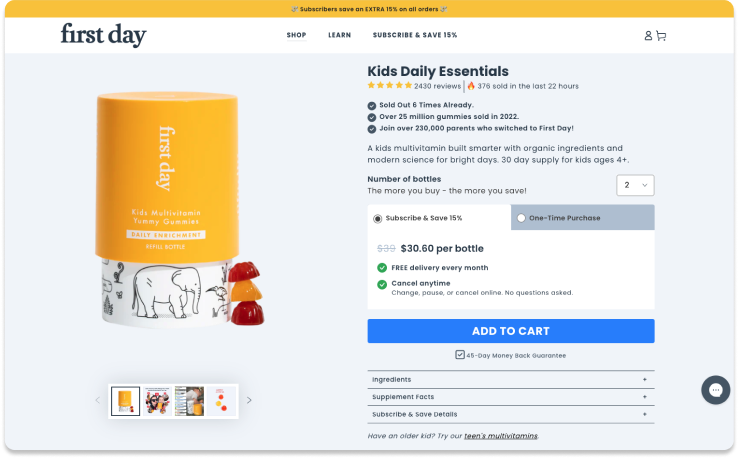
First Day’s unique design nudges shoppers toward savings
Multivitamin brand First Day has truly raised the bar with their buy box design. With its sleek, tab-based layout that defaults to subscribe-and-save, it gently nudges shoppers toward the subscription option by highlighting cost and other benefits. Eye-catching? Check. User-friendly? Check. It’s built to make understanding the perks of subscription as easy as popping your daily vitamin.
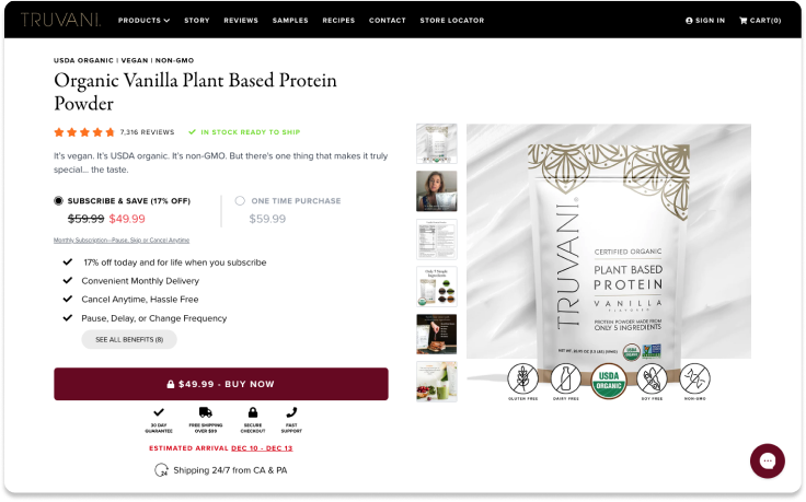
Truvani takes an elevated approach to on-site subscriber acquisition
Personal care brand Truvani takes an unconventional approach to PDPs by crafting them like conversion-optimized landing pages. With intuitive radio buttons, it’s easy for customers to toggle between subscribe-and-save (the star of the show) and OTP so they can find the right option for them. The cherry on top is the “See all benefits” button, which puts customers right in the midst of subscription value messaging. All in all, it’s a stellar example of user-centric, subscription-forward design.
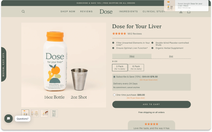
Dose maximizes impact with a minimalist design and program precision
A brand renowned for its minimalist yet compelling approach, Dose extends that ethos to its buy box design while highlighting subscription savings and customer flexibility. When it comes to delivery cadence, Dose is precise, with a schedule optimized based on customer usage data. In short, Dose is a poster child for how clean design, crystal-clear messaging, and a customer-first approach can woo subscribers and make them fall head over heels.
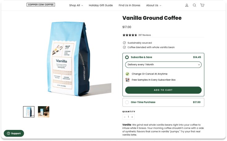
Copper Cow Coffee brings shoppers an intuitive, optimized experience
Copper Cow Coffee serves up a subscription brew experience as smooth as their coffee. Front and center in their buy box, the Sub & Save option takes the spotlight, making it the first thing customers see. And if customers want to pick up the delivery beat? Easy-peasy with their convenient drop-down menu. Finally, they emphasize subscription value props, sweetening the deal with things like free samples to entice shoppers to commit.
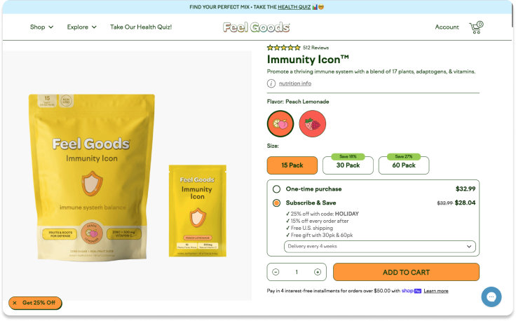
Feel Goods incentivizes subscription with more savings and more flexibility
Supplement brand Feel Goods’ buy box really shines with an ascending savings structure — the more you grab, the more you save — to highlight the cost benefits of larger quantities. Shipment flexibility is built right into the drop-down menu, allowing customers to set their own subscription rhythm. Plus, we love how the brand weaves in subscription value props, with a free first-order gift offer limited to higher quantity subscription orders.
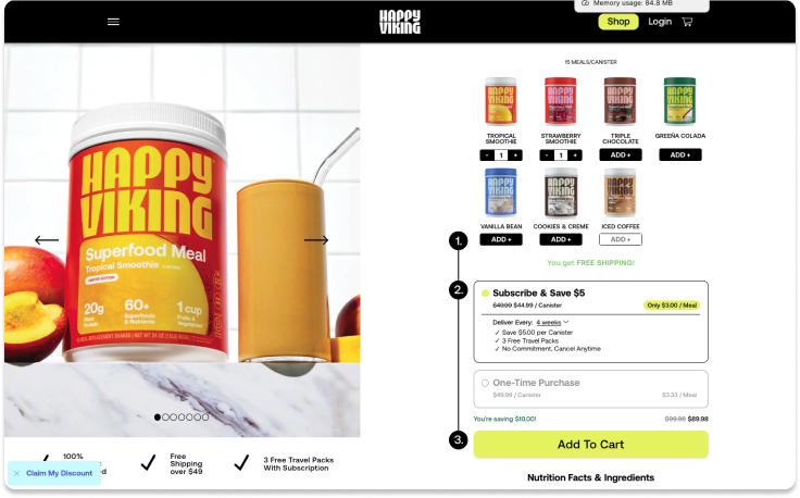
Happy Viking delivers a buy box that makes shopping more fun
Happy Viking’s protein powder buy boxes are one touchpoint in a subscription experience that’s as rich and rewarding as their flavors. They drop shoppers right into a bundle builder, inviting them to mix, match, and subscribe in one fell swoop. Plus, this gamified page makes it even more tempting for customers to stock up as they see their order getting closer to the free shipping threshold. And when it comes to price? It’s even easier for shoppers to understand how much a subscription will save them, with “per meal” cost comparisons.
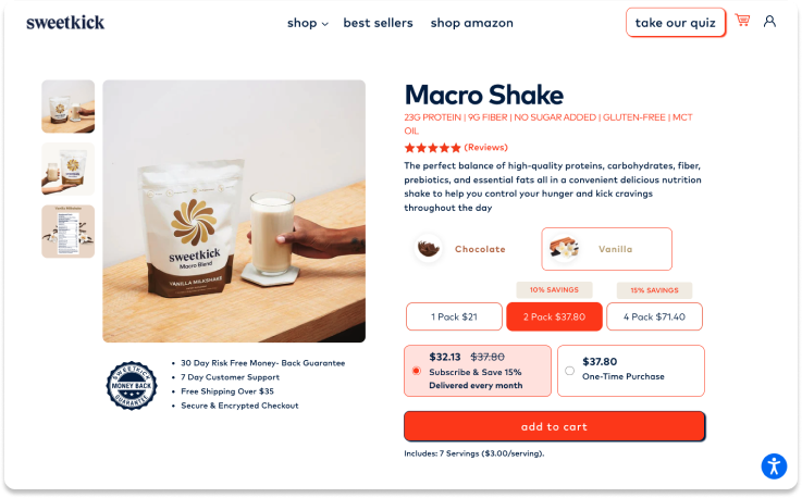
Sweetkick speaks their shoppers’ language with health & value messaging
Sweetkick really gets their sugar-conscious crowd. Their buy box speaks directly to the health-savvy, spotlighting the must-knows like protein and fiber right upfront. It’s not just design, it’s their mission in action, ensuring customers seeking healthier alternatives are well informed from the start. Bulk buying gets a sweet twist here, with ascending savings so the more they buy, the more they save. And the brand smartly reinforces their subscription value props right underneath the product photos, so customers are consistently reminded why they should subscribe.
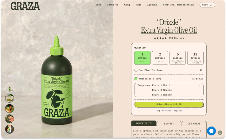
Graza’s buy box encourages bulk buying for extra savings
Graza, A.K.A. DTC’s favorite olive oil brand, is serving a buy box that’s as smart as their internet-loved squeezable bottles. With a subtle nudge toward quantity, the brand’s arranged their quantity options to make bulk buys look extra tempting — marrying free shipping with sweet savings. And for customers, selecting their desired delivery cadence is a breeze. The drop-down delivery frequency menu puts options right at their fingertips so they can tailor their delivery schedule to their unique needs.
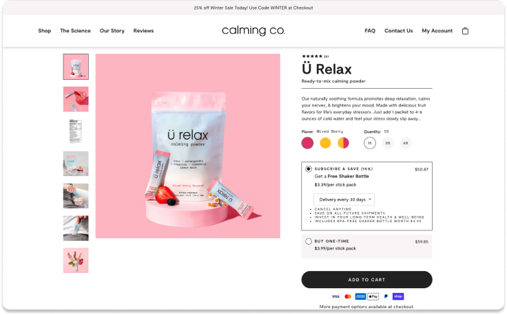
Calming Co makes subscription a sweeter deal with a free first-order gift
Wellness brand Calming Co. has a buy box designed to spotlight subscription savings. Instead of sticking to price strike-outs for overall orders, they include a “per stick pack” breakdown for a clearer way to compare across options. Front and center, they flaunt the perks, like the freedom to “cancel anytime” and “invest in your long-term health & well-being.” Finally, a gift on first-time subscription orders incentivizes the leap to subscription while adding overall value.
If subscription is a driving factor in building relationships with your customers, the importance of a well-crafted buy box cannot be overstated.
Stay AI’s subscribe-and-save buy boxes are the VIPs of the ecommerce world. They’re not just boxes — they’re canvases for creative functionality, blending standout designs, slick experiences, and the kind of offer messaging that makes subscribers click ‘yes’ in a heartbeat.

