A Conversation with Karin Brashears, Director of Product
Most subscription platforms will tell you they rebuilt their customer portal. What they usually mean is they reorganized what was already there.
We sat down with Karin Brashears, Director of Product at Stay AI, to talk about the thinking behind the new Customer Portal — why the architecture looks the way it does, how the team designed for real subscriber behavior, and what it means for merchants who are tired of rebuilding every time the platform ships something new.
You’ve been working on this portal for a long time. Before we get into what it does, can you talk about the philosophy behind how it was built?
The core belief is that a portal should be a retention asset, not a management page. That sounds simple, but honestly it’s a pretty different starting point than most platforms take. If you start from “let’s give subscribers a place to handle their account,” you end up with something functional. If you start from “every portal visit is a decision point,” you end up building something completely different. Way more exciting, honestly.
That framing drove almost every decision we made. Who is this subscriber? What do we know about them? What’s the right thing to surface right now? The portal needs to be able to answer those questions differently for different subscribers, and it needs to do that without requiring a developer every time a merchant wants to change something.
When you say the portal is modular, what does that actually mean for a merchant who’s used to working within a fixed structure?
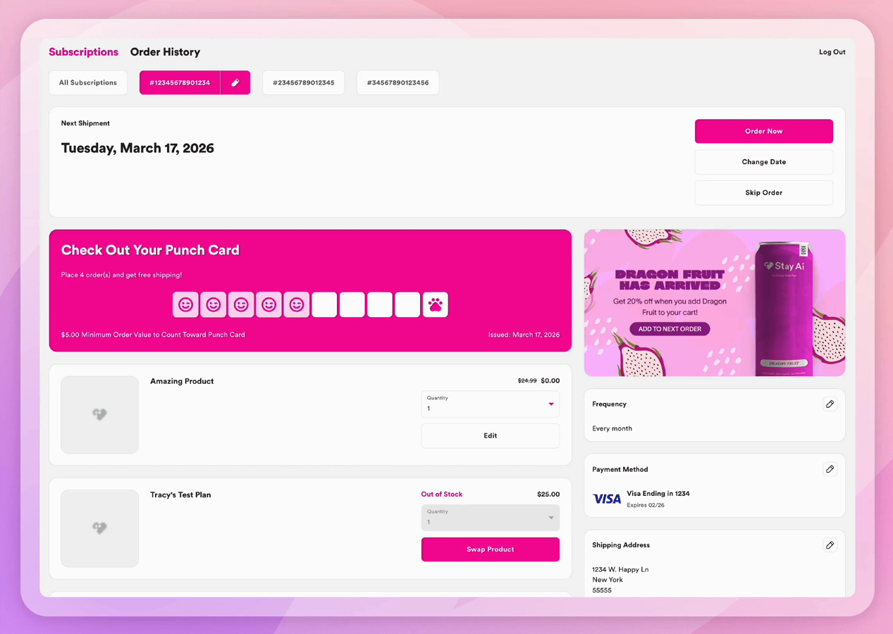
Okay, so most subscription portals organize everything in a single column. You can reorder what’s inside it, but you can’t move anything out of it. Full-width elements, sidebar placements, zones that behave differently from everything else. That’s always meant CSS or a dev ticket. You’re rearranging furniture in a room you didn’t get to design.
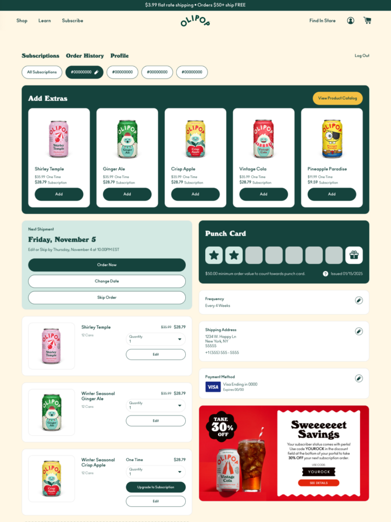
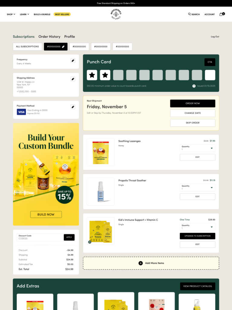
We built around eight independent zones instead. Each one adapts to what’s placed in it, so a component in a full-width zone behaves differently than the same component in a narrow sidebar. The structure responds to the layout decision. Not the other way around.
That’s what we mean by beyond the column. It’s not about having more components to choose from. It’s that where you put them finally means something.
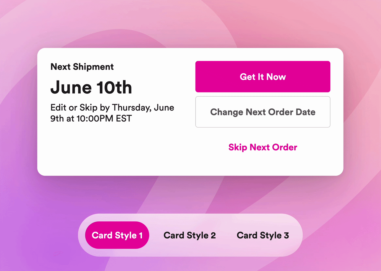
Tell us about card styles. It keeps coming up as something that matters a lot.
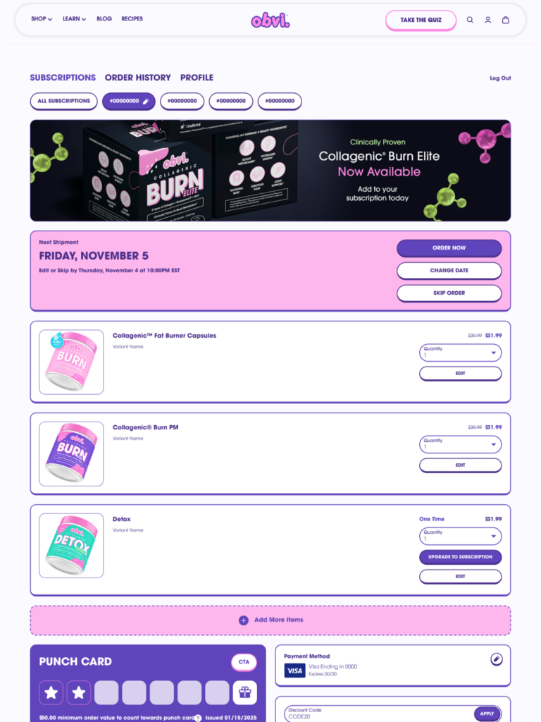
It matters because it solves a problem that has always required custom code, and I get genuinely excited about this one because it’s such a clean fix. Visual hierarchy in a portal, actually directing a subscriber toward the most important action, has always meant CSS. If you want your loyalty card to stand out from your subscription management card, that’s been a dev ticket. If you want your payment update to carry more visual weight, same thing.
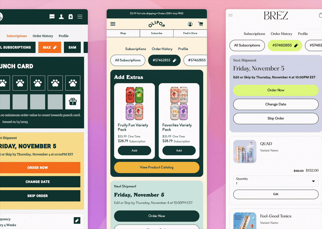
Card styles make it a click. Background color, text color, border treatment, applied per component, no CSS required. And it extends to typography too. Upload a proprietary typeface or pull from Google Fonts and apply it across every text element in the portal — headers, body copy, buttons, labels — without touching a line of code.
Brands that have invested in a distinct visual identity have always had to choose between their portal looking like their brand or not spending engineering hours on it. Card styles remove that choice entirely. That’s the kind of thing that makes me really proud of this build.
Let’s talk about mobile. Eighty to ninety percent of portal traffic is mobile. How did that shape the design decisions?
Fundamentally! The old approach in this space was to design for desktop and make it responsive for mobile. We completely flipped that. Every zone, every component, every action flow — swap, skip, gift, delay — was designed for mobile first and then extended to larger screens.
What that means in practice: when a subscriber gets a renewal reminder on their phone and opens the portal mid-scroll, every action they might want to take renders full-screen. Not a modal that’s been adjusted to be mobile-friendly. Full-screen, because that’s what the experience actually requires on a phone.
That moment, subscriber on their phone, thinking about their next order, is a retention moment. A portal that works there means that decision ends with a swap or an add instead of a cancel because the experience was too hard to navigate. That’s not an edge case. That’s the majority of portal traffic. We have to design for it.
You’ve talked about how the portal is designed to be consistent across every action a subscriber takes. Why does that matter?
Because confusion causes cancels, and that is such a preventable problem! When a subscriber knows how to do one thing in the portal, they should already know how to do everything else. Same screen structure, same confirmation step, same visual treatment whether they’re swapping a product, skipping an order, or gifting a delivery.
That consistency builds comfort over time. And comfort means fewer support tickets, fewer abandons mid-flow, and more subscribers who can actually manage their subscription without needing to contact the brand. Self-service only works if the experience is predictable enough that subscribers actually trust themselves to use it.
Last question: “never migrate again.” What does that actually mean and why should merchants believe it?
This one I love talking about because the problem it solves is so real. When platforms ship a major portal update, merchants typically have to migrate to access it. And whatever they built in CSS, the visual customizations, the brand treatments, the configurations they’ve accumulated over months, often doesn’t survive that migration. So merchants either stay on an older version and fall behind, or they start over and lose the work. Neither option is good!
We designed V3 so that’s not the decision anymore. New capabilities, new widgets, loyalty integrations, additional features, all slot into the same drag-and-drop structure. The work you do today carries forward. And because we’re building through a component library rather than shipping new versions that require rebuilds, merchants flow with the platform instead of chasing it.
The goal was to make this the last portal architecture decision a merchant has to make. So far, that’s exactly what it is.
Ready to see it live? Book a demo today →
Already on Stay? Your CSM can walk you through what’s available in V3 today.