Your customer portal should feel like your brand. Most don’t.
Your Shopify storefront took months. The typography, the color palette, the grid — every decision deliberate. Then a subscriber clicks into their account and lands somewhere that almost looks like it belongs to a different brand entirely.
That gap isn’t a design failure. It’s an architecture failure. Most subscription platforms’ customer portals weren’t built to be yours. They were built to be functional, then skinned to look roughly on-brand. The structure underneath doesn’t change — which means the experience your subscribers live in doesn’t either.
The Stay AI Customer Portal starts from a different premise. Not a template you inherit, but a canvas you design. The result: a subscriber experience that extends your brand rather than interrupting it.
You’re Not Moving Furniture. You’re Designing the Room.
Every other subscription portal offers drag-and-drop with a catch: you can reorder components within a column, but you can’t move them out of it. The structure is fixed. You’re rearranging furniture in a room you weren’t allowed to design.
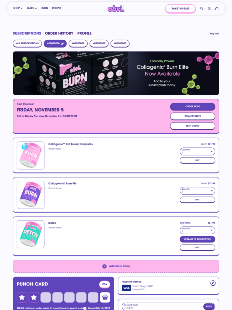
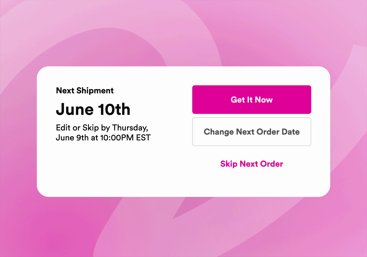
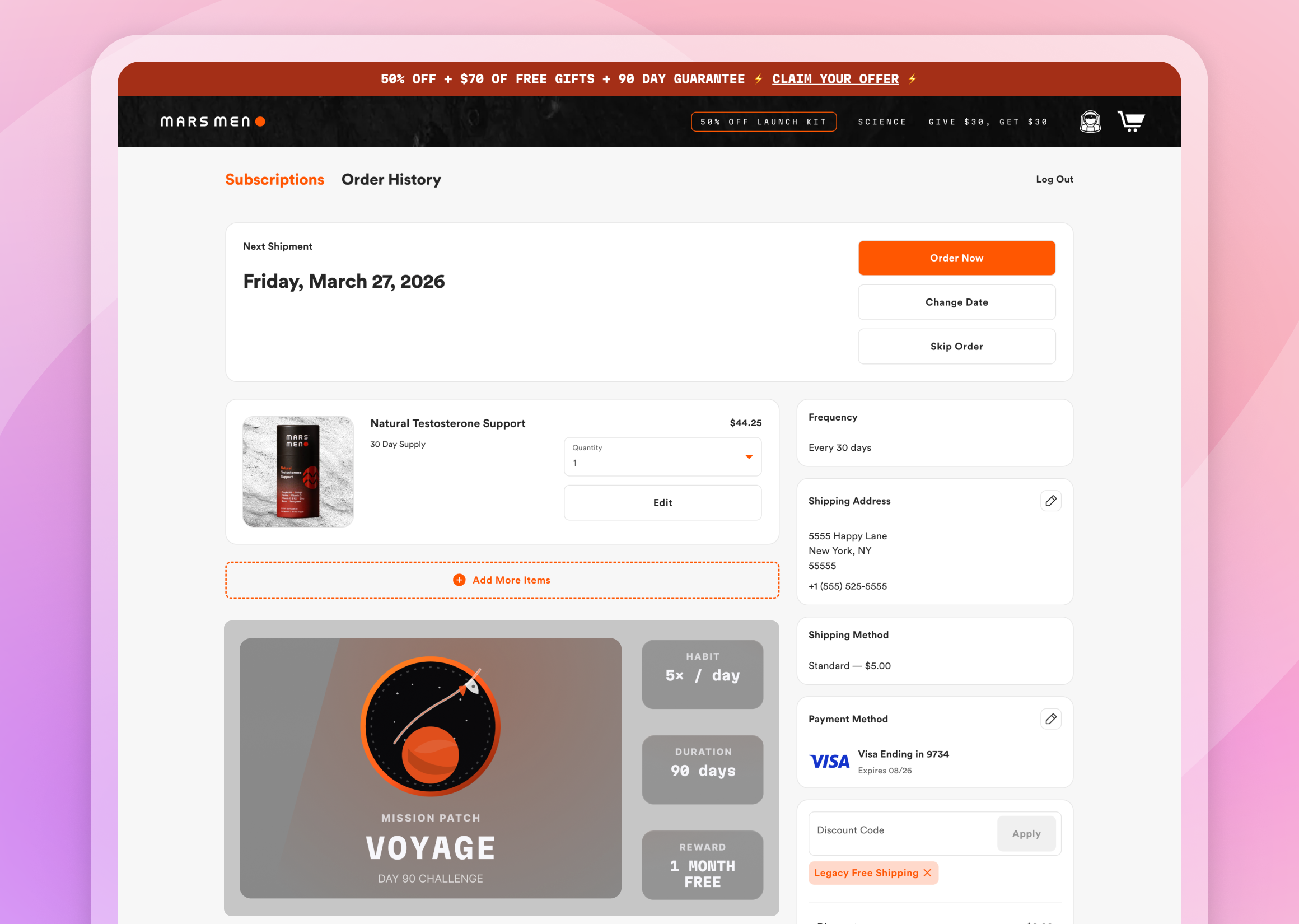
The Stay AI Customer Portal gives merchants 8 independent zones, each with variable width options (full-width, three-quarters, one-quarter), where components move freely. Your loyalty card at the top? Full-width. Banner in the sidebar? Drag it there. Product carousel at the bottom or front and center? Your call.
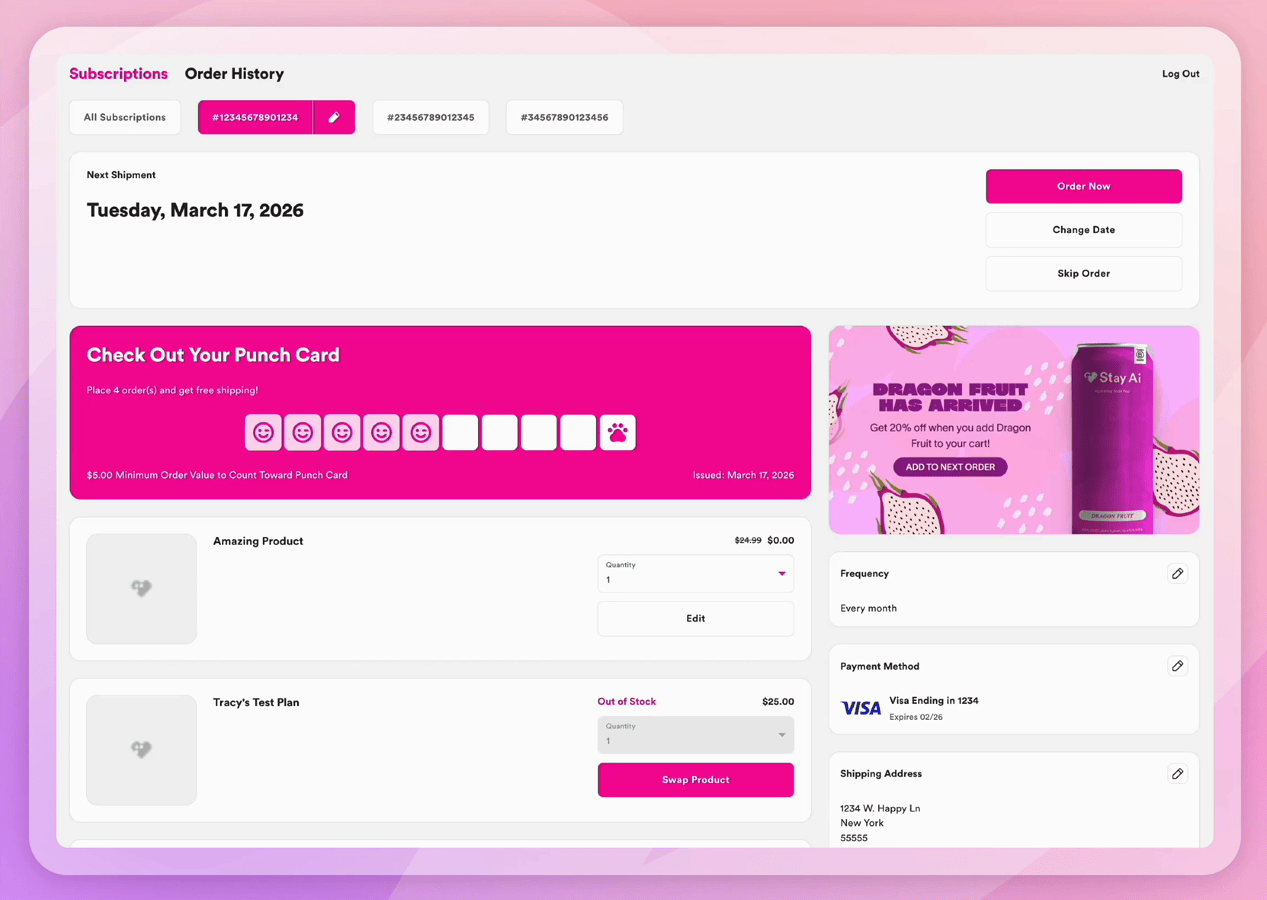
That cross-zone freedom is the architectural difference. On other platforms, the layout is the constraint you design around. On Stay, it’s the thing you control.
A brand that leads with its punch card is making a retention decision — loyalty front and center because that’s where the program’s value lives. A brand that’s visual-first makes a different call entirely. Both are right. Both are possible. Neither required a developer.
And as Stay keeps building, your Customer Portal keeps evolving. No rebuilds, no migrations, no starting over. You’ll never migrate your portal again.
Your Design System. Applied Once. Everywhere.
The Customer Portal gives merchants direct control over the visual decisions that make an experience feel like a brand.
Custom Fonts
If you’ve invested in a custom typeface — commissioned it, licensed it, built it into every touchpoint, then it belongs in your portal. Upload it directly and apply it across every text element: headers, body copy, buttons, labels. For brands where typography is part of the product identity, the portal that doesn’t match is a missed signal. Or pull from Google Fonts if you’re working without a proprietary typeface.
Card Styles
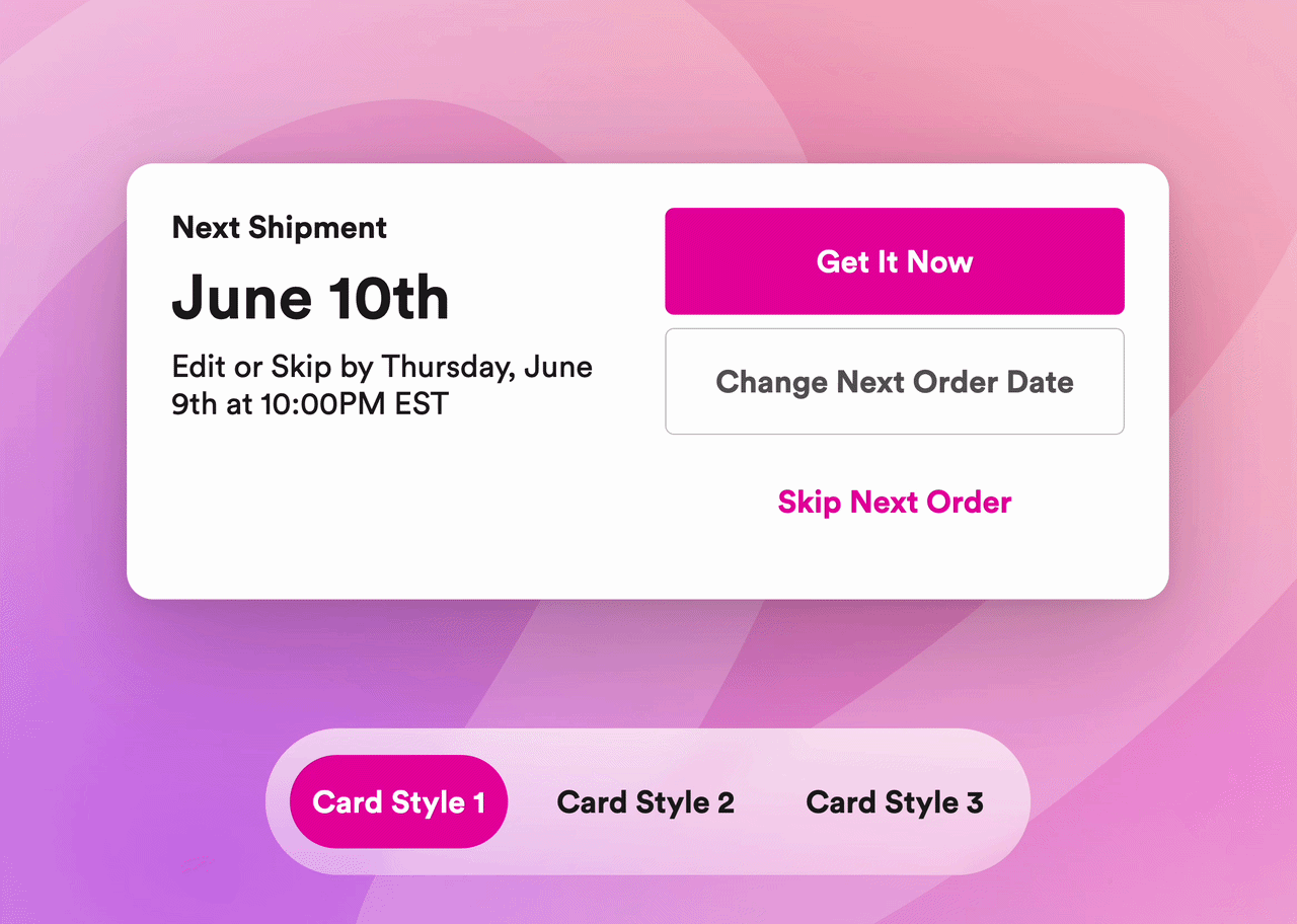
Set your visual treatment once: corner radius, background color, border weight. That style propagates across every card in the portal automatically. For brands with minimal or monochromatic palettes — deep blacks, clean whites, no strong accent color to anchor the design — this matters more than it sounds. Making a minimal brand look intentional required CSS workarounds but Stay’s Customer Portal solves this. Card styles fix it natively. Define the treatment once; the portal holds it everywhere.
Color Palettes & Borders
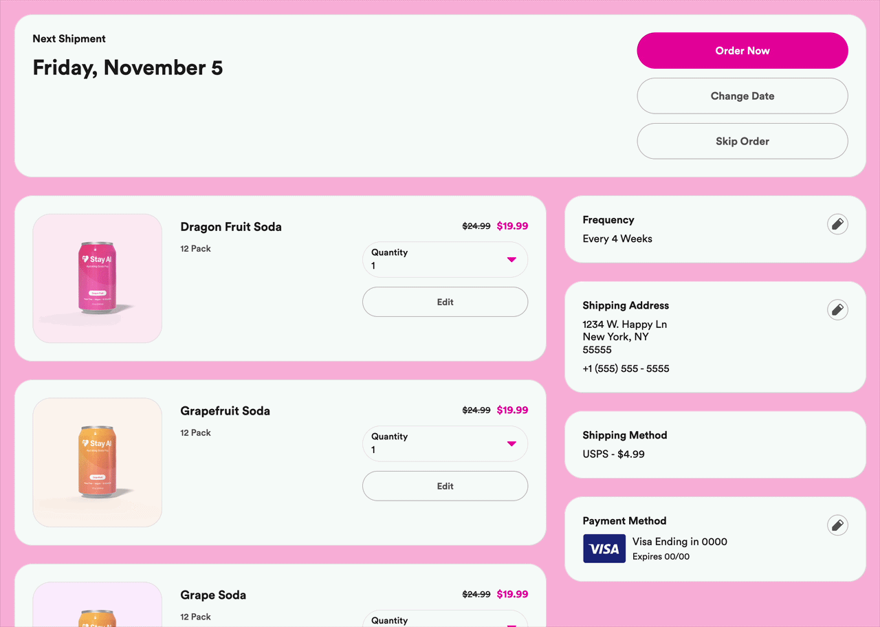
Background, card, button, link, borders, all are configurable independently. Adjust the border radius of your Customer Portal to match your unique brand style!
The result isn’t just a branded portal. It’s a portal that stays branded as you add and rearrange components over time.
Banner Placements That Work as Hard as Your Campaigns
The banner placement is prime subscriber attention. It should earn it.
Banners sit full-width at the top, tucked into a sidebar, or embedded in the main content area — wherever the placement makes sense for your layout. When a subscriber belongs to multiple customer groups, their matching banners display as a carousel. The same portal reads the room differently depending on who’s in it — all configured without code, all swappable whenever the campaign changes.
Product Launch Banners
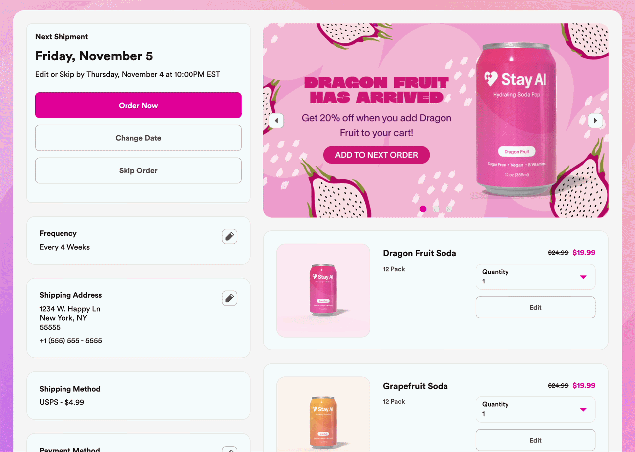
A new SKU. A seasonal flavor. A limited run. Your active subscribers are the best audience for what’s new — and this banner puts it in front of them at exactly the moment they’re already thinking about their order.
One-click add, no email required.
Educational Banners
The subscriber on their fourth order who hasn’t fully connected the product to a result is a quiet churn risk. An educational banner — ingredient benefits, usage timing, what to expect at week six — surfaces that answer where the question is most likely forming. Not a FAQ page. A retention moment.
Loyalty Banners
Progress toward a reward, surfaced where subscribers are already paying attention. Not in an email they’ll open three days later — in the portal, in the moment they’re managing their subscription. The milestone they didn’t know they were close to becomes the reason to stay.
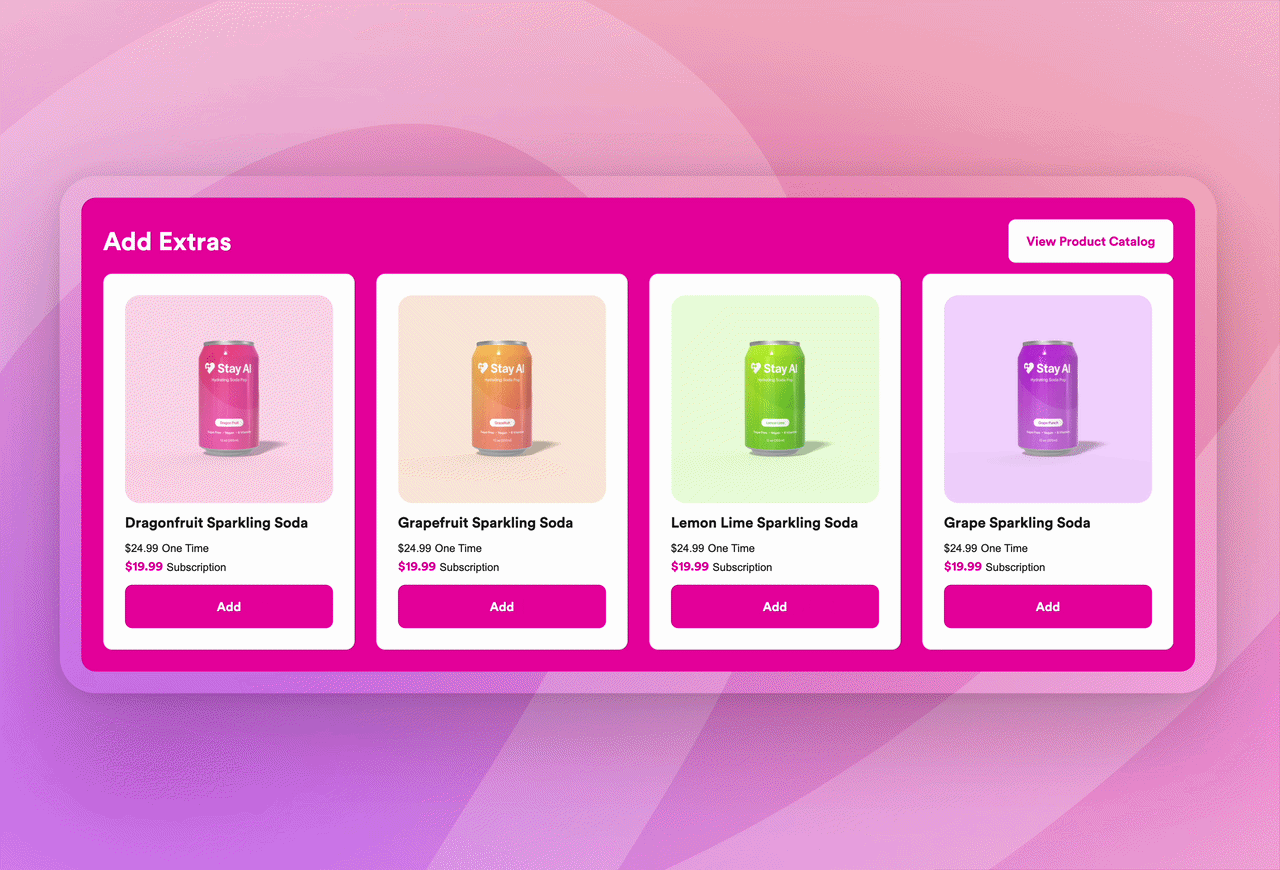
Every Portal Visit Is a Revenue Moment
The Add Extras product carousel appears natively inside the portal — no third-party widget, no separate app. It sits where you put it and shows one-time and subscription pricing side-by-side. What appears in that carousel is controlled by customer groups — so each subscriber sees what’s relevant to them, not necessarily everything in your catalog.
Treats alongside a staple subscription. A seasonal bundle. A new product that pairs with what they’re already ordering. Use this surface for seasonal upsells, bestseller promos, and new product introductions — and it lives in the portal without requiring a separate campaign to encourage subscribers to add something new.
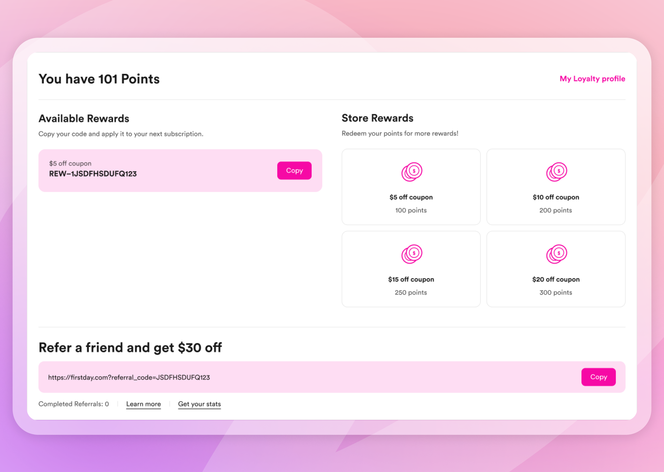
Loyalty That Actually Registers
Loyalty programs only work if subscribers know they’re earning.
Stay Digital Punch Cards are native to the portal — no third-party integration, no separate login. Subscribers see their punch card progress directly in their subscription view. Punch thresholds are spend-based, not just order-count-based, so brands can set meaningful minimum values per punch rather than rewarding every order regardless of size. Placed at the order count where skip risk is highest, the punch card turns a potential churn moment into a reason to stay.
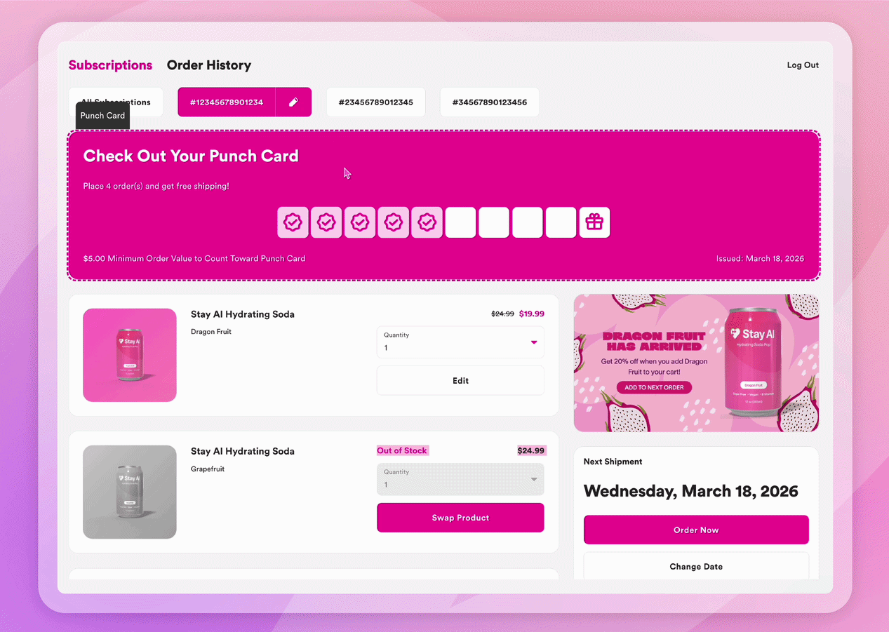
Rivo and Yotpo loyalty widgets are also available as drag-and-drop components in the Customer Portal — so brands already on those platforms can bring their full loyalty experience into the subscriber view: points, tiers, redemption, without asking subscribers to navigate away to access them.
Built for Where Subscribers Actually Are
80–90% of subscriber portal traffic happens on mobile. The Stay AI Customer Portal is built for that reality, not adjusted for it.
Every zone configuration, every component interaction, every layout decision is designed for mobile first, then extended to desktop, landscape, and tablet. Live preview renders across all four device formats before anything goes live.
A subscriber who gets a renewal reminder and opens the portal on their phone — thinking about what they have at home, what they want next month — is making a subscription decision in that moment. A portal that works in their pocket means that decision ends with a swap or an add, not a cancel. Payment updates happen directly in the portal. No redirects, no new windows, no friction that turns a quick check-in into a reason to leave.
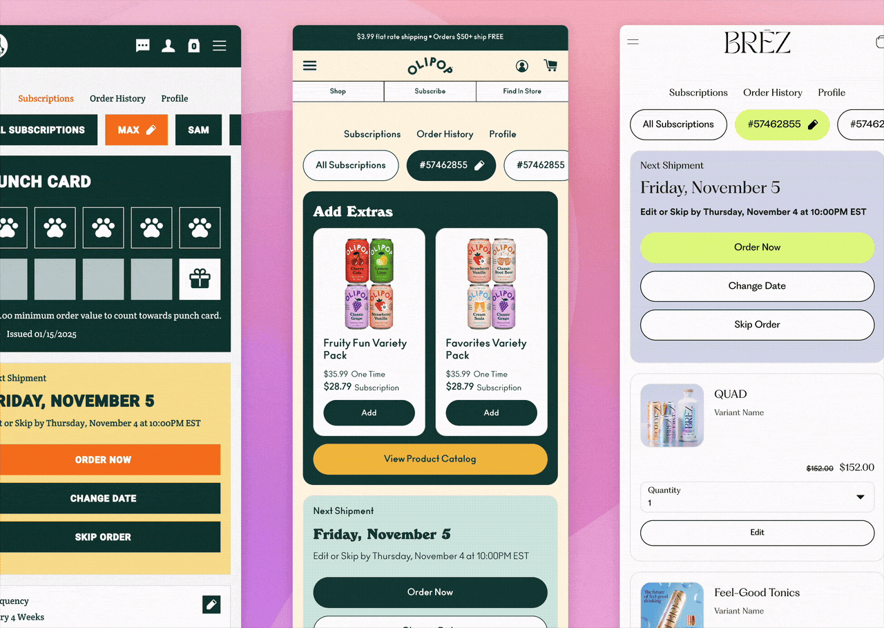
One Customer Portal. Different Brands. Infinite Possibilities.
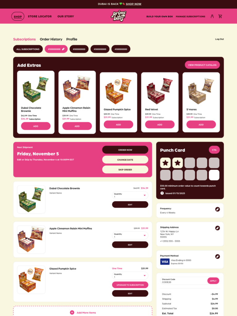
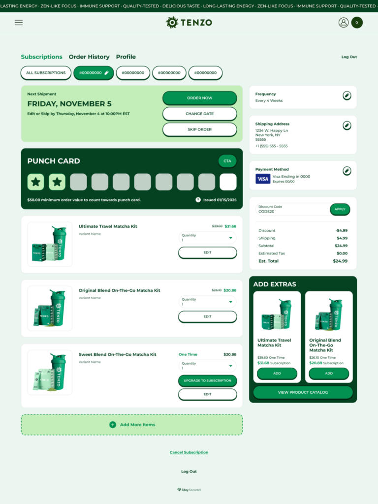
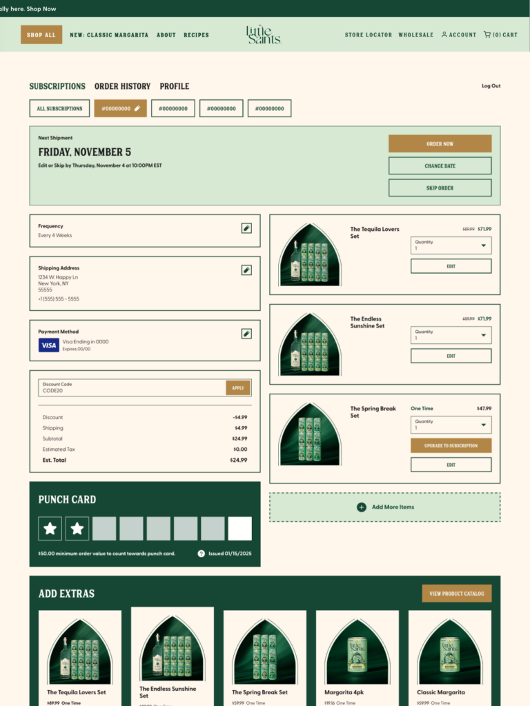
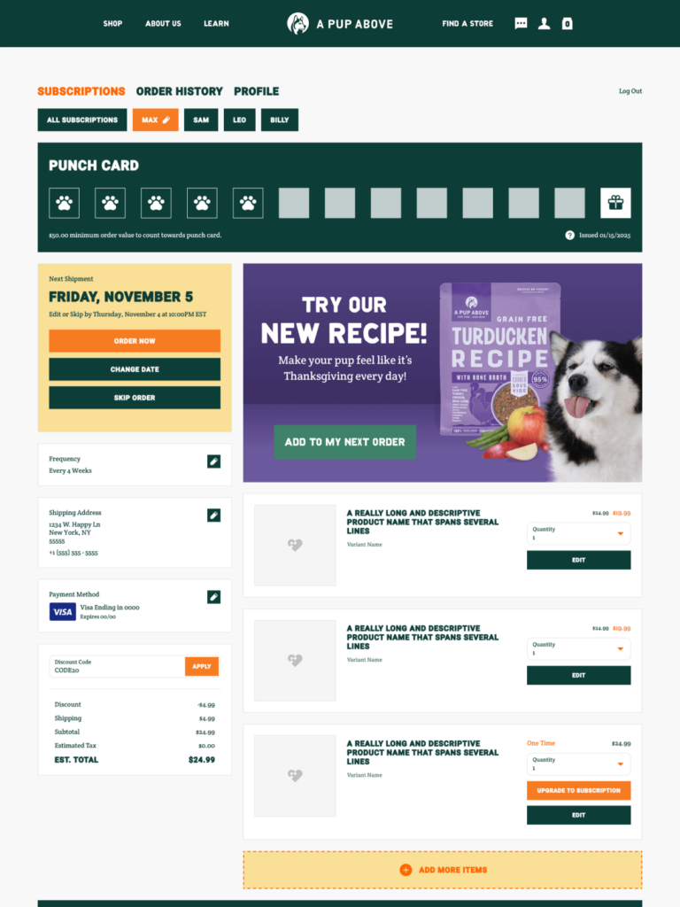
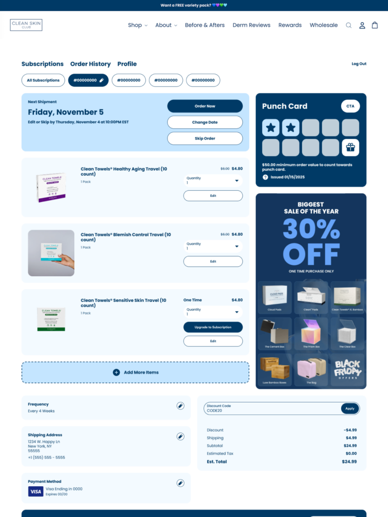
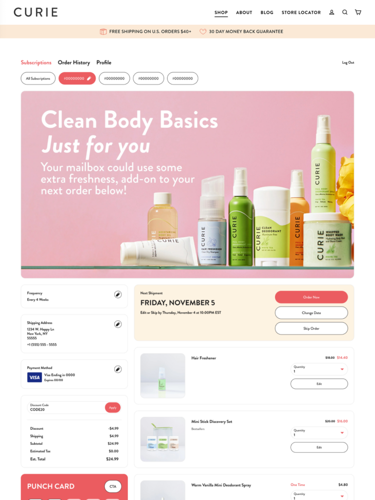
One portal uses a dark, high-contrast palette with square-cornered cards and bold display typography. Direct, no-frills, product-forward.
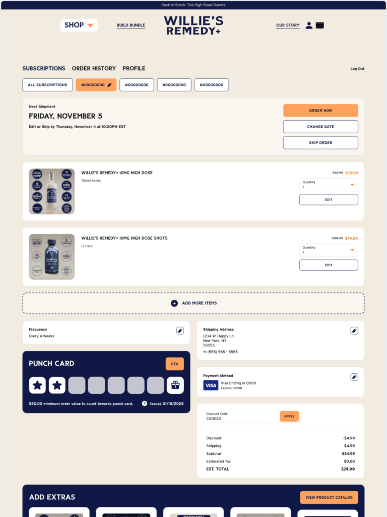
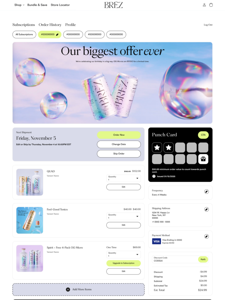
Another runs warm tones with fully rounded buttons, soft card borders, and a full-width product banner leading the experience. Visual-first, sensory — the product earns the subscription.
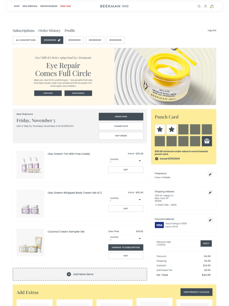
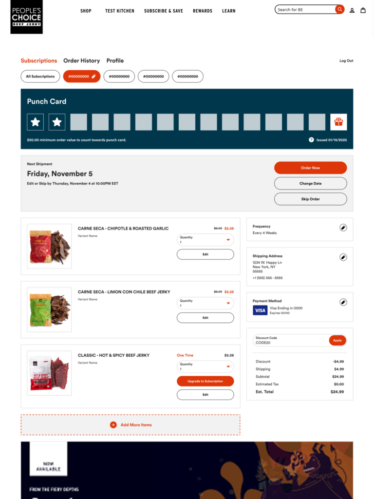
A third leads with the product carousel and a rotating banner, because this brand’s subscriber relationship is built on discovery, not just automatic replenishment. Every portal visit is a chance to deepen that.
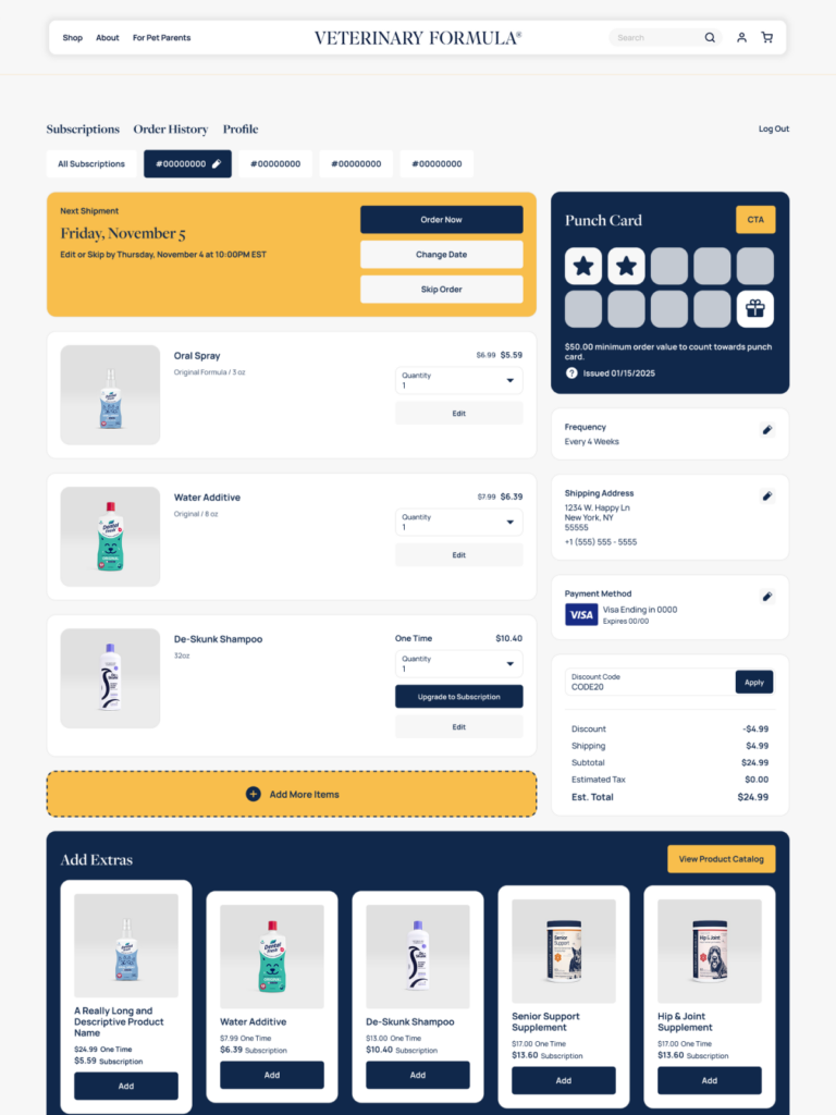
A fourth is deliberately minimal — clean hierarchy, stripped chrome, no visual noise — because the brand’s promise is simplicity, and the portal holds that all the way through.
Same zones. Same components. Same Customer Portal. Different priorities, different palettes, different configurations — because they’re built for different brands with different subscriber relationships.
That’s the point.