Key takeaways:
- Make subscription the default choice in your buy box and show price savings side-by-side to leverage anchoring bias and loss aversion psychology.
- Provide targeted product education about benefits and usage while backing up all claims with diverse social proof like reviews, videos, and endorsements.
- Display serving sizes, pricing details, and FAQ sections to answer customer questions upfront and minimize friction in the purchase process.
Every optimized landing page on your website (or attached to your ads) should have three components:
- Product education
- Social proof
- Commerce optimization
On a Product Detail Page (PDP), basic commerce optimization is a given. But a lot of brands are still missing out on some of the more strategic optimization opportunities.
This doesn’t just translate to lower sales, but also to acquisition of customers that aren’t the right fit for long-term retention.
Let’s avoid that, shall we, and instead dive into some of the best ways to optimize your PDPs.
1. Default to the subscription option in your buy box
It’s such a simple thing, but default options have a strong influence on a customer’s decision-making because of a thing called the anchoring effect.
The anchoring effect is a cognitive bias where people rely heavily on the first piece of information they receive when making decisions.
When customers see the subscription offer as the starting point, they are more likely to perceive it as the standard or baseline.
Because the default option requires less cognitive effort, people tend to ride with that option.
When this default is prominently highlighted, it draws their attention away from the alternative and adds more force behind the choice, while still leaving it as a choice.
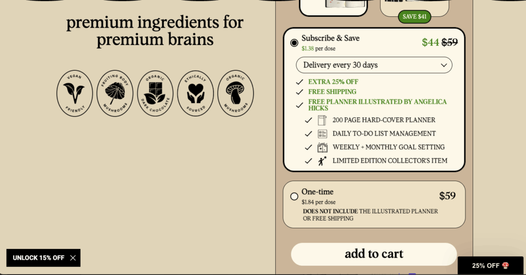
Example of the subscription option in a buy box, from Alice Mushrooms
Alice Mushrooms does this amazingly well by combining the default to subscription with a truly appealing subscription offer.
2. Show the price incentive side-by-side
Everyone loves a good deal. So, when you highlight the higher price of a one-time purchase with the discount they get from subscribing, you’re playing on that good feeling people get when they find one.
Loss aversion is another reason this works.
When customers see the savings associated with subscribing, they may perceive it as an opportunity to avoid losing out on cost-effective deals in the long run. This sense of potential loss can be a powerful motivator.
To highlight the deal, show the original price crossed out next to the old price with a different color that stands out just a bit more than the one-time purchase option.
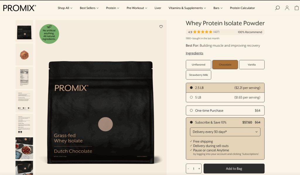
Price incentive example from Promix Nutrition
Promix Nutrition shows this tip in action, with a subscribe and save default displaying the subscribe price next to the one-time purchase price.
3. Default to the most popular delivery frequency on your product detail page
Presenting the preferred frequency — every two weeks? Every month? Quarterly?—guides customers toward the option that makes the most sense for the product, ultimately reducing cancellations for reasons like “too much product.”
By that, we mean frequency options should be set based on how your other customers buy, as well as the natural purchase latency of the product.
If you’re offering a bottle of thirty gummies and you’re supposed to take one gummy a day, the product has a natural thirty-day purchase latency.
Of course, you don’t want to default to the purchase latency and provide no other options. Giving your customers delivery frequency flexibility is a subscription best practice, not just a PDP best practice.
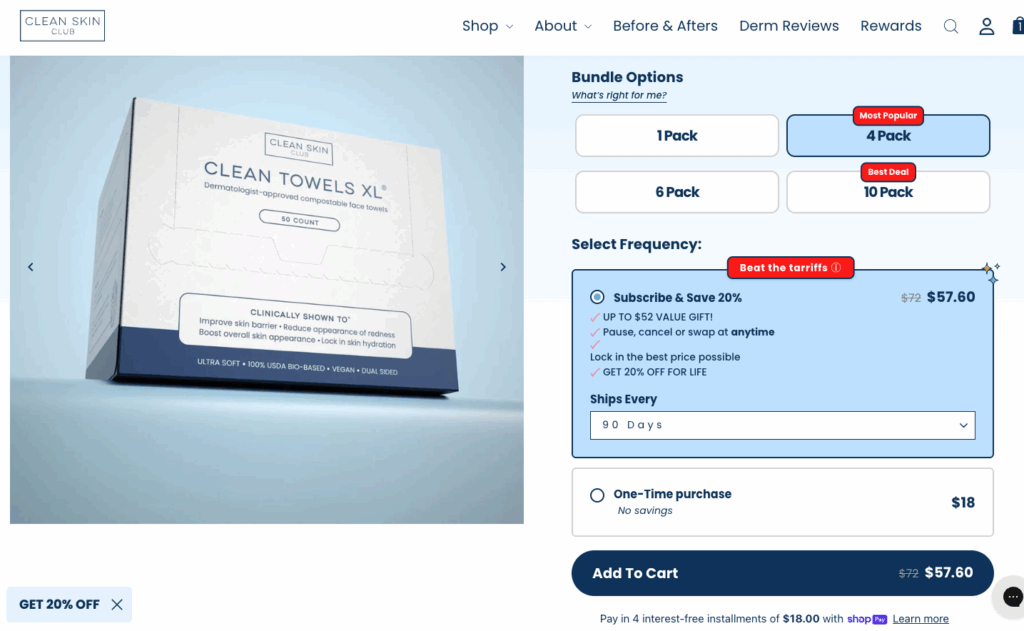
Delivery frequency example from Clean Skin Club
Clean Skin Club doesn’t just allow their customers to choose how many boxes they want to bundle in their order, but automatically sets a ninety-day delivery cadence.
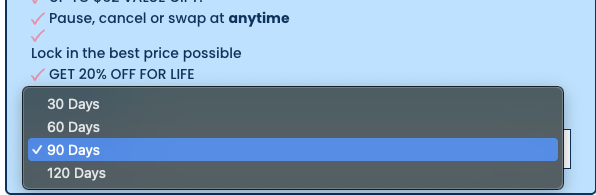
Click on the frequency, and customers can see all of their delivery frequency options.
4. Highlight your subscription value proposition
If you’ve put in all that work to create a truly exceptional subscriber experience, you want your customers to know about it. One of the best place to spread the word about all of the benefits they’d get from their subscription is your PDPs.
Not only will it elevate the perceived value of the products or services included in the subscription, but it will also tap into that discount-seeking nature, make the subscription appear like a more cost-effective option, and create a sense of exclusivity.
Benefits you should highlight include:
- Access to exclusive product releases
- Free shipping
- Special discounts
- Personalized recommendations
- Free gifts
- Free and easy cancellations
- Subscription flexibility (pause, skip, gift, delay)
Example of how to display subscription perks on a product detail page
Clevr Blends beautifully lists off the benefits of subscribing within their buy box, while showing little more than the price for a one-time purchase (making that option look rather bland).
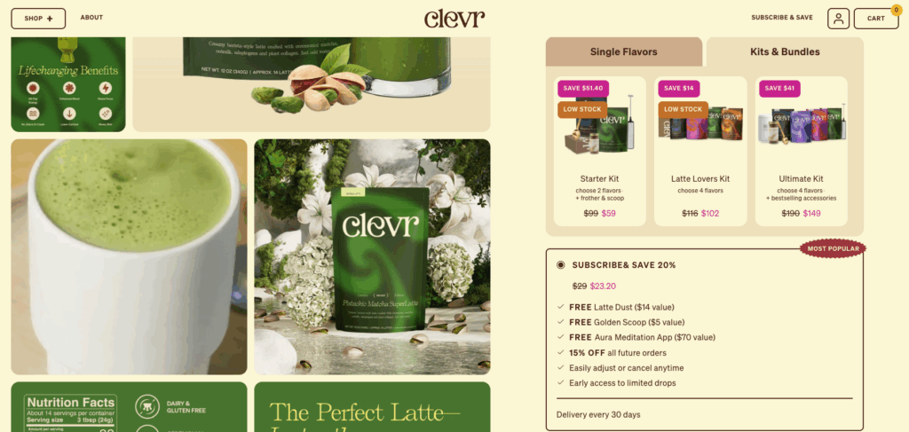
Adding the benefits is effective because you’re ensuring customers see the benefits, whether they read the rest of your landing page or not.
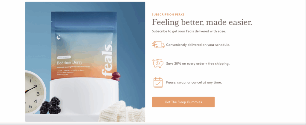
It also helps to tap into the concept of loss aversion. But a buy box isn’t the only place to display subscription perks. In fact, you’ll find that most PDPs display subscription perks below the fold, like the example below.
Subscription perks example from Feals
If you don’t have a comprehensive rewards or loyalty program and don’t offer many free gifts, but still want to show customers the value of your subscription program (discounts on every order, free shipping, subscription flexibility with pause, swap, and cancel options), showcasing those details below the fold on your PDP can do the trick.
5. Display usage and price per person or per serving
Imagine the disappointment a customer feels when they order something for their entire family to use, and they realize it’s not enough. Now they have to order more, wait for it to arrive, or potentially find an alternative solution. Not great for you, either way.
Having this information on the page also helps to add perceived value to your subscription. If you offer a discount for subscriptions, the price per serving is lower.
They’ll still have the same number of servings, but they’ll perceive the subscription value as higher than that of a one-time purchase.
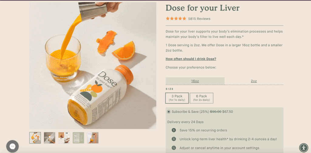
Example of a dosage display on a product detail page
Notice that Dose doesn’t have to get into too much detail to inform their customers of their serving sizes and recommended dosages.
First, you can see in the product description that “1 Dose serving is 2oz.” Then you notice they offer 16 oz bottles in either a three-pack or six-pack, and 2 oz bottles in a 24-pack.
If you look closely, you’ll notice they’ve added “For 1x daily” and “For 2x daily” recommendations, further emphasizing their serving sizes to help customers calculate their actual needs.
6. Add just the right amount of product education on a PDP
Brand and product education doesn’t just tell customers how, why, and when to use your product, but backs up the price of your product, helps you find the right-fit buyer, aids retention, cuts churn, and so much more.
Let’s look at just one of those outcomes for a moment. If you’re a dog food brand, and notice on your cancellation surveys that customers are frequently canceling because they thought the price was too high compared to other dog foods.
Adding details about why it’s so vital to feed your dog those specific ingredients and how it impacts their health can help attract the kind of customers who want to give their dog those benefits, and set the expectation for customers.
Customers go into the purchase knowing what they’re getting and why they chose that option for their dog(s)—they want them to live longer, healthier lives, for example.
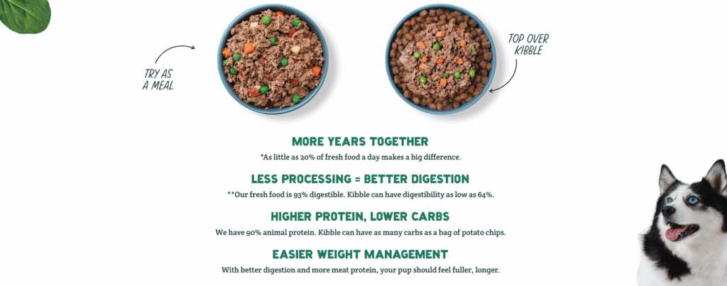
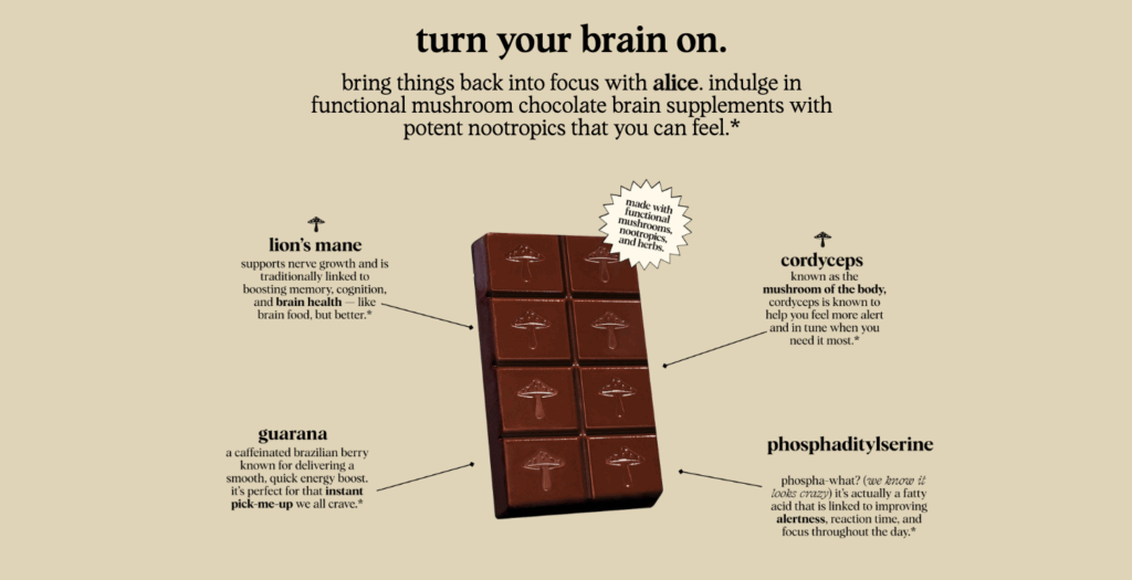
Several examples of product education on PDPs
There are numerous ways to provide product education to your audience, so we feel compelled to share several examples to demonstrate this.
A Pup Above uses product education to speak about outcomes for dogs that eat their wet food, while also giving examples of how to use their product (as a whole meal or over their kibble).
Alice Mushrooms provides extensive product education on their PDPs, but this section in particular addresses several questions simultaneously. Not only does it show off the ingredients that aid sleep, but also how it impacts and benefits the customer, how to take it, and what to expect from taking it.
First Day also does product education extremely well across their entire landing page, but let’s focus on these two sections:

In the first section, they’re speaking directly to outcomes and what users can expect to see in their child after a certain period of use.
This is an amazing detail, because it clearly sets the expectation for customers, while informing them of how long it’ll take to see results (encouraging a monthly subscription and habit forming).
The section below it only fuels their claim that you need to take their vitamins consistently—you need to battle Hidden Hunger, the culprit behind excessive fatigue, and that one-hour tantrum thrown every afternoon.
It’s a compelling selling proposition for parents, but it’s also an excellent demonstration of the value of product education on a PDP.
7. Answer frequently asked questions on the product detail page
Technically, an FAQ section fits within the territory of product education, with a few slight differences.
The questions in an FAQ section aren’t always about the product itself. They can be any commonly asked questions that help set your customer at ease and encourage the buy.
For instance, your brand might often get a question about your shipping or returns policy. Answering those questions in an FAQ section on the PDP means your audience doesn’t have to go searching for answers elsewhere on your site or in reviews and forums across the internet.
Remember, the fewer hoops a customer has to jump through to get to “order confirmed”, the better, and that includes getting answers to basic questions about their purchase.
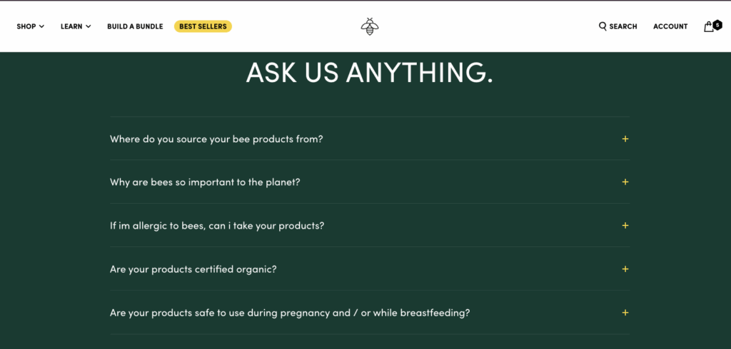
FAQ example on a PDP from Beekeeper’s Naturals
Beekeeper’s Naturals provides a simple yet clear example of how to utilize an FAQ section effectively on a PDP.
They answer questions about safe use during pregnancy, organic certifications, product origin, and allergies.
We love this because the answers will clearly aid in customer acquisition. It’d be hard to find answers to those questions outside of these FAQs, but making them so accessible removes barriers for customers.
8. Feature social proof in various forms
You can’t make claims on a landing page (or anywhere) without backing it up. Of course, no one is going to trust any proof of your claims that comes directly from you. If you want solid credibility, your proof has to be social and user-generated.
There are several ways to do this:
- User-generated reviews
- Videos from social media
- Before and after pictures throughout your landing page
- Publications you’ve been featured in
- Logos of any awards and certifications earned
- Endorsements from experts or celebrities
Most brands include at least a section for user-generated reviews at the bottom of the product detail page. Brands that really want to double down on social proof include at least one other section, typically just below any claims about the product.
Examples of social proof on a PDP
There are about a trillion and one ways to include social proof on your product detail page. You really, truly, can get as creative as you’d like.
A few of our brands demonstrate this point by showcasing reviews in random blurbs, adding user-generated videos, before-and-after pictures from customers, and celebrity endorsements.
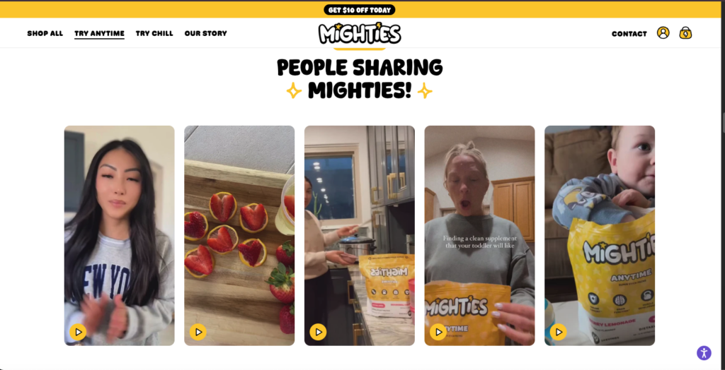
Video social proof is visually impactful
User-generated video reviews are a step up from written reviews, not just because they put a face to the words (hey, they’re really real), but because video reviews take a bit more effort to create.
Also, if they’re willing to post a video review on your social media or on your website, it says that they really like your product and they want to shout about it. It’s like being in love and feeling like everyone needs to know.
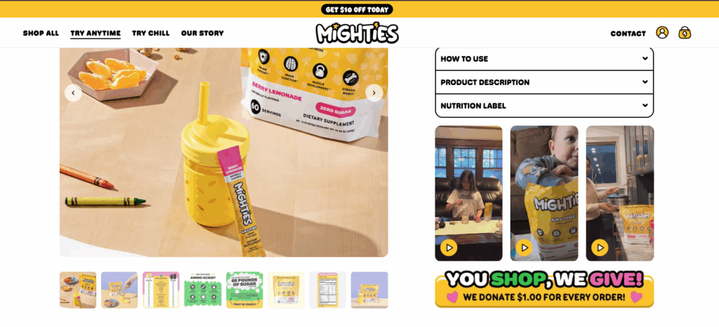
Mighties knows this, which is probably why they doubled down on this tactic by adding video reviews to both their buy box and a section further down on the PDP.
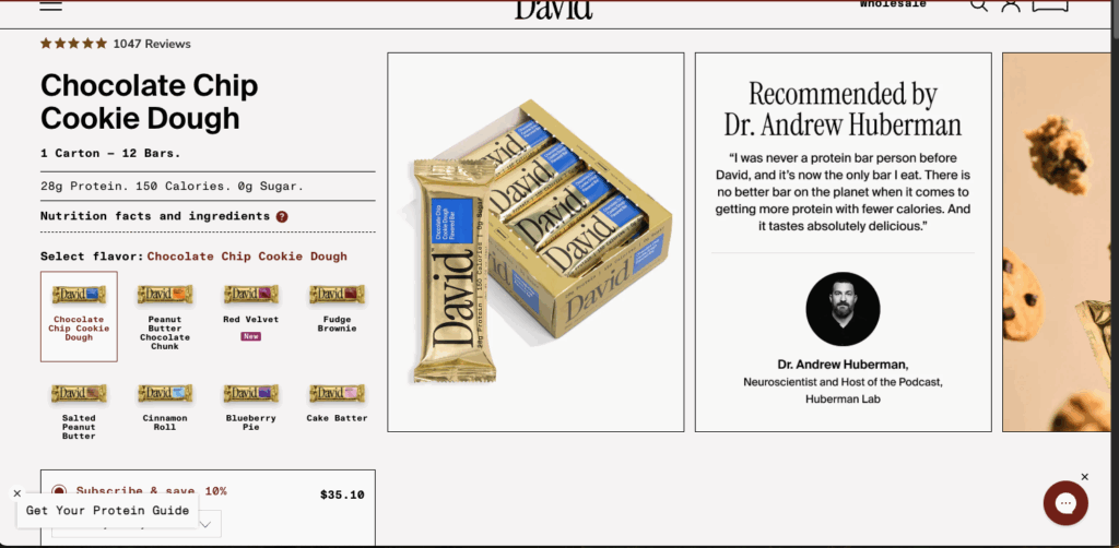
Endorsements can be extremely effective on a PDP
Endorsements from celebrities or experts in the space can be extremely impactful.
After all, who wouldn’t look at Salma Hayek and think, “I wonder what skincare products she’s using to look so good at her age.”
So when she announces that she has her own skincare line (and she does, y’all), or that she uses a prickly pear cactus serum with gold flakes and vitamin E, people jump to the checkout line.
It’s the same with any kind of influencer online, whether they’re a fitness enthusiast, a baker, a dietitian… if they’re stating, “this is the product I swear by,” people trust them.
You’ll have to A/B test to find the best place to put the endorsement, but David Protein shows that placement could be anywhere from the product images slideshow to the bottom of the landing page.
Before and after pictures add a lot of credibility
In our article on converting one-time purchasers to subscribers, we share how OBVI used before-and-after pictures across their Burn Bundle landing page.
We wanted to share it here, too, because it’s a great example of how to sprinkle social proof throughout the entire page, not just a section or two.
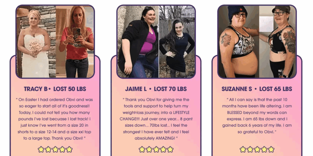
Not only does OBVI use user-generated reviews to deliver product education (answering how long it’ll take to see results), but it also gives credibility to their product.
They have several sections that display before-and-after images throughout the page.
9. Use Stay AI to optimize your PDPs and the subscriber experience
One of the biggest ways to optimize your PDPs is to add flexibility.
Flexible shipping parameters, easy swapping options, easy upsell capabilities, subscribe and save functionality…
You should be able to easily default to subscriptions. You should be able to upsell to a subscription even from a checkout page.
In the examples throughout this article, you saw truly exceptional buy boxes that are optimized for subscriber acquisition, not just for general conversion.
All of that functionality is possible because of Stay AI’s highly customizable API and exceptional CS team that works with brands to develop the most optimized buy boxes and landing pages.
Ready to optimize your PDPs with Stay AI? Get started here.
What is a product details page (PDP)?
A Product Details Page, often referred to as a PDP or product page, is a critical page for customers to learn about a product and its associated subscription offering. It is the store page for a specific product, visited via its URL.
PDP vs. Buy Box: what’s the difference?
A Product Details Page (PDP), also referred to as a product page, is the store page for a specific product, accessed via its URL. It is a critical page for customers to learn about a product and its associated subscription offering.
On a PDP, customers can see product details, pricing, and purchase options. The PDP can also serve as a landing page for campaigns focused on a specific product or subscription offer.
The Buy Box is a specific element or section located on the Product Details Page. It is often considered the primary point of conversion on the PDP.
The Buy Box is where customers make their purchase selection, allowing them to choose between a one-time purchase and a subscription option.
What is the difference between PLP and PDP in ecommerce?
A Product Details Page (PDP), also known as a product page, is the specific page for a single product accessed via its URL.
On this page, details like product specifications, pricing, and purchase options, including the choice between a one-time purchase and a subscription, are displayed.
Key distinctions:
- Shows multiple products simultaneously
- Provides summary information for quick comparison
- Includes filtering and sorting options
- Serves as a discovery and navigation tool
- Examples: search results page, category pages like “Men’s Shoes” or “Laptops under $1000”
A PLP (Product Listing Page) is a page that displays multiple products in a grid or list format, typically showing results from a category browse or search query. Think of it as the “catalog view” where customers can see many products at once with basic information like product images, names, prices, and brief descriptions.
Key distinctions:
- Focuses on one specific product
- Contains extensive product information and media
- Designed for conversion with purchase options
- Includes customer reviews, detailed specifications, and related products
- Example: the dedicated page for “Nike Air Max 270 – Size 10 – Black”