Compared to other popular subscription management apps, Stay AI’s out-of-the-box customer portal isn’t just easier to sign into and use – it offers a lot more options for cross-sells, upsells, and actions other than cancellation (skip, swap, delay, etc.).
This customer self service portal enables your subscribers to take complete control over their plans without having to contact your support team. It also expands the reach of other products in your catalog and makes it a whole lot easier for them to purchase.
In this article, we’re checking out customer portal examples from 21 top DTC brands that leverage Stay AI’s intuitive platform to design in-portal banners, consistent branding, and high-visibility upsell carousels that really feel like their own. Ready to get inspired?
What is a customer portal?
A customer portal is a secure online hub where subscribers can manage every aspect of their subscription without contacting support. A truly self service customer portal gives subscribers the flexibility to update their orders, discover new products, engage with loyalty programs, and take positive actions (like gifting, swapping, or adding items) instead of canceling.
In the subscription space, a strong customer portal tackles three essential goals:
1. Reduces friction for subscribers, lessens overload on CX teams
Instead of emailing support to change shipment dates, update their address, or adjust the contents of their next order, subscribers can log into the customer portal and manage everything themselves. This creates a faster, more convenient experience and reduces CX ticket volume.
2. Drives revenue through in-portal offers
The best customer portal design examples clearly demonstrate how this feature can be used as a personalized shopping environment. Brands can showcase add-ons, feature limited-time offers, highlight loyalty milestones, and position discovery-focused product carousels.
3. Improves retention with more flexible, customer-friendly controls
A customer self service portal allows customers to pause, delay, skip, swap, or adjust their subscription with ease. When customers see appealing options before the cancellation button, churn drops. This is why many of the best customer portal examples strategically position high-value actions, like add-ons or exclusive offers, ahead of negative ones.
Many top DTC brands use Stay AI to build portals that go beyond utility and transform the subscriber experience into something fun, on-brand, and profitable. Let’s check out customer portal examples from 21 of these top brands.
Best customer portal examples
- Beekman 1802: A bold editorial banner highlights new product launches the moment subscribers land, while a Digital Punch Card and “Add Extras” carousel turn every portal visit into a discovery moment
- BRĒZ: Banner ads highlight subscriber-exclusive promos and a birthday BOGO deal that feel VIP-worthy, paired with a Digital Punch Card that keeps subscribers coming back
- A Pup Above: Leads with a full-width Punch Card and a compelling banner showcasing a new recipe, with an intuitive on-brand layout and add-on carousel to boost AOV
- Little Saints: On-brand portal puts self-serve actions and a Punch Card front and center, with an “Add Extras” carousel that makes discovering new products effortless
- Clean Skin Club: Digital Punch Card and a bold sale banner keep subscribers engaged and coming back to the portal for exclusive deals
- OLIPOP: Leads with a vibrant add-on carousel and positions cancel/skip at the bottom, prioritizing more positive actions up top, with a subscriber-exclusive savings banner rounding it out
- Willie’s Remedy: On-brand, simple customer portal for their recently-launched subscription program, with a Punch Card and “Add Extras” carousel that keep things intuitive and engaging
- Curie: Leads with a beautiful full-width banner and a Punch Card for a clean, intuitive portal layout
- NIRA: Clean, elegant branding anchored by a product launch banner with standout specs, a Punch Card, and easy-to-access self-serve actions
- Beekeeper’s Naturals: Punch Card leads at the top, followed by a bold bundle-builder banner and easy subscription management tools that work together to boost retention and AOV
- Tenzo: Clean layout with a Punch Card and a compact add-on carousel gives subscribers everything they need to manage their matcha subscription in one place
- Graza: Spotlights a seasonal collaboration at the top alongside a Punch Card, and encourages subscribers to move up orders for higher AOV
- Clevr: Fully customizes their portal with standout product photography in their banner, plus a Punch Card and “Add Extras” carousel
- OBVI: A bold product launch banner and Digital Punch Card create a high-engagement subscriber experience that always feels fresh
- Magic Spoon: Fully brands their customer portal and regularly updates their banner space to highlight new product launches with dual CTAs to shop or bundle
- Prime Bites: Leads with a full “Add Extras” carousel showcasing their full flavor lineup, paired with a Digital Punch Card that rewards subscribers for their loyalty
- Veterinary Formula: Clean, on-brand portal puts key order management actions front and center, with a Digital Punch Card and robust “Add Extras” carousel that makes stocking up on pet essentials a no-brainer
- People’s Choice Beef Jerky: Punch Card leads at the top to drive long-term loyalty, while a bold product banner highlights new releases and keeps the portal worth coming back to
- Cann: Bright, on-brand portal puts key actions like order now, change date, and skip front and center, with a vibrant add-on carousel that makes product discovery effortless
- Ora Organics: Easily accessible self-serve actions and an on-brand add-on carousel make it simple for subscribers to update their plans and discover new products in one place
- Broya: A tiered Digital Punch Card rewards subscribers after 3 and 7 orders, paired with a robust add-on carousel that keeps engagement and AOV high
1. Beekman 1802
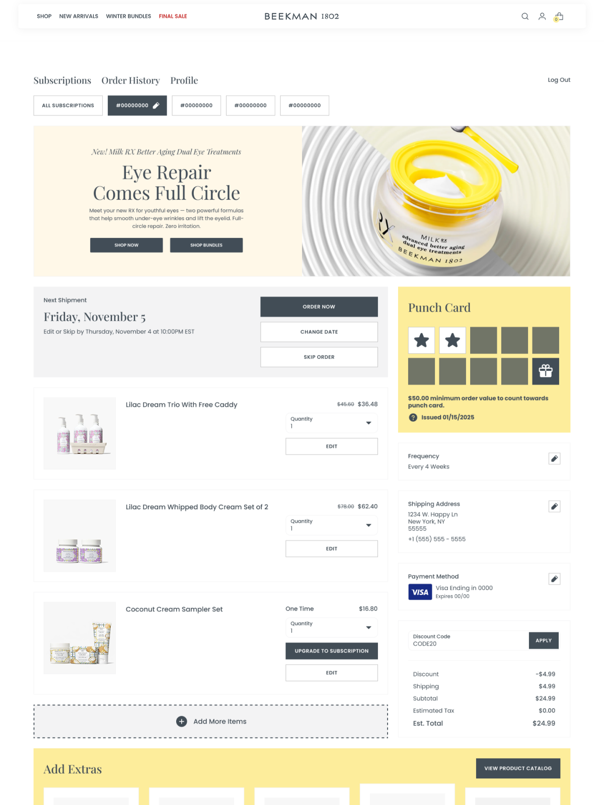
Beekman 1802 leads with a full-width editorial banner that does double duty as a product launch vehicle, with gorgeous photography, compelling copy, and dual CTAs that make subscribers want to shop, not just manage. Below that, a Digital Punch Card rewards loyalty over time while the “Add Extras” carousel with a “View Product Catalog” button keeps the portal feeling like a premium shopping destination. It’s a great example of how the right banner strategy can make the portal the most valuable real estate on your site.
2. BRĒZ
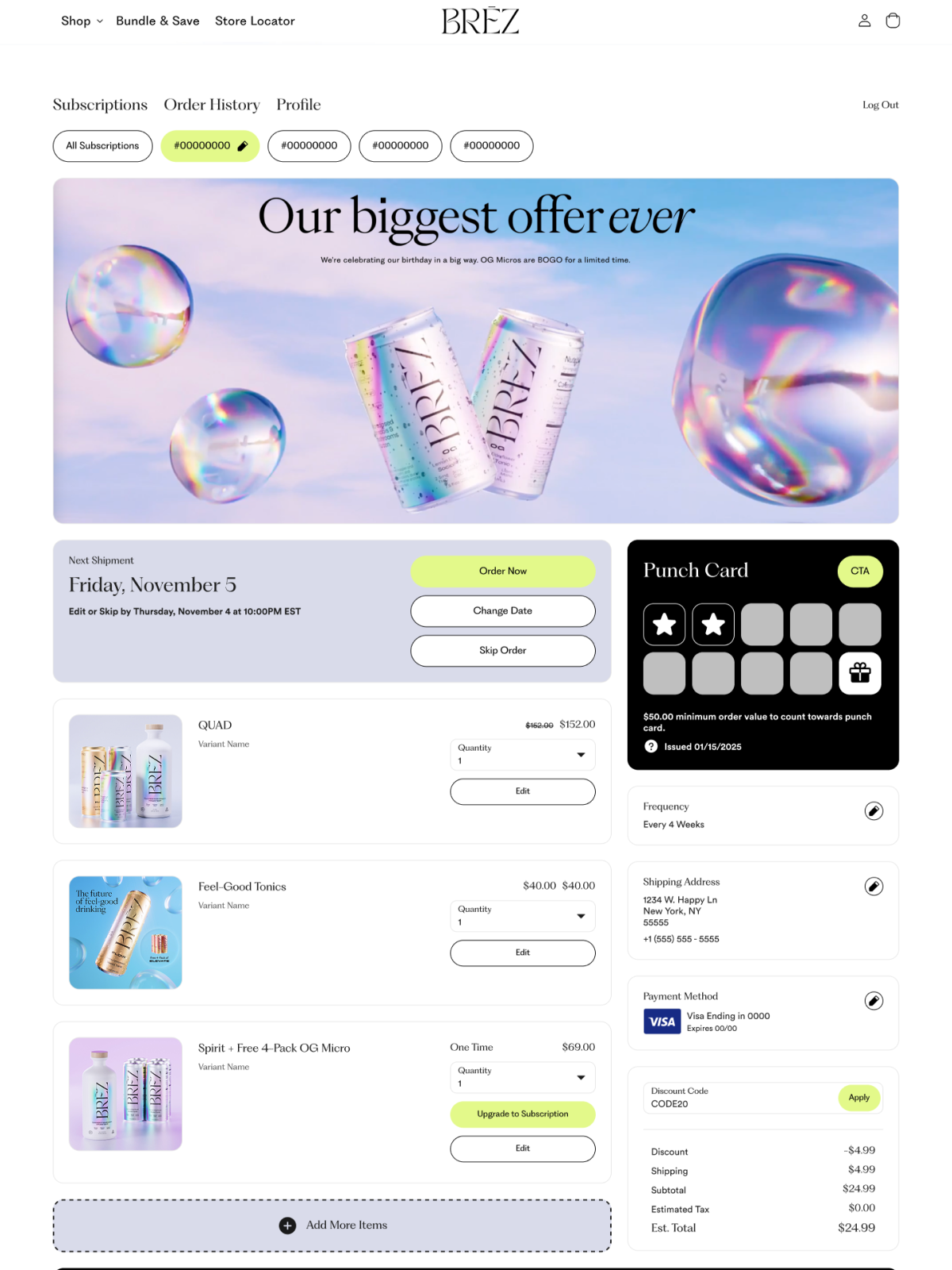
BRĒZ scaled their subscriber base from a couple hundred customers to over 15K in two years. So they know a thing or two about treating subscribers like VIPs – and how they use their subscriber portal is a great example of this. The team leverages banner ads to highlight their subscriber-exclusive promos, like this birthday BOGO deal. They also pair it with a Digital Punch Card, giving subscribers even more reasons to stay engaged and keep coming back.
3. A Pup Above
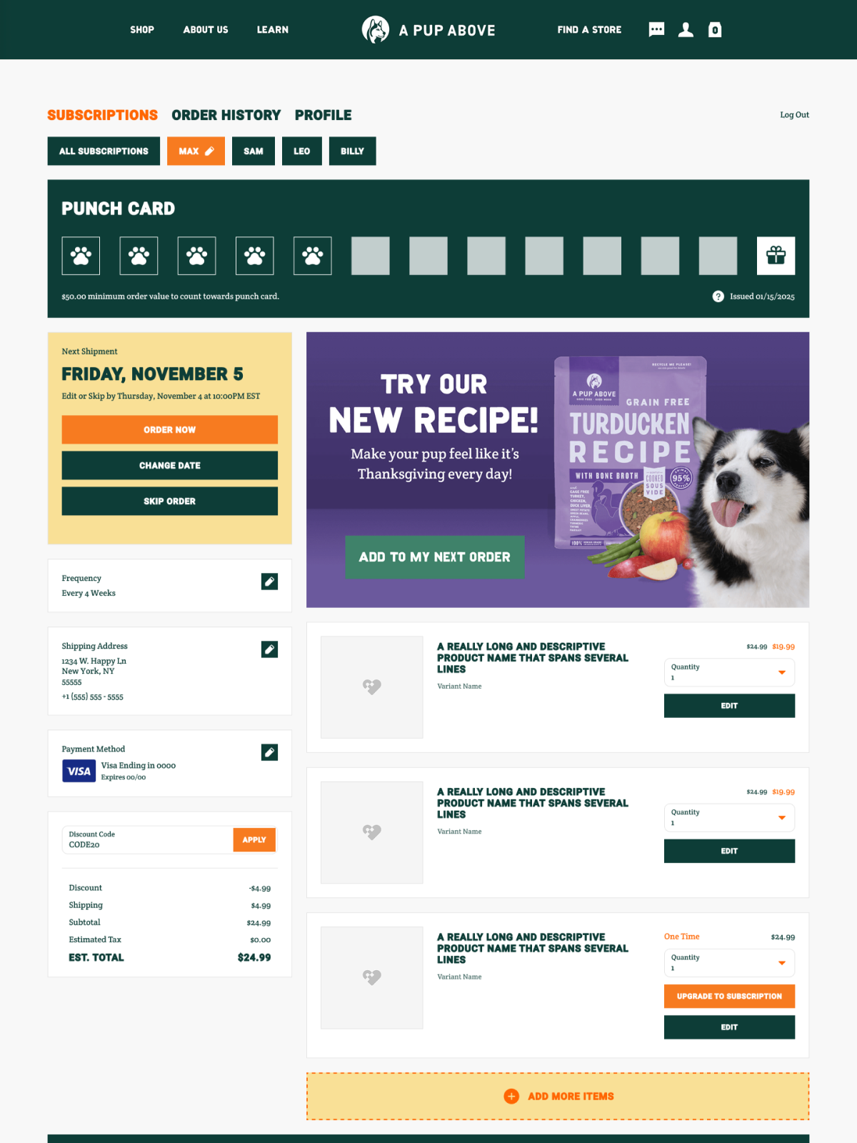
If you want another masterclass in banner ads, look no further than this customer portal example. A Pup Above leads with a full-width Digital Punch Card at the top, followed by a compelling banner showcasing their Grain Free Turducken Recipe – complete with an “Add to My Next Order” CTA that makes it easy to try something new in one click. Easy to navigate, on-brand, and taking advantage of AOV-boosting features like the add-on carousel, A Pup Above doesn’t miss a single detail when it comes to giving subscribers an intuitive self-serve experience.
4. Little Saints
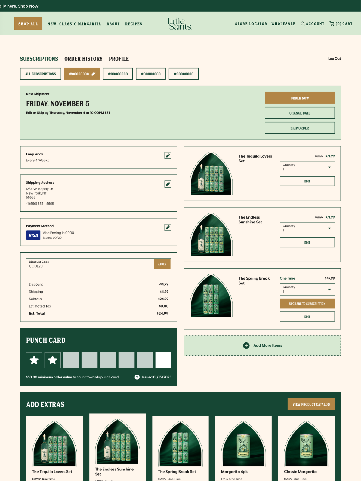
Little Saints gives us a customer portal example that’s perfectly tailored to the non-alcoholic beverage brand’s festive – and totally whimsical – identity. Key self-serve actions are front and center the moment subscribers land, followed by a Digital Punch Card and an “Add Extras” carousel that makes it easy to discover new products before leaving.
“Stay was a breath of fresh air – the desires we had such as loyalty and customer experience were a part of the roots of Stay, not a developing afterthought.”
— Andie Waugh, Director of Customer Experience, Little Saints
5. Clean Skin Club
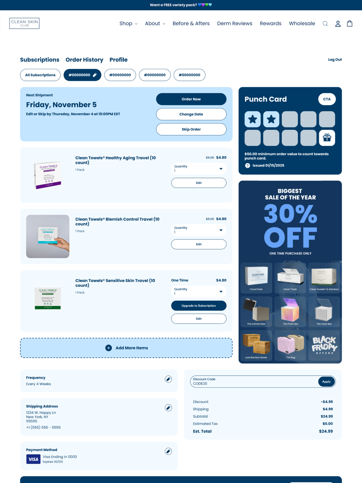
Clean Skin Club utilizes our Digital Punch Cards in their customer self service portal to keep customers engaged and excited about their brand and products. They’ve also taken full advantage of the banner ad space, using it to spotlight a bold sale offer that’s impossible to miss when subscribers land on the page. Subscribers immediately understand their options, and they don’t have to search their customer portal to make simple changes.
6. OLIPOP
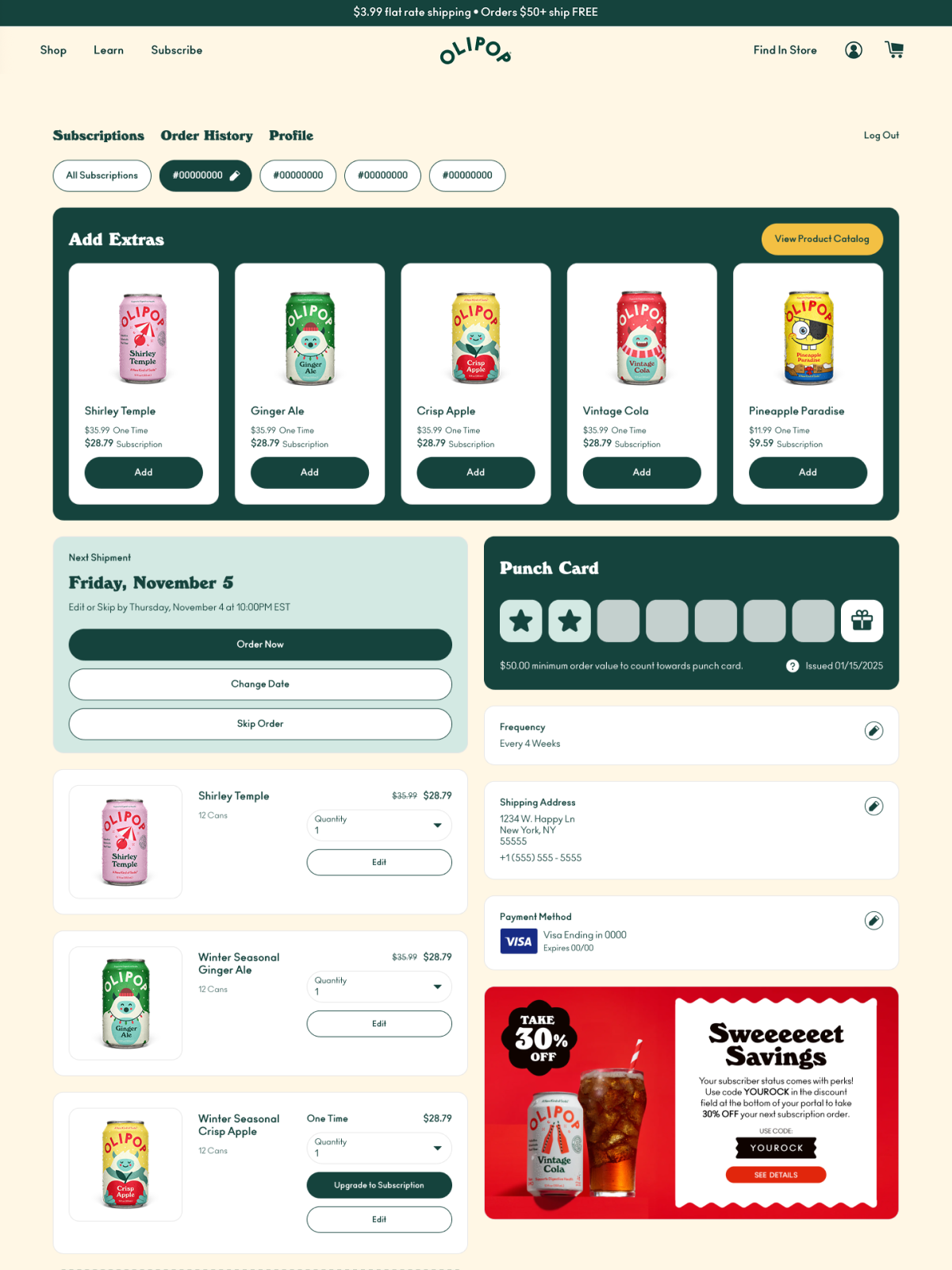
OLIPOP really puts the “self-serve” in customer portals. Their vibrant add-on carousel leads the moment subscribers enter, putting product discovery front and center with flavors like Shirley Temple, Ginger Ale, and Crisp Apple. And take note: the negative actions – like pausing and cancelling – are at the bottom, so subscribers first see all the flexibility they have without churning or pausing. A bold subscriber-exclusive savings banner rounds out the portal, making every visit feel rewarding.
“We were completely sold on switching from Recharge to Stay AI after seeing [the customer portal] for the first time on the demo. This was it for us. It’s so much easier to navigate than our old portal.”
— Michelle Paulhus, Sr. Growth Marketing and Retention Manager, OLIPOP
7. Willie’s Remedy
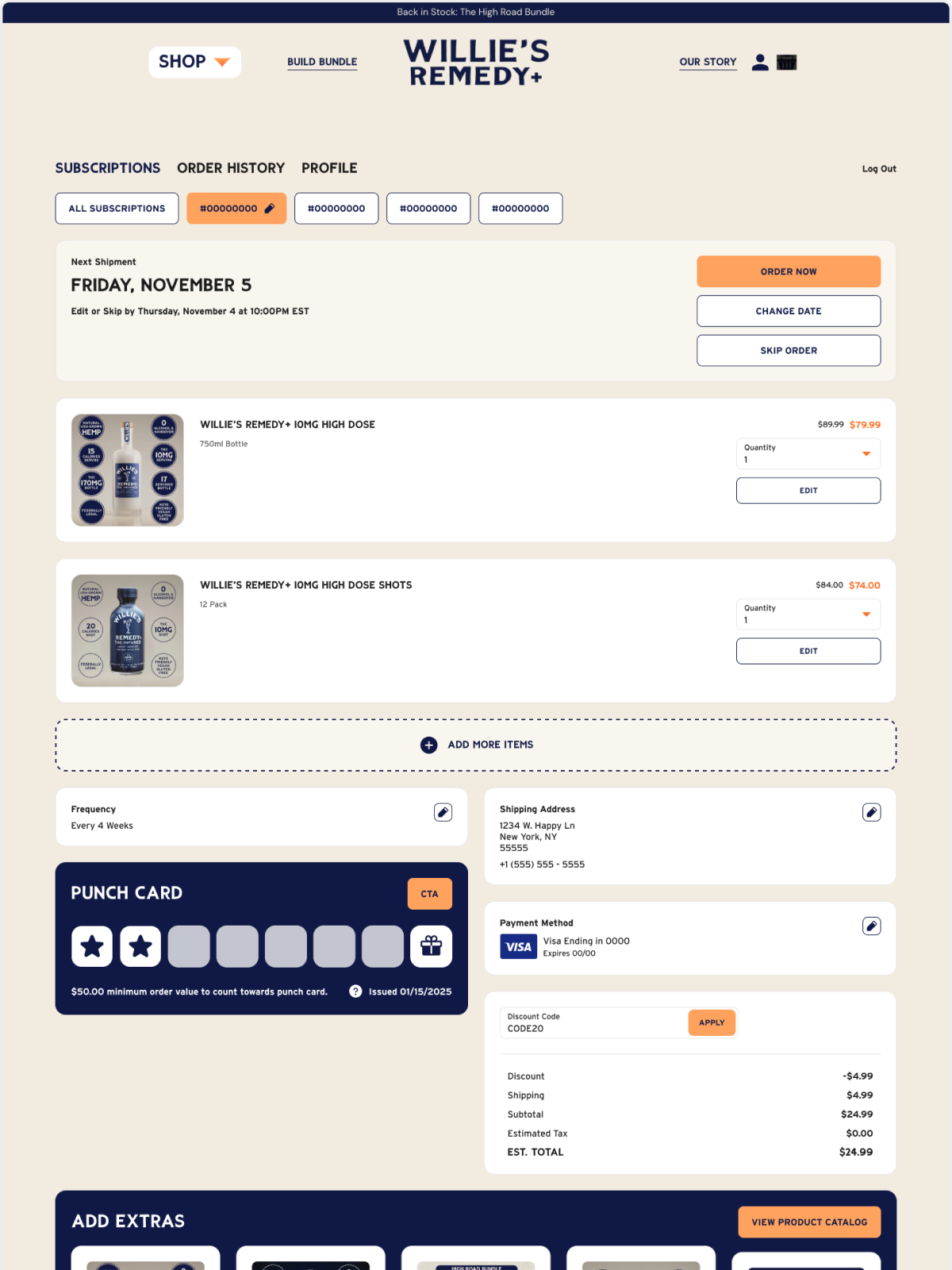
Non-alcoholic social tonic brand, Willie’s Remedy, recently launched their subscription program, Willie’s Outlaw Club. To make sure their early subscribers – which leaned towards an older demographic – get a really clear and intuitive experience, they designed a simple yet totally on-brand customer portal. Self-service options are front and center, so subscribers feel in control and know exactly how to adjust their orders. A Digital Punch Card and an “Add Extras” carousel round things out, making it easy to stay engaged and discover new products.
8. Curie
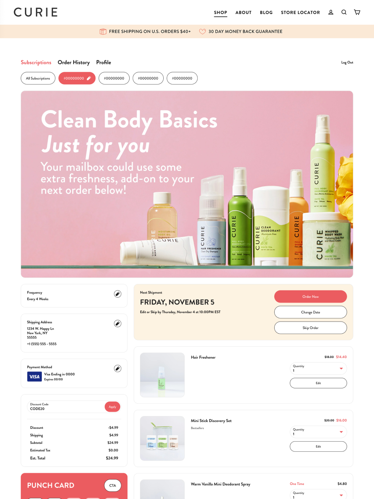
Simple but effective customer portal examples like Curie show that sometimes less is more. They lead with a beautiful full-width banner that puts their product line front and center the moment subscribers arrive, followed by subscription management and a Digital Punch Card that feels rewarding and engaging. Curie masterfully makes great use of the real estate, putting everything within easy reach and laying it out in an intuitive way.
9. NIRA
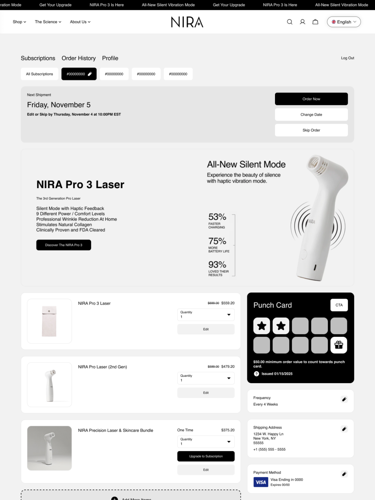
Like their professional-grade skincare products, NIRA is all about clean and elegant branding. Their customer portal needed to reflect this, while driving higher AOV and guiding subscribers to manage their plans so the team could reduce CX tickets. The result? A subscription portal that leads with a stunning product launch banner – complete with specs like 53% faster charging and 75% more battery life – followed by a Punch Card and easy-to-access subscription management tools.
10. Beekeeper’s Naturals
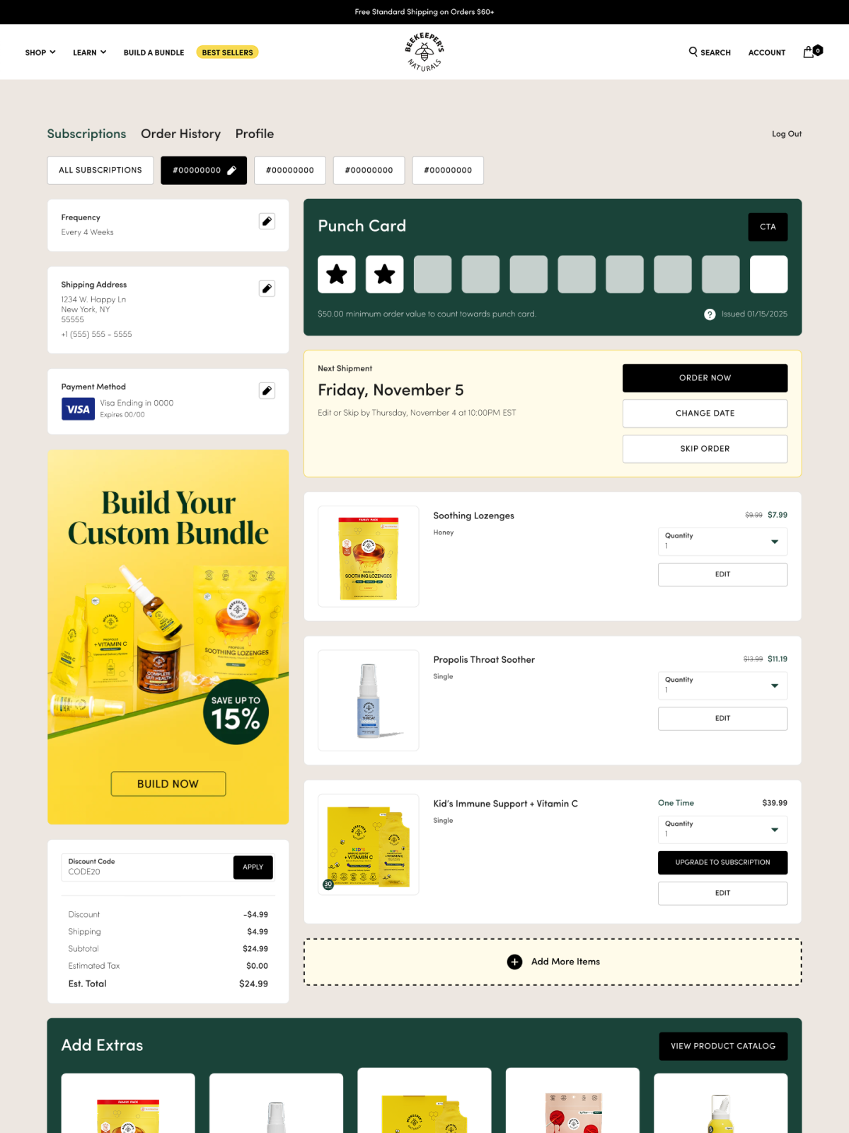
Beekeeper’s Naturals kept their customer portal as clean as their honey products, while still effectively using the banner ad, product carousel, and easy-to-access subscription management buttons. The Punch Card leads at the top of the page, followed by a bold “Build Your Custom Bundle – Save Up to 15%” banner that’s designed to boost retention and AOV in one click.
11. Tenzo
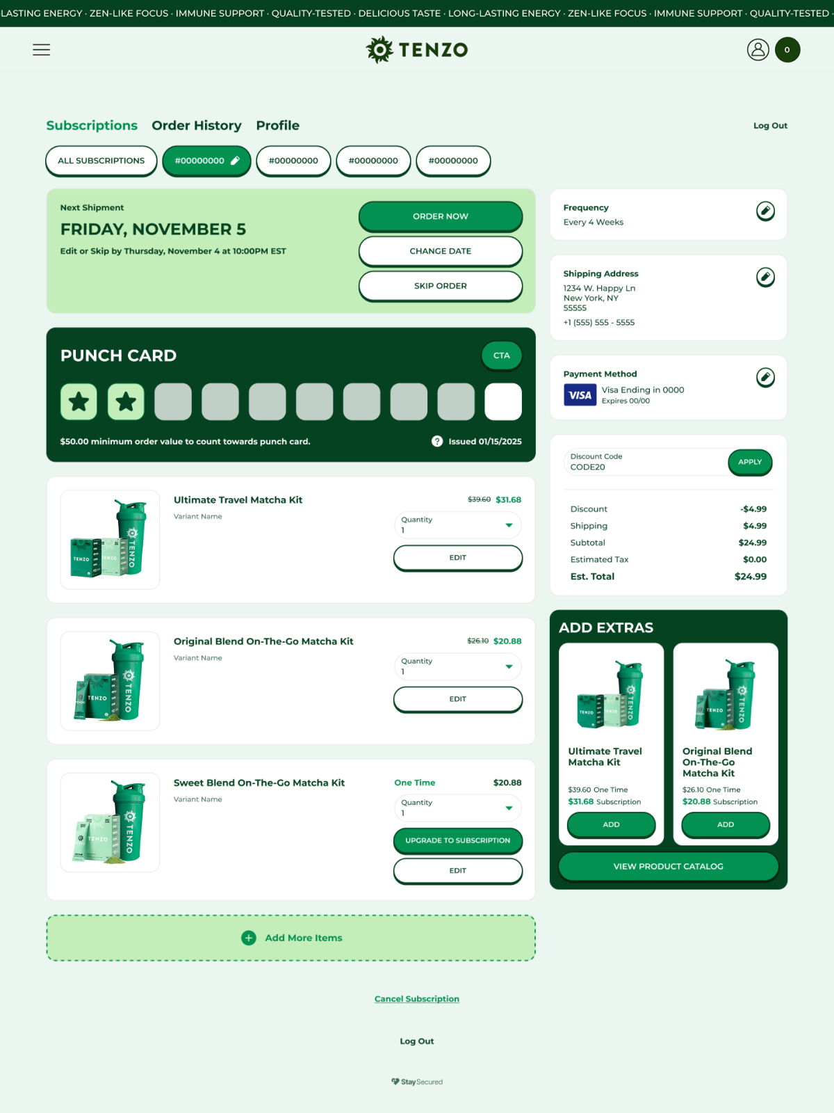
Tenzo is one of the best customer portal examples we know of for keeping things clean and functional. Their portal leads with order management up top, a Digital Punch Card mid-page, and a compact “Add Extras” carousel showcasing their matcha kit lineup. With clear self-serve CTAs, customers know exactly what positive actions to take next and feel empowered to manage their plans.
12. Graza
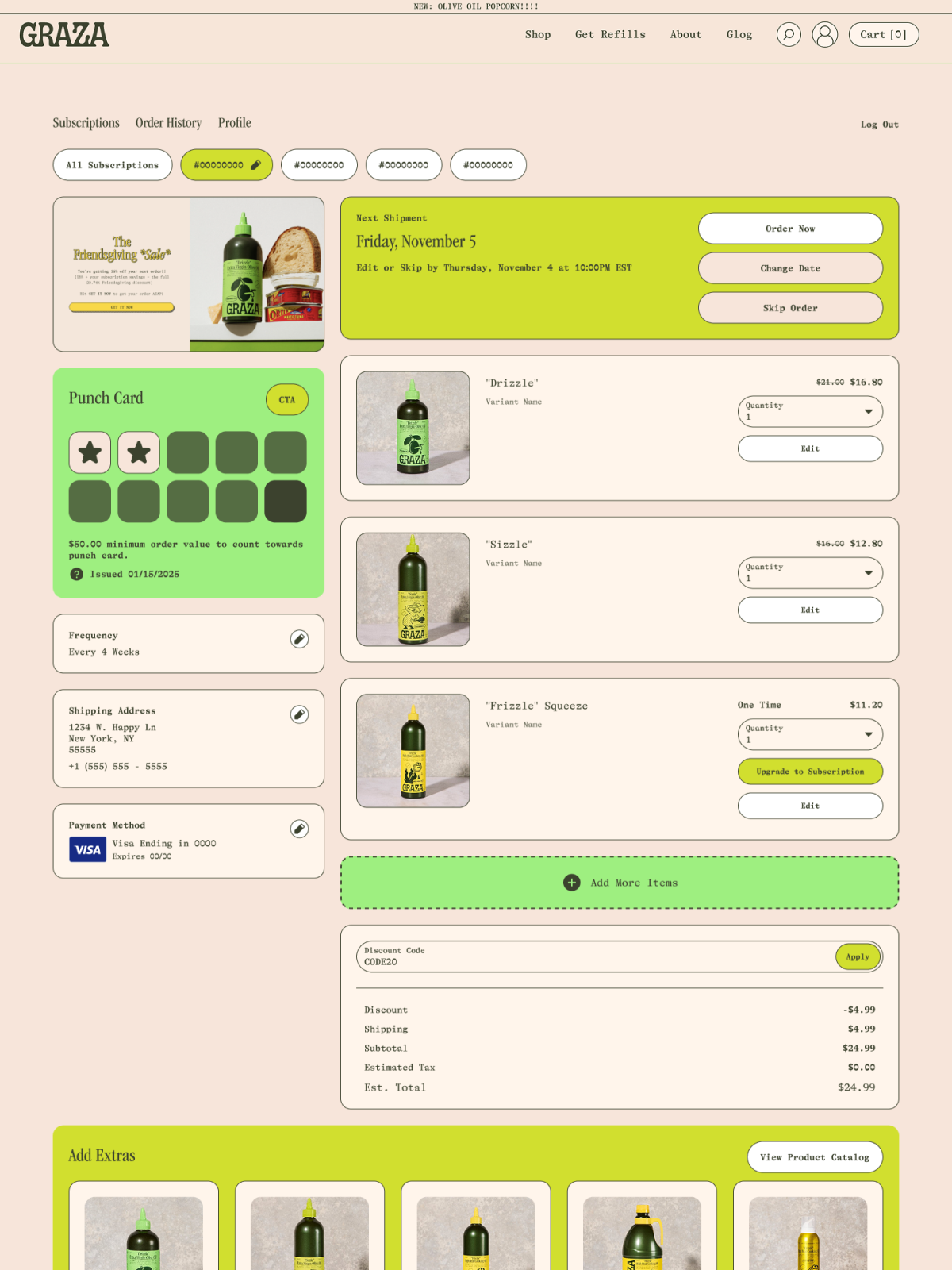
Graza really knows how to show off their products, and this customer portal design example proves that. A compact banner spotlights a seasonal collaboration at the top alongside key order management actions, and a Digital Punch Card keeps subscribers engaged over time. They also encourage customers to move up their subscription orders and get it now – that’s a great strategy for higher AOV and retention.
13. Clevr
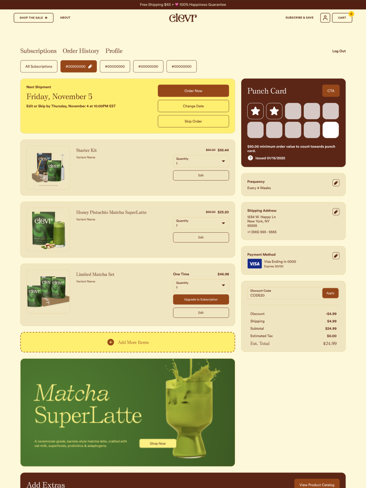
Stated simply, Clevr has absolutely tricked out their customer portal. In addition to pulling each of their branding elements through the interface, they also leverage banner ad space to showcase some of the most beautiful product photography we’ve ever seen – like their Matcha SuperLatte banner. A Digital Punch Card sits in the sidebar while an “Add Extras” carousel rounds out a portal that feels as good to browse as it does to manage.
14. OBVI
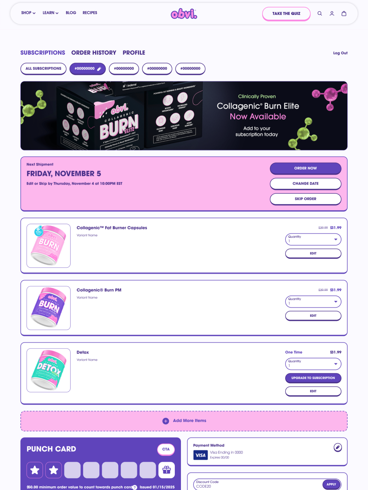
OBVI uses a prominent product launch banner, a Digital Punch Card, and accessible subscription management buttons in their customer portal to create a powerful combination that fuels the customer experience. Their bold banner spotlights their latest product release and encourages subscribers to add it to their subscription today, so the portal always feels fresh and worth visiting.
15. Magic Spoon
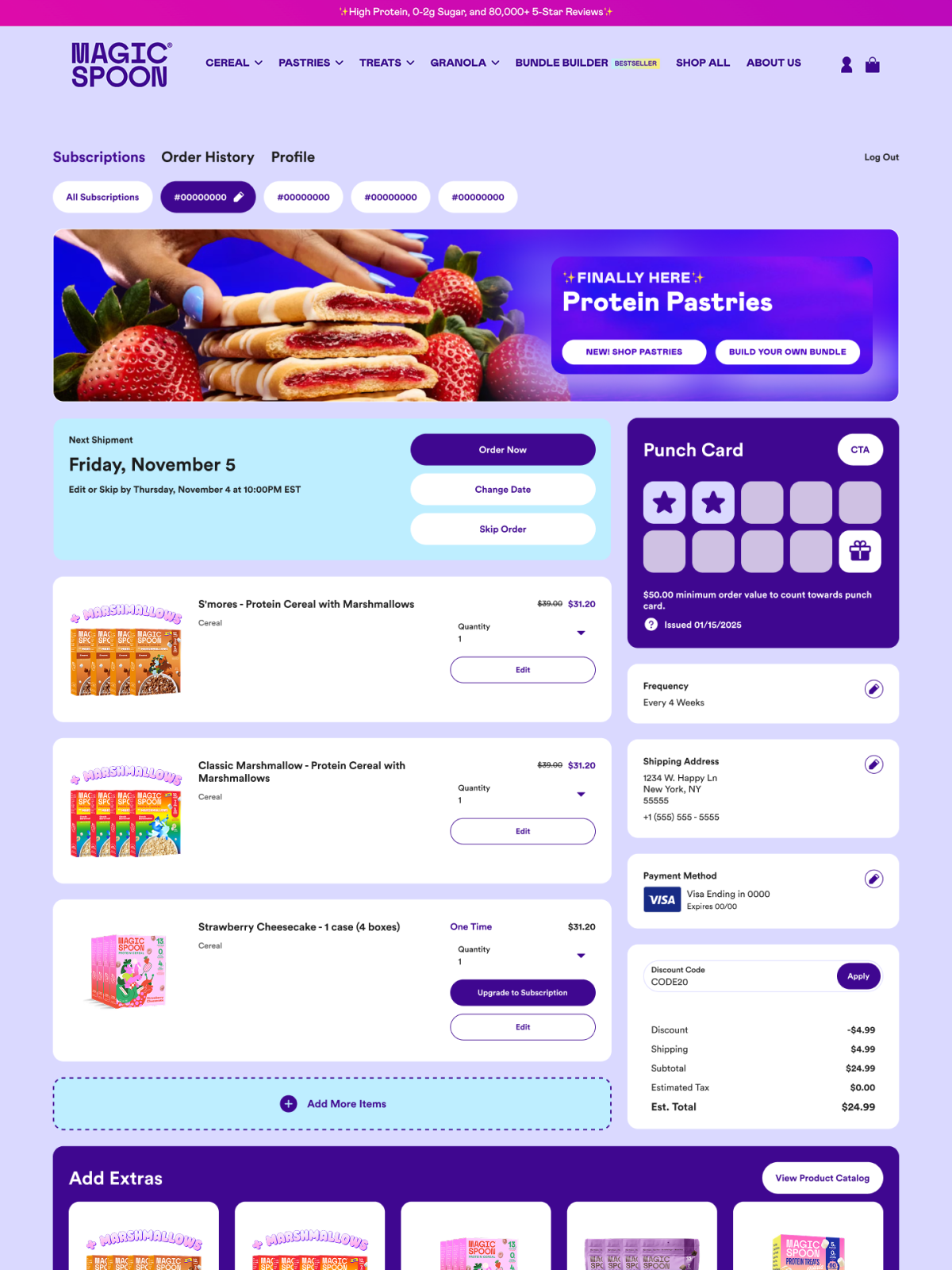
If you want to see decked-out customer portal examples, look no further than Magic Spoon. They fully branded their subscription portal, and absolutely max out on their portal banner real estate. The team regularly swaps out the portal banner to feature new product releases, like their latest Protein Pastries launch, with dual CTAs that make it easy to shop or build a bundle right from the portal.
16. Prime Bites
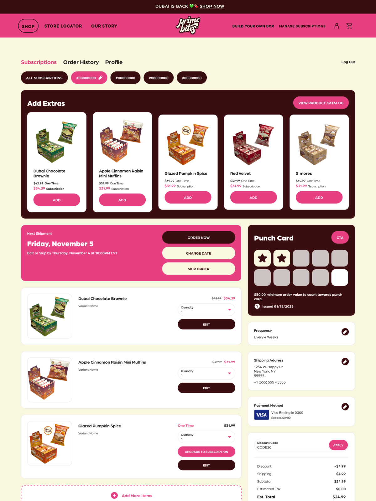
Prime Bites knows that the portal is a great place to put their products front and center. They lead with a full-width “Add Extras” carousel showcasing their full flavor lineup, so the first thing subscribers see is something they might want to add to their next order. A Digital Punch Card rewards ongoing loyalty, making every visit feel like it’s working toward something.
17. Veterinary Formula
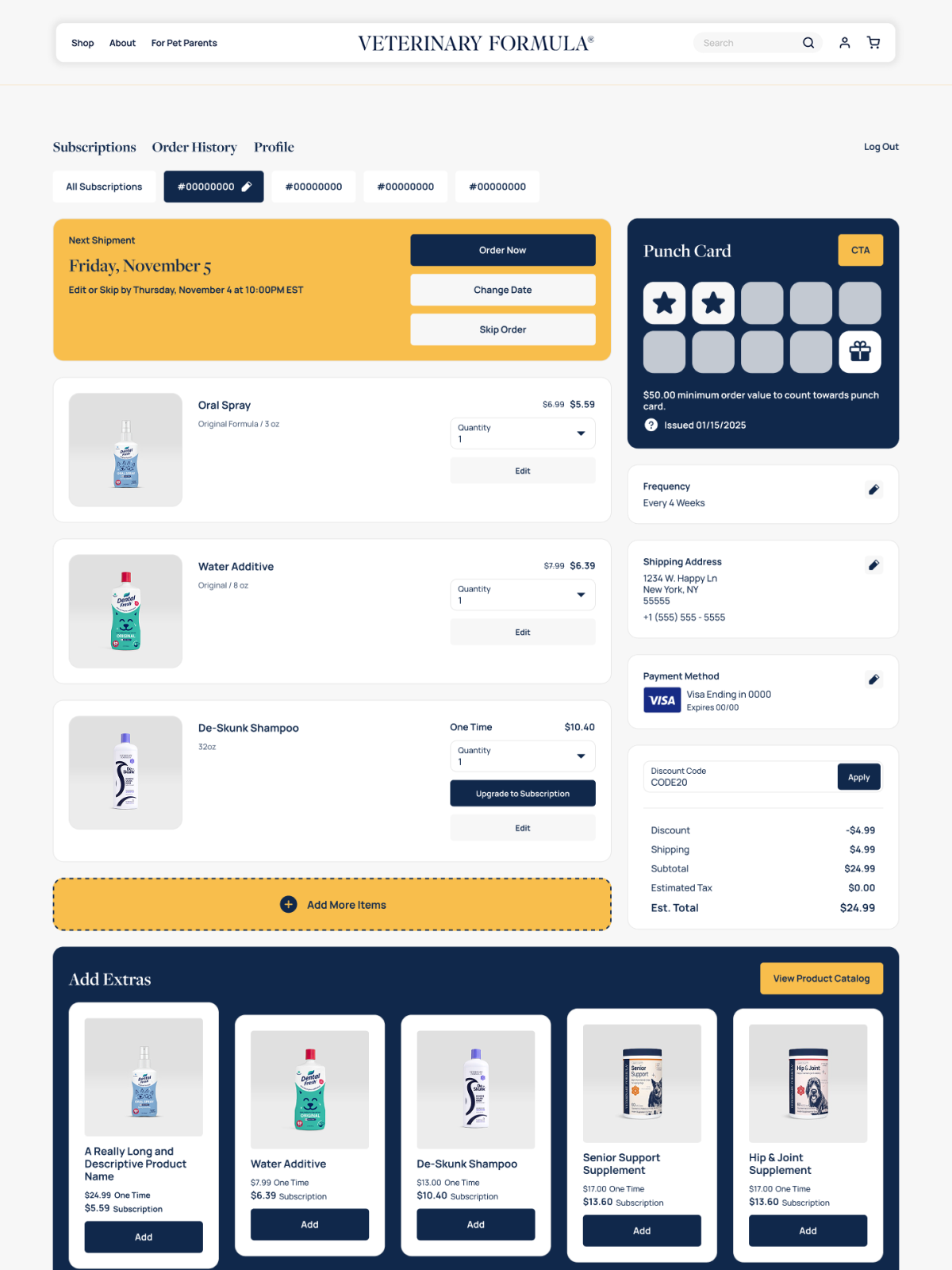
Veterinary Formula’s portal nails the fundamentals with a clean, on-brand layout that pet parents can navigate without a second thought. Order Now, Change Date, and Skip are front and center, and a Digital Punch Card in the sidebar gives subscribers something to work toward. The “Add Extras” carousel rounds things out with the full product catalog, from dental care to Senior Support and Hip and Joint supplements, making it easy to build out a complete pet wellness routine in one place.
18. People’s Choice Beef Jerky
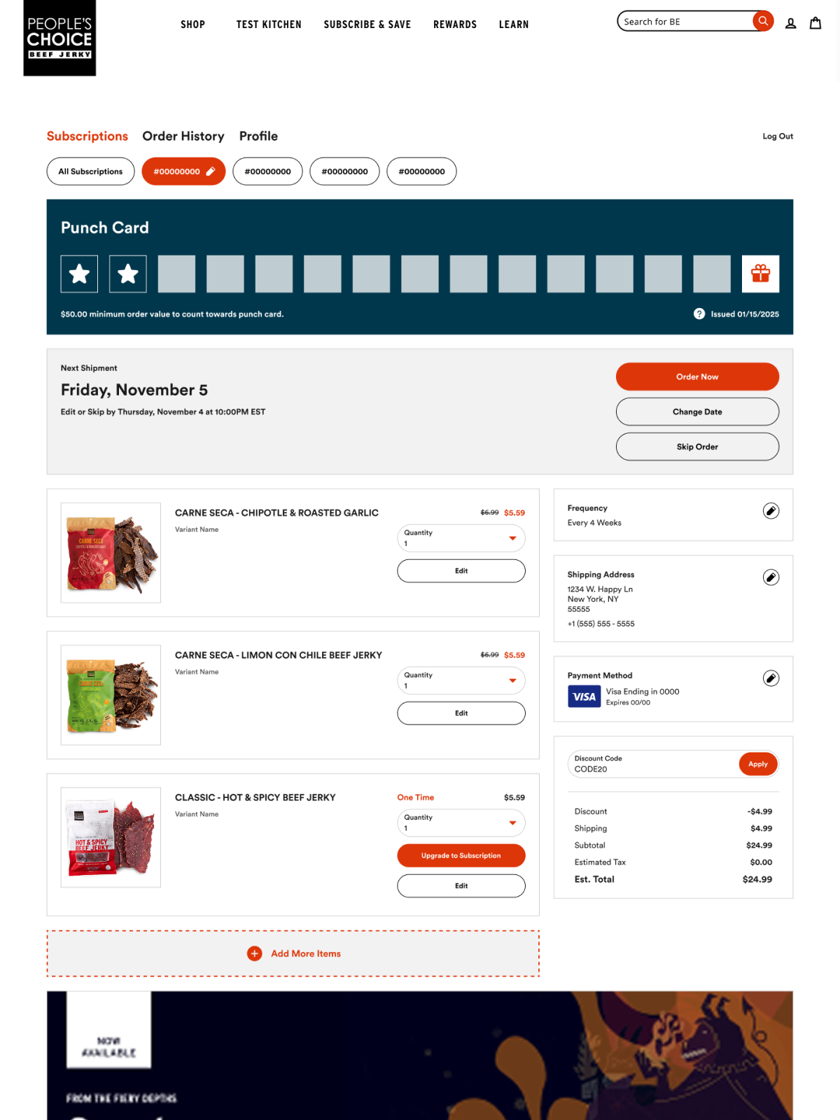
Craveworthy product imagery and totally on-brand elements make the subscription portal for People’s Choice Beef Jerky stand out. A full-width Digital Punch Card leads at the top, building loyalty from the moment subscribers land. A bold product banner lower on the page highlights new releases and keeps the portal feeling exciting and worth checking back on.
19. Cann
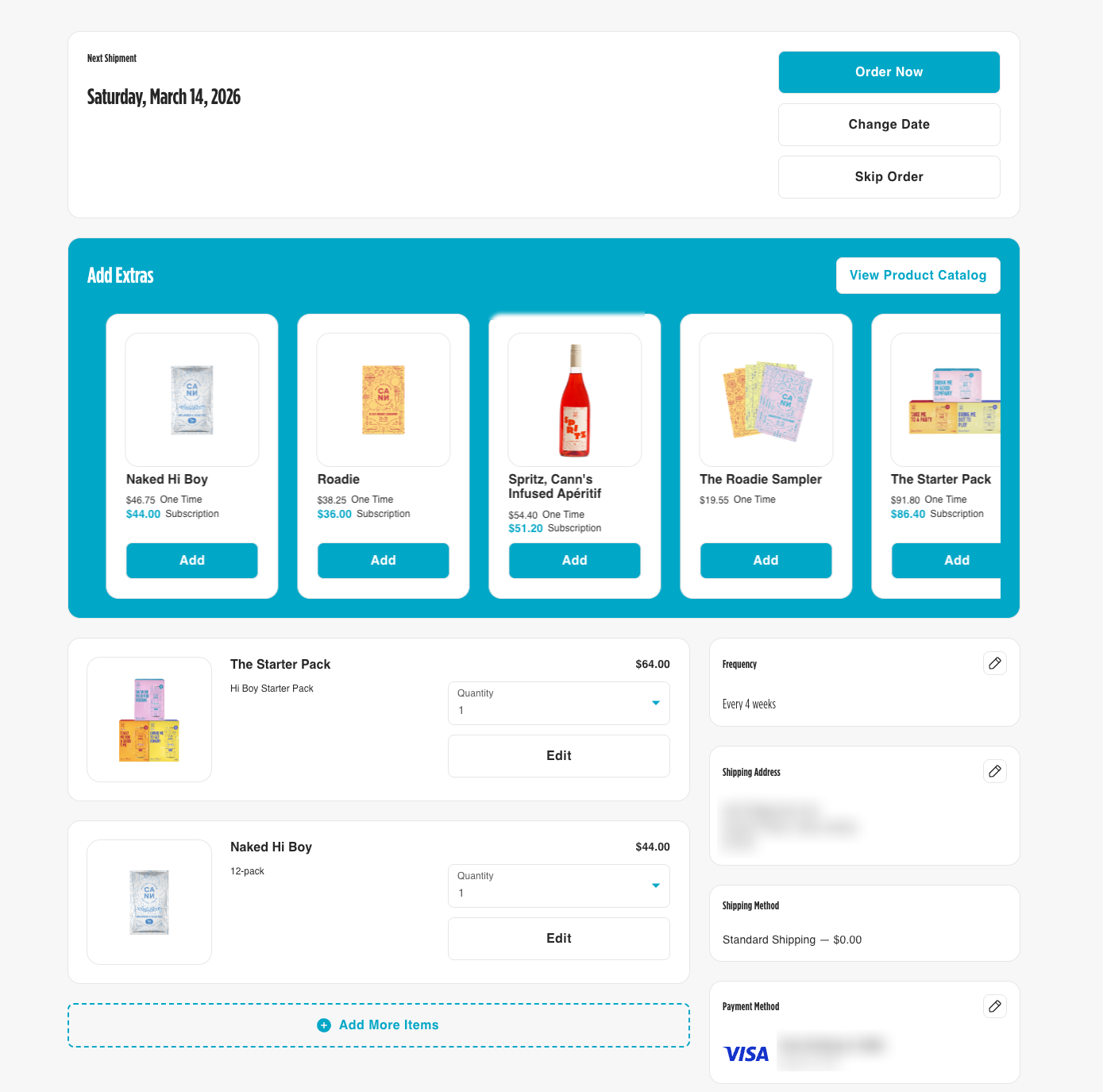
Cann‘s portal is as vibrant and fun as the brand itself. Key actions like ordering now, changing a delivery date, or skipping an order are front and center the moment subscribers land on the page. Their bright teal add-on carousel makes product discovery feel effortless, showcasing everything from the Naked Hi Boy to the Spritz Apéritif in one scrollable, shoppable view.
20. Ora Organics
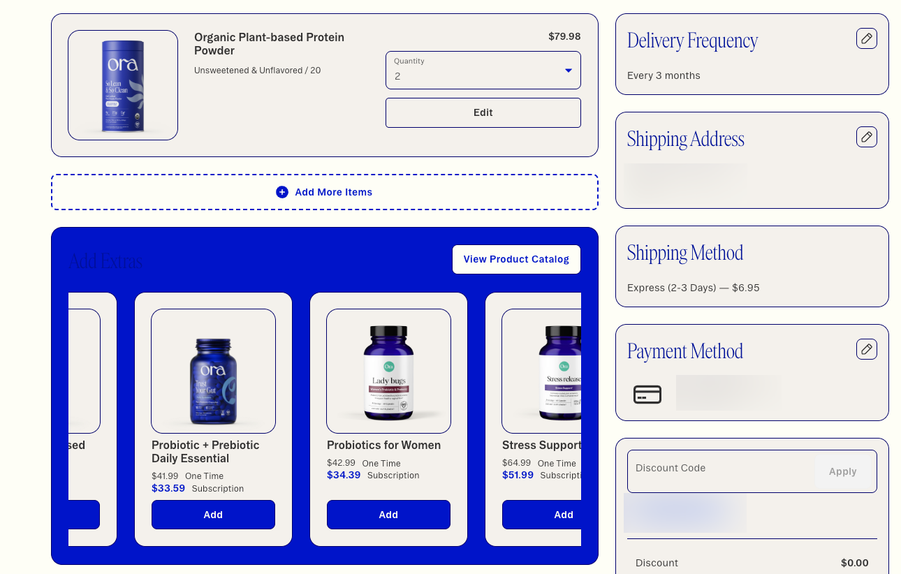
Ora Organics keeps things clean and conversion-focused. Key self-serve actions like updating a shipping address or payment method are easy to find, reducing friction and CX tickets. And with a bold, on-brand add-on carousel showcasing complementary products like probiotics and stress support, subscribers have plenty of reasons to add to their order before they leave.
21. Broya
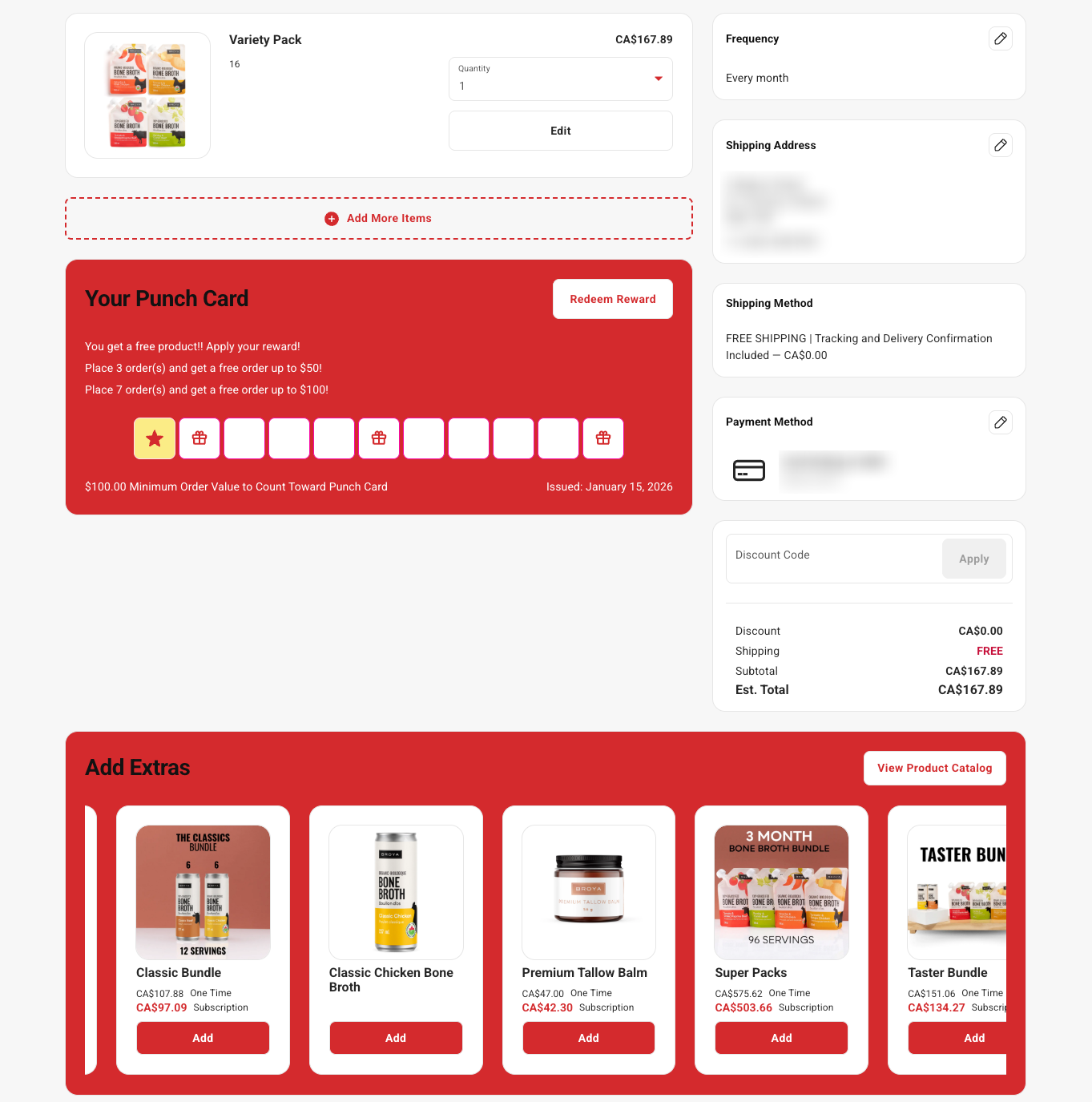
Broya’s portal is a standout example of pairing loyalty with product discovery. Their Digital Punch Card takes center stage, offering subscribers a free product after 3 orders and a free order up to $100 after 7 – a tiered reward structure that keeps engagement high over time. Add in a robust product carousel spanning bundles, broths, and beyond, and you’ve got a portal that’s as good at retention as it is at boosting AOV.
Join the list of top customer portal examples
The best customer portals all share one theme: when brands make subscription management intuitive, on-brand, and value-packed, subscribers stay longer and spend more. From subscriber-exclusive offers to flexible self-serve controls, a well-designed subscription portal can transform a typically high-churn touchpoint into one of your strongest revenue and retention engines.
If you’re ready to build a customer portal that delights subscribers and drives more recurring revenue, get in touch with us.
A customer portal like Stay AI’s is a secure self-service hub where subscribers can manage every aspect of their subscriptions without contacting support. Customers can update order frequency, skip or swap products, change their next order date, add new items, manage profile information, and redeem rewards – all in one place. Brands use Stay AI to create customer portals that feel fully on-brand while giving subscribers a seamless, passwordless way to manage their plans.
Stay AI stands out among customer portal examples because it combines no-code customization with powerful merchandising and retention tools. Marketers and retention teams can easily adjust branding, copy, buttons, and layout with a drag-and-drop editor, or enhance the experience with custom CSS, HTML, or JavaScript. Features like product carousels, banner ads, Digital Punch Cards, flexible CTAs, and confetti for rewards let brands turn the portal into a branded shopping and loyalty experience to boost AOV and recurring revenue.
Customer portals improve retention by giving subscribers easy access to positive actions before they consider cancelling. Examples include gifting options, flexible frequency settings, and clear swap pathways that prevent subscribers from abandoning a subscription just to make a product change. A subscription portal like Stay AI even uses Digital Punch Cards or another rewards journey to keep subscribers engaged over time, and offer a frictionless login experience that reduces barriers to reordering or plan management.
When reviewing customer portal design examples, brands should look for a mix of strong UX, customization options, and retention-focused features. Ideal portals like Stay AI allow teams to adjust branding and messaging easily, add promotional banners, highlight key actions with customizable CTAs, and display curated product recommendations. Advanced setups within Stay can even allow granular discount rules, variant exclusions, and drag-and-drop editing, giving marketers full control over how subscribers interact with their upcoming orders.

