While we do see brands acquire new subscribers by driving directly to the PDP, the brands that have the most success doing so have extremely subscription-optimized product pages. If you are running paid traffic with the intention of acquiring new subscribers, and want to test out a subscription landing page built specifically for that audience, we’ve got some tips/tactics for you!
More awesome subscribe page examples from Stay’s top brands coming up – broken down by a few of the most effective strategies for subscriber acquisition.
What are the Best Subscription Landing Pages?
There are a few consistent characteristics of a subscribe landing page that drive high conversion rates across brands.
Basically, they’re laser-focused on clarity, value, and trust. The best subscription page examples make it immediately obvious what the offer is, why it’s worth subscribing to, and how flexible the experience will be. It’s also crucial to clearly highlight pricing and savings, reinforce benefits such as free gifts or exclusive discounts, and establish credibility through reviews and strong social proof.
Whether you’re optimizing an evergreen Subscribe & Save page or designing a paid-traffic subscription landing page, keeping these key features in mind is how you can turn curious visitors into loyal subscribers.
Subscription Page Examples:
- Clevr: Starter kit subscription landing page featuring free gifts, health education, 15% future credit, and flexible recurring orders
- Intake Breathing: Discount-focused LP offering $25 off, a free travel case, and strong social proof with reviews
- Beauty by Earth: Build Your Own Bundle subscription page highlighting personalized bundles, UGC, flexible options, and visible savings
- Magic Spoon: Custom bundle landing page showcasing 20% off, free gift set, bold visuals, and verified customer reviews
- Curious Elixirs: Welcome offer LP with 28% discount, order flexibility, and high-quality product visuals
- The Lift Box: Social proof-driven subscription landing page featuring 20,000+ subscribers, user videos, press mentions, and a $17 discount
- Clean Skin Club: Trial-to-subscription landing page with free container offer, sticky CTAs, and consistent conversion messaging
- BeautyLux: Subscribe & Save landing page emphasizing 15% savings, free shipping, and transparent subscription management
- Beekeepers Naturals: Evergreen subscription page detailing discounts, subscriber benefits, FAQs, and high-performing bundle options
MDrive: Hybrid product detail + subscription landing page with default subscribe option, recurring savings, and benefit-driven content
The Starter Kit LP
Clevr

Clevr directs a significant amount of ad traffic to their “Starter Kit” page, where shoppers select two lattes to start their subscription. The subscription landing page includes information on free gifts with purchase, education about the product’s health benefits, a 15% credit towards future orders, and information on the flexibility of recurring subscription orders. This is a masterclass in nudging a shopper to become a high-AOV subscriber!
Intake Breathing
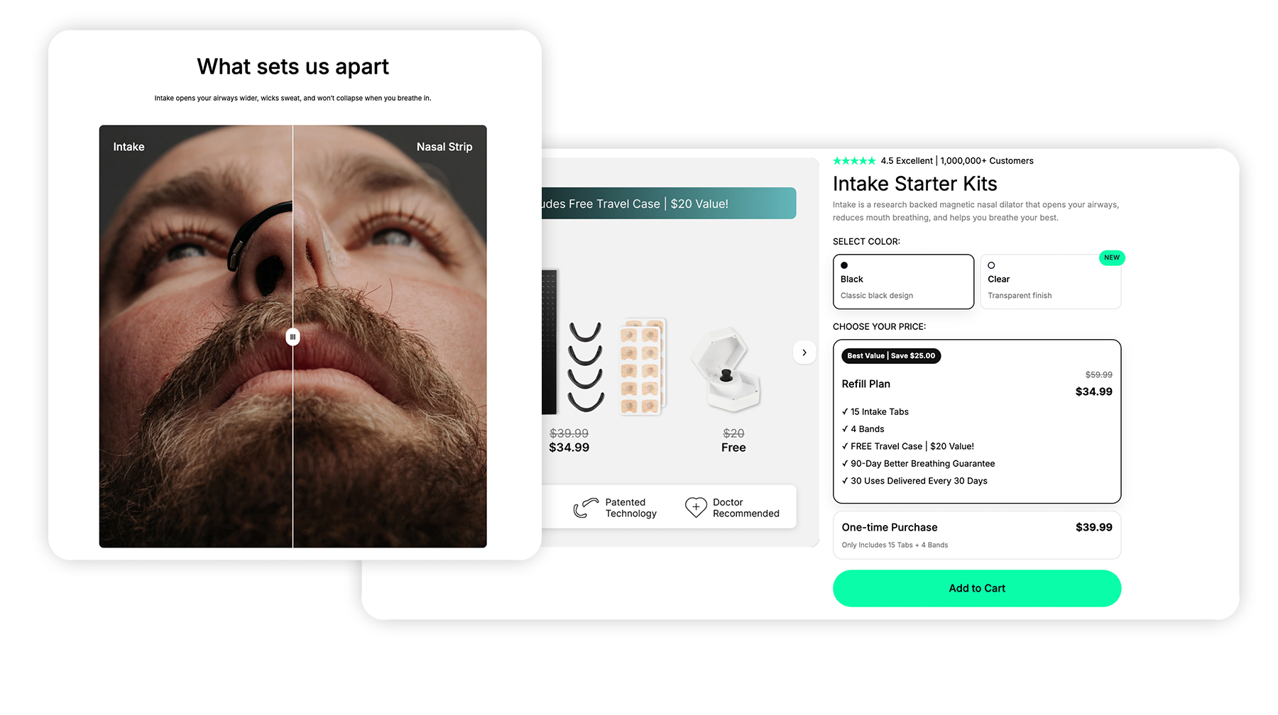
Intake’s starter kit landing page presents customers with a $25 discount, tossing in a free travel case with new subscriptions. This subscription landing page example has all the juicy elements for strong CVR: pricing strikeouts, free GWP, customer reviews/social proof, product education, and more. A must-see.
The BYO Bundle/Box LP
Beauty by Earth
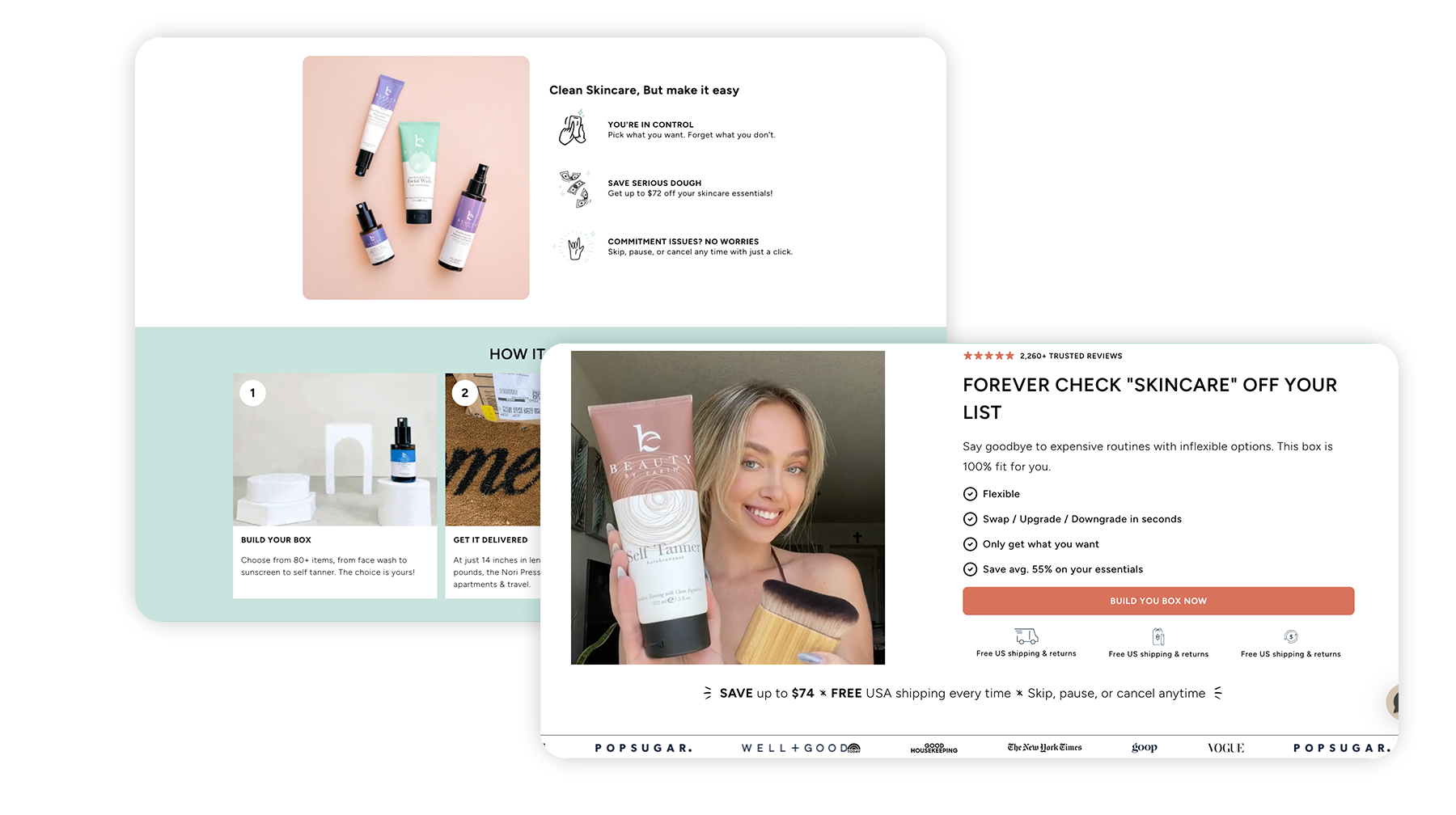
Beauty by Earth has absolutely nailed their BYO bundle subscription landing page. What we love about it: loaded with compelling UGC, emphasis on flexibility and personalization, callouts for $ and % discounting, spotlights on free GWP…the list goes on and on. We love to see it.
Magic Spoon
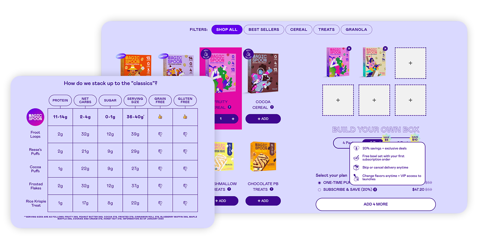
You can’t miss Magic Spoon’s branding – it’s colorful, elevated, and always eye-catching. It’s no surprise, then, that the subscription page design for their custom bundles is one of the best in the biz. Along with the creative selection of products, they also highlight the 20% subscription savings, a free bowl set for new subscribers, customer reviews, and product benefits.
The Welcome Offer LP
Curious Elixirs

Curious Elixirs runs ads highlighting the 28% discount on their welcome offer. The subscribe landing page does an excellent job of highlighting the subscription discount, order flexibility, and more. Their use of gorgeous product photos and on-brand design all the way through is awesome, too.
The Lift Box
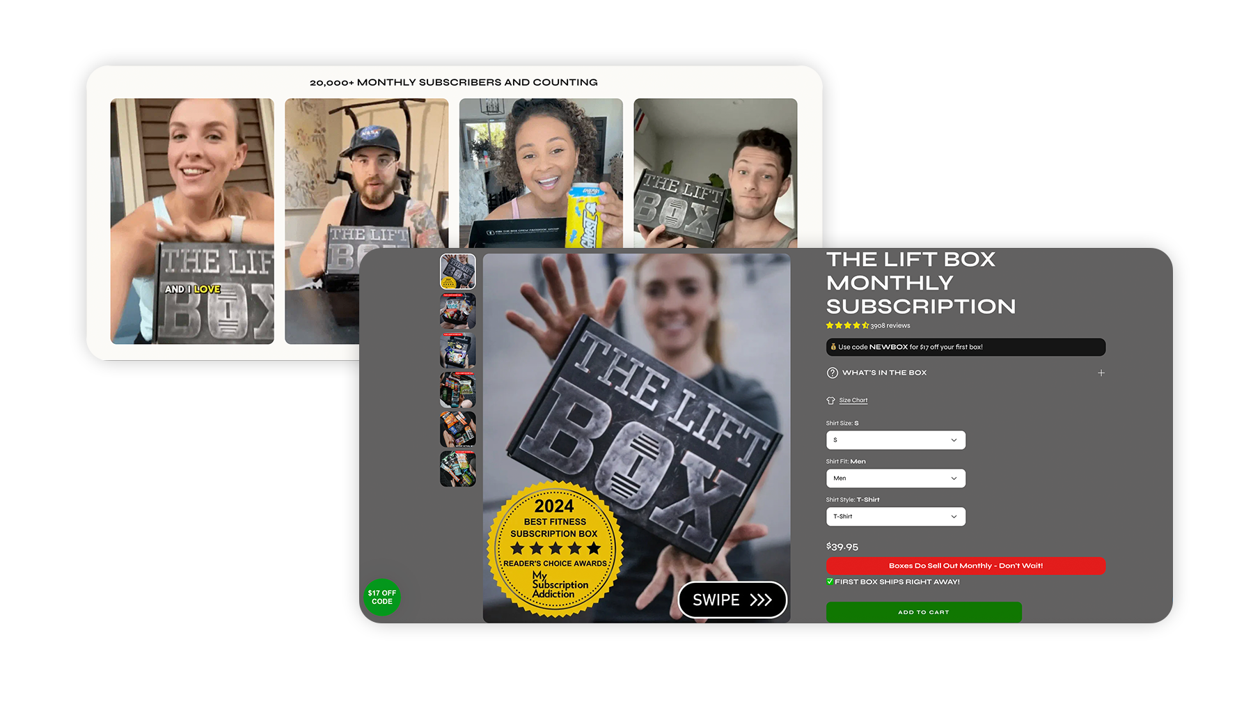
The Lift Box highlights social proof in their ads, calling out their 20,000+ subscribers. On their welcome offer LP, they hammer that messaging home again with tons of unboxing videos, customer reviews, and press mentions. Plus, they give new subscribers a $17 discount to sweeten the whole deal.
The Trial-to-Subscription LP
Clean Skin Club
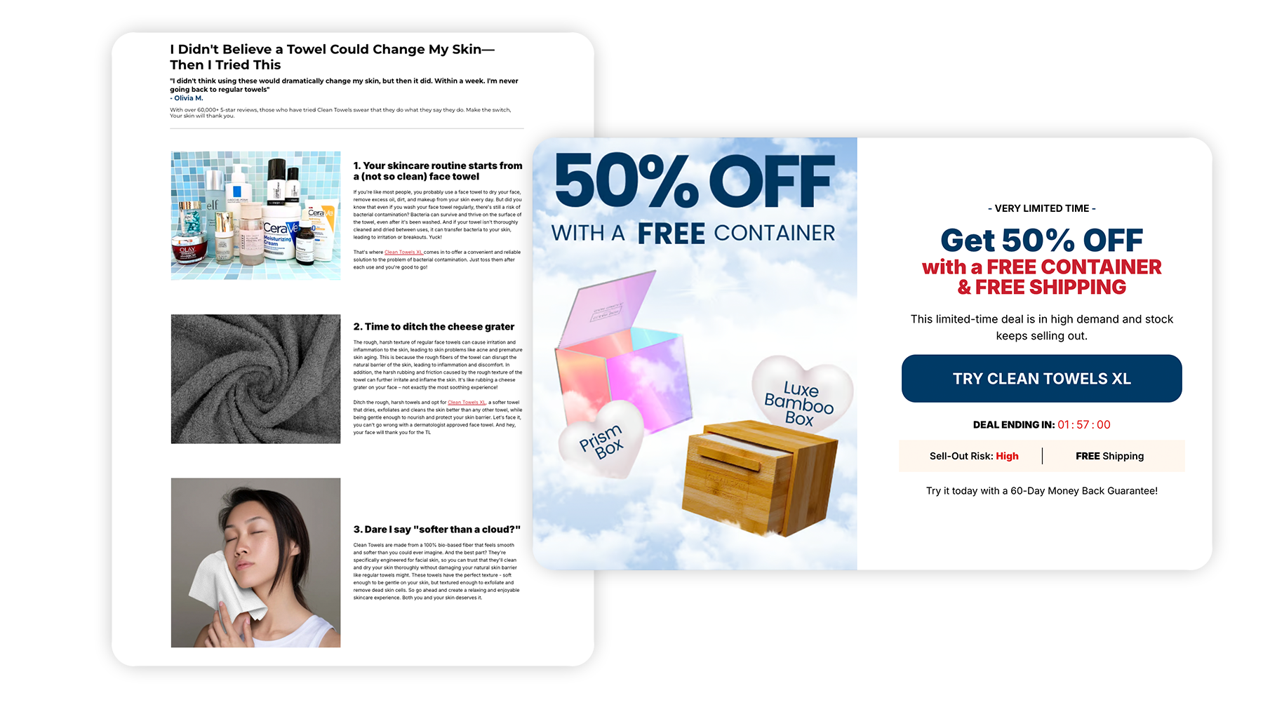
Clean Skin Club runs specific “free trial” ads to a listicle-style subscription landing page – and they don’t let you forget about the discount and free container offer at any point as you scroll. The sticky CTA combined with regular offer reinforcement infused throughout the page, makes it pretty hard not to act on the deal. Super compelling.
Subscribe & Save LP
BeautyLux

BeautyLux has a clean and compelling subscription page design that calls out the 15% discount and free shipping incentives front and center. As customers keep scrolling, they get to uncover all the subscription perks, including sections about why they should susbcribe, benefits, and how to sign up and manage their subscriptions (there are even screenshots!). Now this is simplicity and clarity at its finest.
Beekeeper’s Naturals
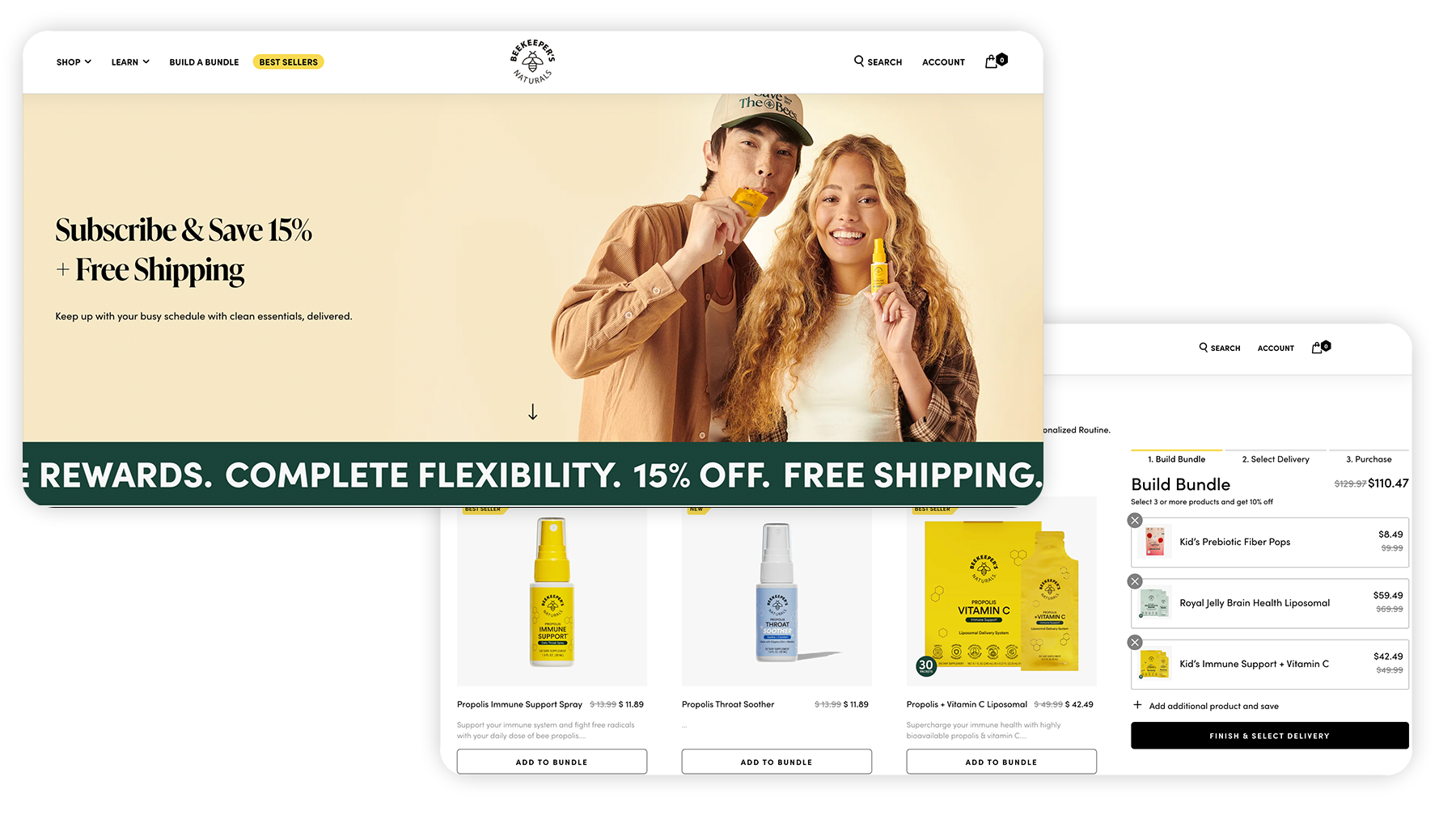
Beekeeper’s Naturals directs traffic from some of their subscription ads to the evergreen subscribe landing page built into their site. It breaks down the subscription discount, additional program benefits, includes reviews from subscribers, and even covers FAQs. Their most popular subscription products and bundle builder are featured on the page, accompanied by quick add-to-cart buttons, as well as a button that directs users to a subscribe and save product category page.
MDrive
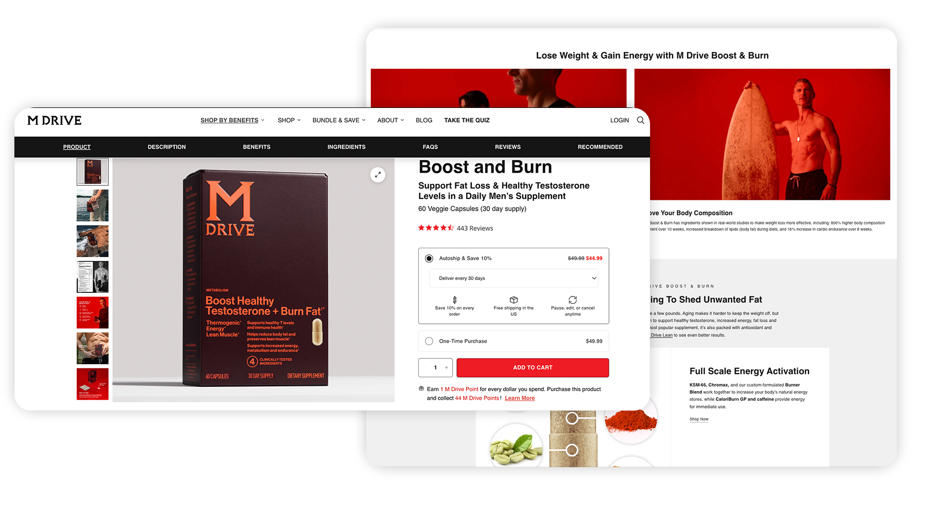
Technically, we’re cheating a little bit with this one, since this subscription landing page example is actually a PDP, not a landing page. But if we’re being literal, MDrive is sending folks who click their subscription ads to land on this page…so we’re going to count it. MDrive has crushed turning their PDP for Boost & Burn into a blend of a traditional product page + subscribe landing page. Their subscribe & save option is the default on the buy box, they emphasize subscription value props throughout the page, and overall, it’s insanely compelling when it comes to content.
FAQs:
What is a subscription landing page?
A subscription landing page is a focused web page built to turn one-time visitors into subscribers for recurring services or products, like newsletters, memberships, SaaS plans, or subscription boxes. It highlights the offer, benefits, pricing, and call to action, while keeping distractions to a minimum.
Why is having a subscription landing page important?
Subscription landing pages are important because they focus solely on driving subscriptions, eliminating distractions, and improving conversion rates. An LP can be optimized for SEO and designed to address subscriber questions upfront, which reduces friction and churn.
How to create a subscription landing page?
To create an effective subscription landing page, start by defining your goal, whether it’s driving free trials or paid subscriptions. Clearly communicate your value proposition so visitors understand what they’ll gain. Keep the design clean and focused with a strong call-to-action (CTA). Highlight pricing and benefits, and include trust signals like testimonials or guarantees. Add a short FAQ section to address common concerns. Finally, optimize the page for SEO and mobile performance, and test different versions to improve conversions over time.
What common mistakes should I avoid on a subscription landing page?
Some typical issues to avoid include:
- Having too many distractions (multiple CTAs, excessive navigation links) instead of a focused conversion goal
- Failing to clearly answer subscriber concerns (how to cancel, billing frequency, what’s included)
- Slow page load or poor mobile experience, which hurts both UX and SEO
- Not targeting the right keyword intent, like if you target purely informational keywords rather than transactional/subscription intent